A magic card using CSS is a simple card that has been created in such a unique way that if the user hovers over the card, the hidden data inside the card will be displayed to the user. This type of unique design provides great user interactivity and uniqueness to the website.
In this article, we will be explaining the step-by-step process of creating a modern and responsive Magic Card using HTML and CSS.
Also Read – 20+ Bootstrap Projects with Source Code
Before diving into the code, let’s discuss some benefits of creating a Magic Card Using CSS.
What are the features of a Magic card?
There are multiple key benefits to using the hamburger menu, and some of the features are discussed below:
- Responsive Design: It helps save space on the screen and makes the website look more appealing, user-friendly, and responsive.
- Hidden Option: The data inside the Magic Card is usually hidden, and using the hover property, the data is displayed to the user.
- Animation and Transition Effects: CSS allows you to add animation and transition effects to your cards, enhancing the user experience. This can include hover effects, fade-ins, and other interactive animations.
- Ease of Maintenance: By separating the HTML structure from the styling using CSS, it becomes easier to update and maintain your code. Changes to the design can be made in the CSS file without altering the HTML markup.
Getting Started
Setting up the IDE (Integrated Development Environment)
Before coding, we need to follow some basic steps for creating the environment for writing the code for our Hamburger menu using CSS. Here are the steps that need to be followed before writing the code for our portfolio website:
- First of all, open a Visual Studio code editor for creating and writing the code for Magic Card Using CSS.
- Then create a folder inside by selecting the location and saving it as “Magic Card.”
- Inside the folder, create two files for HTML and CSS and save them as “index.html” and “style.css.”
HTML: Structure Your Content
Let’s understand each code line by line.
Basic Structure:
<!DOCTYPE html>
<html lang="en">
<head>
<meta charset="UTF-8">
<meta name="viewport" content="width=device-width, initial-scale=1.0">
<title>Magic Card</title>
</head>
<body>
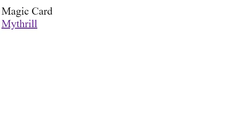
<div class="card">
Magic Card
</div>
<a href="https://mythrillfiction.com/" target="_blank">Mythrill</a>
</body>
</html>
Basic HTML structure includes the major tags that tell the browser that the file contains the HTML code. HTML tag contains tags such as:
<!Doctype HTML>: This tag is used to tell the browser that the file we are using is HTML 5 which is the latest version of HTML.
<HTML lang=” en”>: The HTML is the root tag, which contains all the HTML tags, and lang is the attribute used to tell the browser that the supporting language is English.
<head>: The head contains the meta information of the HTML, such as the title,links to external files, and some common meta tags.
Inside the head tag, using the <link> tag with the href attribute, we have provided the link for the external CSS, which helps in adding styling to the structure of the Magic Card.
<body>: The body tag contains all the content that is displayed to the user.
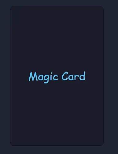
<div class="card">
    Magic Card
  </div>

  <a href="https://mythrillfiction.com/" target="_blank">Mythrill</a>
First of all, we will create a container using the block-level element. We will create a block-level element using the <div> tag, and with the class card, we will create a main for our Magic Card.
Then, inside our magic card container, we will write some text, which we will later hide using the CSS properties. Inside our block-level element, we will write “Magic Card,” and we will add the closing div tag.
Then underneath, we will be using the <a> tag to add a hyperlink for the other projects we did in web development. Using the <a> tag, we will add the link to our other project work.
Now we have completely added the structure for our magic card. We will use some advanced CSS concepts to add styling to our magical card, which will make it more unique and user-interactive.
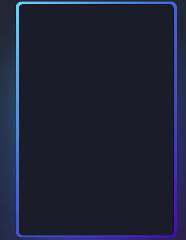
Output:
CSS: Styling Your Content
Now let’s come to the heart of our project, the styling part. We will add styling to our Magic Card and make it look more interactive. Before styling, I would suggest you guys try adding styling from your side after going through the project, which will help you build your styling skills.
Root Styling:
@property --rotate {
    syntax: "<angle>";
    initial-value: 132deg;
    inherits: false;
  }
First of all, using the CSS custom property, we will create a custom property called “rotate,” and using the rotate property, we will store the angle values of our Magic Card. The initial value is set to 132 degrees. Unlike typical properties, this custom property is configured not to inherit values from its parent elements, as indicated by the “inherits: false” declaration. It provides a convenient and reusable way to store rotation angles in CSS, promoting consistency and ease of maintenance in styling.
 :root {
    --card-height: 65vh;
    --card-width: calc(var(--card-height) / 1.5);
  }
Using the root selector property, we will create two custom CSS properties for setting the height and width of the card. We will first create a custom property (– card-height: 65 vh). This property will create a custom variable that contains the card height in vh, and similarly, we will create a custom variable (–card-width: cal(var(– card-height)/1.5), in which we set the width according to the height of the card.
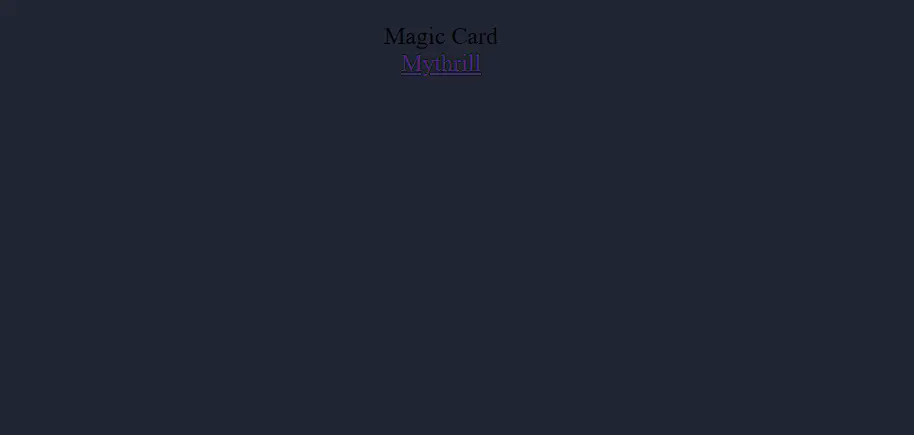
Styling Body and background:
Using the body tag selector, we will use the minimum height property. We will set the minimum height of the body of the webpage to 100 vh, and using the background-color property, we will set the background to “dark blue.” Now, using the align item property, we will align all the content to the center of the webpage, and also using the box-sizing property, we will set it to “border-box.”
 body {
    min-height: 100vh;
    background: #212534;
    display: flex;
    align-items: center;
    flex-direction: column;
    padding-top: 2rem;
    padding-bottom: 2rem;
    box-sizing: border-box;
  }
Styling Elements
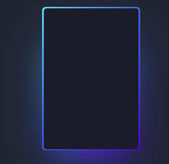
Using the class selector (.card), we will add the styling to our card container. Using the background property, we will set the background of the container to “dark blue,” and using the custom CSS property, we will inherit the width and height of our Magic Card. Using the padding property, we will add 3px of padding around the container.
Also, using the border-radius property, we will add some curves or smooth edges to the card container, and we will align all the content to the center of the webpage.
.card {
    background: #191c29;
    width: var(--card-width);
    height: var(--card-height);
    padding: 3px;
    position: relative;
    border-radius: 6px;
    justify-content: center;
    align-items: center;
    text-align: center;
    display: flex;
    font-size: 1.5em;
    color: rgb(88 199 250 / 0%);
    cursor: pointer;
    font-family: cursive;
  }
Now using the hover property of the CSS, we will add a hover property to our magic card. As the user hovers over the card, a border of RGB color around the card with a transition will start in the interval of 1 second.
 .card:hover {
    color: rgb(88 199 250 / 100%);
    transition: color 1s;
  }
  .card:hover:before, .card:hover:after {
    animation: none;
    opacity: 0;
  }
.card::before {
    content: "";
    width: 104%;
    height: 102%;
    border-radius: 8px;
    background-image: linear-gradient(
      var(--rotate)
      , #5ddcff, #3c67e3 43%, #4e00c2);
      position: absolute;
      z-index: -1;
      top: -1%;
      left: -2%;
      animation: spin 2.5s linear infinite;
  }
Using the class selector (.card::before) property, we will use the content property as “empty” and set the width of the card before hover to 104% and the height of the card to 102%. Using the border-radius property, we will set the border radius to 8 pixels to give some edges to the magic card. Using the custom CSS property rotate, we will set the position of the card to absolute, and using the animation property, we will add a spin card with an interval of 2.5 seconds and an infinite loop.
.card::after {
    position: absolute;
    content: "";
    top: calc(var(--card-height) / 6);
    left: 0;
    right: 0;
    z-index: -1;
    height: 100%;
    width: 100%;
    margin: 0 auto;
    transform: scale(0.8);
    filter: blur(calc(var(--card-height) / 6));
    background-image: linear-gradient(
      var(--rotate)
      , #5ddcff, #3c67e3 43%, #4e00c2);
      opacity: 1;
    transition: opacity .5s;
    animation: spin 2.5s linear infinite;
  }
Similarly, we will create an after property for our magic card after the hover property. Using the position property, we will set the position of the magic card as “absolute,” and then using the custom variable, we will inherit the actual height of the magic card. Using the background image property, we will add a linear background to our magic card with an animation of a spin card with an interval of 2.5 seconds.
Adding Animation Movement:
Using the keyframes property, we will add the animation to our magic card. Using the keyframe property called spin, we will create two keyframes of 05 where we use the CSS custom rotate property to rotate the card 0 degrees, and then using the 100% keyframe, we will change the angle of the card from 0° to 360°.
@keyframes spin {
    0% {
      --rotate: 0deg;
    }
    100% {
      --rotate: 360deg;
    }
  }
Final Output:
See the Pen Magic Card by Gayane Gasparyan (@gayane-gasparyan) on CodePen.
Conclusion
I hope you get the idea of the project. We just attempted to make the entire thing more beginner-friendly by breaking it down step by step. We advise beginners to read and understand this article first and then Try creating a unique and customizable Magic Card Using CSS, we have finished our Magic Card using CSS project. Please feel free to leave a comment below if you have any doubts.