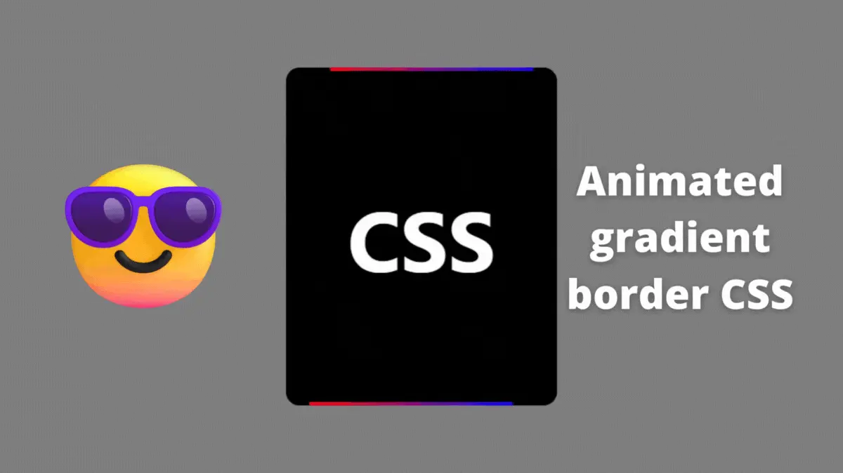
Hi fellow coders. In this tutorial, we will learn how to create an animated gradient border using CSS. The border goes around the edges with a gradient.
How to create an animated gradient border CSS?
We will try to create the animated gradient border by dividing it into small parts.
First, we need to create a card, then we will create a border around it, then animate it.
Card design CSS codepen
See the Pen Card in CSS by Rare Programmer (@rareprogrammer) on CodePen.
Here, we will create a simple card with a black background and some border-radius.
border-radius – This property defines the corner radius of an HTML element.
.card {
  position: relative;
  height: 25rem;
  width: 20rem;
  background: black;
  display: flex;
  justify-content: center;
  align-items: center;
  border-radius: 1rem;
}
Creating a card is not that much of a task.
Gradient border CSS codepen
See the Pen Gradient border in CSS by Rare Programmer (@rareprogrammer) on CodePen.
In CSS, a gradient border is a background element with a gradient overflowing at the edges of the foreground element.
We can use the CSS before and after pseudo-elements to create the gradient border
.card::before {
  content: "";
  height: 40rem;
  width: 20rem;
  background: linear-gradient(90deg, red, blue);
  position: absolute;
  z-index: 2;
}

.card::after {
  content: "";
  height: 24.5rem;
  width: 19.5rem;
  background: black;
  position: absolute;
  z-index: 2;
  border-radius: 1rem;
}
At this point, we have a card with a gradient border. Next, we just need to rotate the border card.
Border gradient animation CSS codepen
See the Pen Animated gradient border card by Rare Programmer (@rareprogrammer) on CodePen.
We can achieve the rotation animation using the CSS keyframes rule.
The @keyframes rule describes the animation in CSS. The animation is created by gradually changing from one set of CSS styles to another.
.card::before {
  content: "";
  height: 40rem;
  width: 15rem;
  background: linear-gradient(90deg, red, blue);
  position: absolute;
  z-index: 2;
  animation: rotate 3.5s linear infinite;
}

@keyframes rotate {
  from {
    transform: rotateZ(0deg);
  }
  to {
    transform: rotateZ(360deg);
  }
}
In the above code, we are rotating the gradient border card from 0 deg to 360 deg infinitely. And I also shortened the width of it so that it looks like two lines are circling around the card.
At this point, it’s just a matter of creativity.
The source code is available on GitHub.
If this article helped you in any way then please share it.
You Might Like This:
- Color Changing Search Bar
- Text Reveal Animation
- Product Card
- CSS Scroll Animation
- Magnetic Hover Interaction
- Glassmorphism Icon Buttons
- Click To Send


