Creating a project with visuals that are aesthetically appealing and attract user interaction—the secret behind this type of project is the designing skills of the developers. In the modern era of 3D websites and design, you may have come across various 3D projects.
But I’m sure the project today that we will be creating hasn’t been seen commonly because these types of projects require in-depth concepts of CSS (Cascading Style Sheet).
Also Read – 20+ Advance Javascript projects with Source Code
We will be creating a highly interactive and aesthetic 3D glowing cube with bouncing animation and gradient glows, and we will be adding all these stylings to our project.
If you are wondering how you can create these types of projects, then the answer is simple: you just need to follow all the instructions that we will be providing you with in this article.
A 3D glowing cube is a unique combination of graphics and animation properties of CSS that helps in creating a unique and visually appealing cube with a rotation function. We will be creating this project from scratch.
Starting from creating the structure of the webpage and then using the CSS properties to add styling to our cuber to give it a 3D look.
Step 1: Understand the Basics of HTML
Before we dive into the deep concepts of knowledge, we must take into consideration that our article’s motive is to make all the topics understandable for beginners to advanced levels.
We will start with the basics of HTML. We will first look at the basic structure of an HTML page. How it looks HTML is the markup language that uses attributes and tags to create the structure of websites.
<!DOCTYPE html>
<html>
  <head>
    <title>Your Page Title</title>
  </head>
  <body>
    <!-- Your content goes here -->
  </body>
</html>
Step 2: Creating a Folder
We need a folder where we can organize all the pages of HTML in one place, which can be organized and used by the user according to their choices.
To create a new folder, we need to follow the below steps:
- First of all, select the location where you want to create the folder.
- Now right-click and click on the new button, select the folder option, and click enter.
- Now, rename the folder according to your choice. Here we will name our folder “3D Cube”.
Step 3: Creating a New HTML File
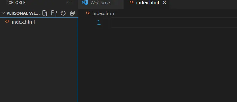
Now open our personal website folder and use the right-click mouse button.
Create a new file name called “index.html”. Also, using a simple text editor like Notepad in Windows and TextEdit in MacOS, we can open our HTML files inside our text editor.
In our project, we have used Visual Studio to open our HTML file.
Step 4: Link Your Web Pages
We will add the external link to the CSS file inside the head section of the HTML file so that we can link the styling to our 3D cube webpage.
<!DOCTYPE html>
<html lang="en">
  <head>
    <meta charset="UTF-8" />
    <meta http-equiv="X-UA-Compatible" content="IE=edge" />
    <meta name="viewport" content="width=device-width, initial-scale=1.0" />
    <link rel="stylesheet" href="style.css" />
    <title>3D Glowing Bouncing Cube using CSS</title>
  </head>
  <body>

  </body>
</html>
Step 5: Creating the Structure
We all know that a cube has six faces, so for creating all six faces, we have used six different block-level “<div>” elements for the structure of the cube.
Using the div tag with the class scene, we will create a container for our cube, and we have done something unique to our bouncing 3D cube: we have created a hyperlinked cube. When the user clicks on the cube, he or she will be redirected to the particular website.
Now, using the main div tag with the class cube, we have created a container where we will add all the faces of the cube. We will be creating different blocks for the front, back, top, bottom, left, and right faces of the cube.
<div class="scene">
  <div class="cube-wrapper">
    <a
      href="https://www.rareprogrammer.com/3d-glowing-bouncing-cube-using-css"
    >
      <div class="cube">
        <div class="cube-faces">
          <div class="cube-face top"></div>
          <div class="cube-face left"></div>
          <div class="cube-face right"></div>
          <div class="cube-face back"></div>
          <div class="cube-face front"></div>
          <div class="cube-face bottom"></div>
          <div class="cube-face light"></div>
        </div>
      </div>
    </a>
  </div>
</div>
Step6: Styling 3D Glowing Cube
Basic Styling to our 3d cube webpage
We will be starting with adding some basic styling to the body of our webpage, Using the body tag selector we will set the padding and margin of the webpage as zero from the browser default property.
html,
body {
margin: 0;
padding: 0;
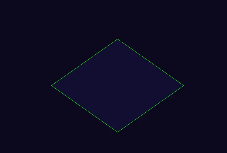
}Now using the background-color property, we will add a dark background to our webpage as we are going to create a 3D glowing cube, so we will set the background of our webpage to black, and set the height to 100vh (viewport’s height).
body {
background-color: #0b081f;
height: 100vh;
width: 100%;
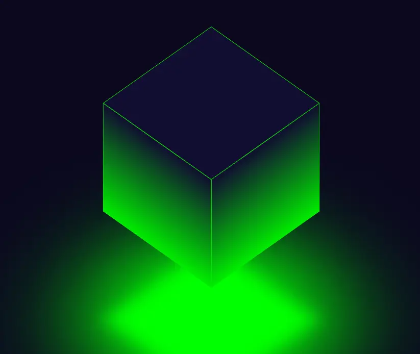
}Basic Styling Output

Styling Scene and the Wrapper Section
Now using the class selector scene we will set the position of the scene as relative according to the webpage and using the z-index property we ensure the scene will be at the top of the webpage.
.scene {
  position: relative;
  z-index: 2;
  height: 100%;
  width: 100%;
  display: flex;
  justify-content: center;
  align-items: center;
}
The transform-style property is used to ensure that every child element should for the same styling.
Now we will add the animation named bouncing with the duration of 2s up to infinite time so that we can add a smooth bouncing motion.
.cube-wrapper {
  transform-style: preserve-3d;
  animation: bouncing 2s infinite;
}
Creating Cube Faces
Class selector (.cube) We will add some styling to the cube faces container we will set the same styling to each child element. Now using the transform property we will rotate the cube 45 degrees in the x direction and 45 degrees in the z direction.
Also using the animation property we will create an animation with the same 2-second duration but this time we will add the rotation animation.
.cube {
  transform-style: preserve-3d;
  transform: rotateX(45deg) rotateZ(45deg);
  animation: rotation 2s infinite;
}
Now that we will be creating the cube faces, we will set the height and width of the cube faces to 300 pixels, respectively, and using the position property, we will set the position of the face according to the cube container.
.cube-faces {
transform-style: preserve-3d;
height: 300px;
width: 300px;
position: relative;
transform-origin: 0 0;
transform: translateX(0) translateY(0) translateZ(-40px);
}
.cube-face {
position: absolute;
inset: 0;
background: #110d31ff;
border: solid 1px #00ec00;
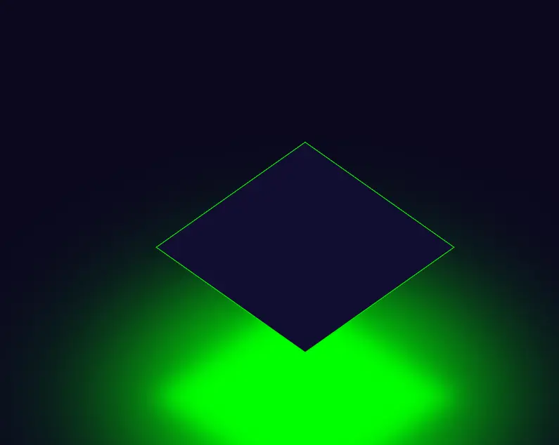
}We will create a border for our cube face with a solid 1px width of green color, and the position of the face will be absolute to fix the position of the face.
Now we will be creating a Glow/Light around our cube face using the transform property.
We will move the light of the cube to -300px, or, as we can say, in the negative direction of the z-axis.
Using the background-color property, we will add a green background to the light, and using the filter blur property, we will add a blur effect to our background to give a glowing look to our cube face.
.cube-face.light {
  transform: translateZ(-300px);
  background: #0f0;
  filter: blur(20px);
  box-shadow: 0 0 120px rgba(0, 255, 0, 0.2), 0 0 200px rgba(0, 255, 0, 0.4),
    0 0 300px rgba(0, 255, 0, 0.6), 0 0 400px rgba(0, 255, 0, 0.8),
    0 0 500px rgba(0, 255, 0, 1);
  animation: bouncing-light 2s infinite;
}
Styling Faces of the cube
Now using the class selector .cube-face.top, .cube-face.front, .cube-face.back, .cube-face.right, and .cube-face.left. We will set a gradient background to each face and using the transform property we will set the position of the faces in the 3d environment.
Starting with .cube-face.top, This class with help in styling the top face of the cube.
It applies the transformation on the z-axis by 300px using the translateZ() function of CSS.
.cube-face.top {
  transform: translateZ(300px);
}
Note: Since we can’t see the bottom face of the cube is already at it’s position, we don’t need to apply any styles to it.
Next with .cube-face.front, This class will help in styling the front face of the cube.
It applies a linear gradient background from a dark purple #110d31ff to a vibrant green #00ec00 in a horizontal direction.
The transform-origin property sets the origin point for transformations to the left edge and vertically centered.
The transform property rotates the face around the Y-axis by -90 degrees, effectively positioning it as the front face of the cube.
.cube-face.front {
  background: linear-gradient(-90deg, #110d31ff, #00ec00);
  transform-origin: 0 50%;
  transform: rotateY(-90deg);
}
Now using the .cube-face.back class we will add the styling to the back face of the cube.
It shares similar styles with the front face, including the gradient background and transform origin.
However, the transform property additionally translates the face along the Z-axis by -300 pixels, pushing it behind the cube.
This creates the illusion of depth, with the back face appearing farther away from the viewer.
.cube-face.back {
  background: linear-gradient(-90deg, #110d31ff, #00ec00);
  transform-origin: 0 50%;
  transform: rotateY(-90deg) translateZ(-300px);
}
Next, .cube-face.right represents the right face of the cube.
It applies a gradient background from dark purple to green, this time in a vertical direction.
The transform origin is set to the top center of the face. The transform property rotates the face around the X-axis by -90 degrees and translates it vertically by -300 pixels.
This places the right face to the right side of the cube, giving it a side view appearance.
.cube-face.right {
  background: linear-gradient(180deg, #110d31ff, #00ec00);
  transform-origin: 50% 0;
  transform: rotateX(-90deg) translateY(-300px);
}
Finally, .cube-face.left represents the left face of the cube. It shares similar styles with the right face, including the gradient background, transform origin, and rotation.
.cube-face.left {
  background: linear-gradient(180deg, #110d31ff, #00ec00);
  transform-origin: 50% 0;
  transform: rotateX(-90deg) translateY(-300px) translateZ(300px);
}
However, it additionally translates the face along the Z-axis by 300 pixels. This positions the left face to the left side of the cube, completing the 3D effect.
Now we have completed the structure of the cube along with all the styling required for our 3D cube. We just need to add animation to our 3D Glowing cuber for a better user experience.
Adding Animation
Animation in CSS is created with the help of keyframe property we use different keyframes for adding animation to a particular element.
Here in our 3D glowing cube, we will be adding two animations one is for bouncing and the second one is for adding rotation to our cube.
Rotation Animation
In the first keyframe (0%), the element is initially rotated with rotateX(45deg) and rotateZ(45deg), giving it a specific orientation in the 3D space.
The rotateY(0) indicates no rotation around the Y-axis. Additionally, the animation-timing-function property is set to cubic-bezier(0.17, 0.84, 0.44, 1), which defines the pace of the animation with a cubic Bezier curve.
In the second keyframe (50%), the element’s rotation is updated to rotateZ(225deg), indicating that it has rotated further along the Z-axis.
The animation timing function is adjusted to cubic-bezier(0.76, 0.05, 0.86, 0.06), Which helps in changing the speed of the animation.
In the final keyframe (100%), the element completes its rotation, ending up with a total rotation of rotateZ(405deg). The animation-timing function reverts to cubic-bezier(0.17, 0.84, 0.44, 1) to maintain consistency in the curve.
@keyframes rotation {
  0% {
    transform: rotateX(45deg) rotateY(0) rotateZ(45deg);
    animation-timing-function: cubic-bezier(0.17, 0.84, 0.44, 1);
  }

  50% {
    transform: rotateX(45deg) rotateY(0) rotateZ(225deg);
    animation-timing-function: cubic-bezier(0.76, 0.05, 0.86, 0.06);
  }

  100% {
    transform: rotateX(45deg) rotateY(0) rotateZ(405deg);
    animation-timing-function: cubic-bezier(0.17, 0.84, 0.44, 1);
  }
}
Bouncing Animation for Cube
Using the keyframes property at 0%, the animation begins with the element translated upwards by 40 pixels (translateY(-40px)), initiating the bounce motion. It is the starting position of the bounce.
At 45%, the animation reaches its peak as the element is translated downwards by 40 pixels (translateY(40px)). This indicates the highest point of the bounce where the element stops for a millisecond the bouncing starts decreasing.
At 100%, the animation completes one full bounce cycle as the element returns to its original position (translateY(-40px)). This marks the end of the bounce motion, bringing the element back to its initial state.
@keyframes bouncing {
  0% {
    transform: translateY(-40px);
    animation-timing-function: cubic-bezier(0.76, 0.05, 0.86, 0.06);
  }

  45% {
    transform: translateY(40px);
    animation-timing-function: cubic-bezier(0.23, 1, 0.32, 1);
  }

  100% {
    transform: translateY(-40px);
    animation-timing-function: cubic-bezier(0.76, 0.05, 0.86, 0.06);
  }
}
Bouncing Animation for Light
Here the light is going in the opposite direction while increasing it’s its size. This is to create an illusion of light being cast from the bottom face of the cube.
@keyframes bouncing-light {
  0% {
    transform: translateZ(-80px) scale(1.3);
    animation-timing-function: cubic-bezier(0.76, 0.05, 0.86, 0.06);
    opacity: 0.7;
  }

  45% {
    transform: translateZ(0) scale(1);
    animation-timing-function: cubic-bezier(0.23, 1, 0.32, 1);
    opacity: 1;
  }

  100% {
    transform: translateZ(-80px) scale(1.3);
    animation-timing-function: cubic-bezier(0.76, 0.05, 0.86, 0.06);
    opacity: 0.7;
  }
}
Using the keyframes property at 0%, the animation begins with the element translated downwards by -80 pixels (translateZ(-80px)) with the 1.3 scale (scale(1.3)) and 0.7 opacity, initiating the bounce animation. It is the starting position of the animation.
At 45%, the animation reaches its peak as the element is translated upwards to its original position at 0 pixels (translateZ(0px)) with an opacity of 1 and a scale of 1. This indicates the lowest point of the bounce where the element stops for a millisecond and then the bounce starts.
At 100%, the animation completes one full animation cycle as the element returns to its original position (translateY(-80px)) with 1.3 scale and 0.7 opacity. This marks the end of the bounce animation for light, bringing the element back to its initial state.
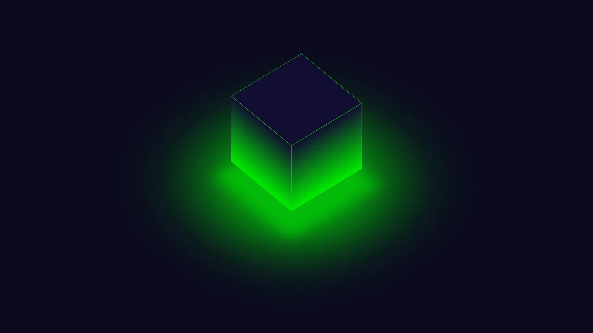
Final Output
See the Pen 3D Glowing Bouncing Cube using CSS by Rare Programmer (@rareprogrammer) on CodePen.
Now we have created our 3D glowing and bouncing cuber. We can deploy our HTML webpage server, and we can also deploy it to dedicated servers, or we can deploy it on personal servers so that it can be accessed by the selected user only.
For running our project inside the VS code we need to use the live server extension in the VS code which helps in creating a local host where our project is live for us only, where we can look at the final look of our project.
Conclusion
Now that’s everything finished! We have successfully created our 3d glowing cube with bouncing and rotation animation.
If you find this article helpful, do share it, find your friends, and give some positive feedback that makes us motivated to bring new concepts to you guys.

