A 3D carousel is a type of graphical user interface that shows the 3D presentation of several images and videos.
Multiple Images are arranged in an elliptical or circular layout in a 3D carousel. Users can rotate the carousel vertically or horizontally to look at the objects from different viewpoints or sides.
Also Read – 3D Glowing Bouncing Cube using CSS
In comparison to static or flat carousels, 3D carousels are used for displaying multiple images at the same time.
This type of project is mainly used in e-commerce websites where the seller needs to display the images of the product to the user in an interactive manner. This type of 3D carousel effect helps in gaining user attention.
In this article, we will be creating a 3D carousel in a step-by-step manner from scratch so that even beginners can understand the project easily, I would also recommend that you try incorporating your styling for better user design.
Step1: Planning your 3D Carousel Webpage
Before we start coding, it is important to plan your 3d Carousel webpage structure, content, and design.
It is necessary to plan what type of media you will be using like images or videos, what the website’s design will look like, and whom we want to target.
Based on these parameters, we will be planning our 3D Carousel.
- We will first of all create a wireframe for our website. It will include details about the structure of the website. How elements are going to be placed. The majority of the rough structure of the website will be created through wireframes.
- Then we will plan the type of media Content.
- Then we will write up the code for our website.
- At last, we will host your 3D carousel web page.
- These steps all help in creating a fully responsive blog website.
Step2: Setting Up the IDE
Now we will choose an IDE for the code editor, and we will create a folder for our 3D Carousel.
Inside the folder, we will create the files for the HTML structure for our 3D carousel website and the CSS file for styling our 3D Carousel website.
Step3: Building the HTML Structure
To create the structure of our 3D carousel we will first add some basic HTML tags inside our file.
<!DOCTYPE html>
<html lang="en">
<head>
    <meta charset="UTF-8">
    <meta name="viewport" content="width=device-width, initial-scale=1.0">
    <title>3D Carousel</title>
</head>
<body>

</body>
</html>
Basic HTML Tags
Basic HTML structure includes the major tags that tell the browser that the file contains the HTML code. HTML tag contains tags such as:
<!Doctype HTML>: This tag is used to tell the browser that the file we are using is HTML 5 which is the latest version of HTML.
<html lang=” en”>: The HTML is the root tag, which contains all the HTML tags, and lang is the attribute used to tell the browser that the supporting language is English.
<head>: The head contains the meta information of the HTML, such as the title, links to external files, and some common meta tags.
Meta tags: Meta tags are those tags that contain additional information and are not visible to the user, but they are important tags that are used for search engine optimization and search engines and web browsers. Meta tags help search engines match keywords with relevant information and display the result to the user.
<body>: The body tag contains all the content displayed to the user.
Adding the Carousel Container and Media files
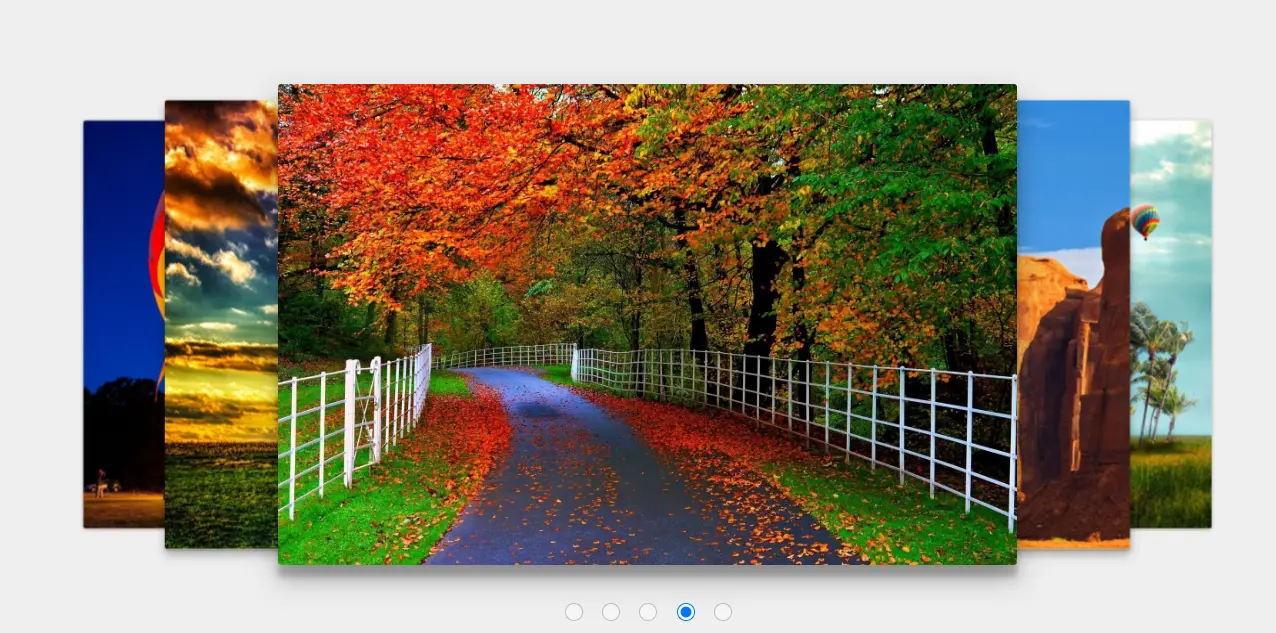
Using the section tag we will create a section for our carousel image slider and then using the input tag with type as radio button we will create 5 radio buttons for each slide of our carousel which will help us in switching slides.
<section id="slider">
    <input type="radio" name="slider" id="s1" checked>
    <input type="radio" name="slider" id="s2">
    <input type="radio" name="slider" id="s3">
    <input type="radio" name="slider" id="s4">
    <input type="radio" name="slider" id="s5">
Now using the label tag, we will create the label for each slide, which helps in telling which slide number is visible on the screen as soon as the hover hovers over the image, inside our label tag, we will use the <img> tag for adding the image for our first slider.
Similarly, we will create some more sliders for creating a unique 3D interactive carousel with multiple images. You guys can add any number of slides you want to your carousel.
<label for="s1" id="slide1"><img src="https://i.pinimg.com/originals/2b/de/de/2bdede0647e3cdf75b44ea33723201d9.jpg" alt=""></label>
    <label for="s2" id="slide2"><img src="https://images6.alphacoders.com/462/thumb-1920-462371.jpg" alt=""></label>
 <label for="s3" id="slide3"><img src="https://wallpaperaccess.com/full/1154341.jpg" alt=""></label>
    <label for="s4" id="slide4"><img src="https://wallpapercave.com/wp/wp2634222.jpg" alt=""></label>
    <label for="s5" id="slide5"><img src="https://images5.alphacoders.com/343/thumb-1920-343645.jpg" alt=""></label>
  </section>
HTML Output:

Step4: Styling our 3D Carousel Website
Adding Basic Styling
body {
    margin: 0;
    background: #EEE;
    user-select: none;
    font-family: sans-serif;
  }
First of all, using the body tag selector we will set the padding and margin of the browser as zero from the browser’s default padding and margin, and then using the background property we will add off-white tone to our carousel background.
Styling slider Section and Radio Button
Id tag selector (#slider) We will set the position of the carousel as relative and using the width and height property we will set the width as 50% and using the height property we will set the height as 32vw (viewport’s width) of the slider section.
#slider {
    position: relative;
    width: 50%;
    height: 32vw;
    margin: 150px auto;
    font-family: 'Helvetica Neue', sans-serif;
    perspective: 1400px;
    transform-style: preserve-3d;
  }
In the input tag selector, type “radio“. We will set the position of the radio button relative to the slider section, and we will add a space of 108% relative to the body of the webpage and 50% of the space.
 input[type=radio] {
    position: relative;
    top: 108%;
    left: 50%;
    width: 18px;
    height: 18px;
    margin: 0 15px 0 0;
    opacity: 0.4;
    transform: translateX(-83px);
    cursor: pointer;
  }


  input[type=radio]:nth-child(5) {
    margin-right: 0px;
  }

  input[type=radio]:checked {
    opacity: 1;
  }
Styling Image
Using the id tag selector, we will select the label and the child element image and set the position of the label and child image tag as absolute and the width and height of the image as 100%, respectively.
Using the color property, we will set the font color to white; using the border-radius property, we will set the border radius to 3 pixels. Also, using the align item property, we will center all the images and sections in the center of the webpage.
We will add some effect to our slider using the transform property on our image with a delay of 300ms with ease.
#slider label,
#slider label img {
  position: absolute;
  width: 100%;
  height: 100%;
  left: 0;
  top: 0;
  color: white;
  font-size: 70px;
  font-weight: bold;
  border-radius: 3px;
  cursor: pointer;
  display: flex;
  align-items: center;
  justify-content: center;
  transition: transform 400ms ease;
}
Slider Function
Adding the styling for our slider functionality we will be using all the radio buttons for each slider such as (s1) as the radio button for our slider 1.
* Slider Functionality */


/* Active Slide */
#s1:checked ~ #slide1,
 #s2:checked ~ #slide2,
  #s3:checked ~ #slide3,
   #s4:checked ~ #slide4,
    #s5:checked ~ #slide5 {
  box-shadow: 0 13px 26px rgba(0,0,0, 0.3), 0 12px 6px rgba(0,0,0, 0.2);
  transform: translate3d(0%, 0, 0px);
}


/* Next Slide */
#s1:checked ~ #slide2,
 #s2:checked ~ #slide3,
  #s3:checked ~ #slide4,
   #s4:checked ~ #slide5,
    #s5:checked ~ #slide1 {
  box-shadow: 0 6px 10px rgba(0,0,0, 0.3), 0 2px 2px rgba(0,0,0, 0.2);
  transform: translate3d(20%, 0, -100px);
}


/* Next to Next Slide */
#s1:checked ~ #slide3,
 #s2:checked ~ #slide4,
  #s3:checked ~ #slide5,
   #s4:checked ~ #slide1,
    #s5:checked ~ #slide2 {
  box-shadow: 0 1px 4px rgba(0,0,0, 0.4);
  transform: translate3d(40%, 0, -250px);
}


/* Previous to Previous Slide */
#s1:checked ~ #slide4,
 #s2:checked ~ #slide5,
  #s3:checked ~ #slide1,
   #s4:checked ~ #slide2,
    #s5:checked ~ #slide3 {
  box-shadow: 0 1px 4px rgba(0,0,0, 0.4);
  transform: translate3d(-40%, 0, -250px);
}


/* Previous Slide */
#s1:checked ~ #slide5,
 #s2:checked ~ #slide1,
  #s3:checked ~ #slide2,
   #s4:checked ~ #slide3,
    #s5:checked ~ #slide4 {
  box-shadow: 0 6px 10px rgba(0,0,0, 0.3), 0 2px 2px rgba(0,0,0, 0.2);
  transform: translate3d(-20%, 0, -100px);
}
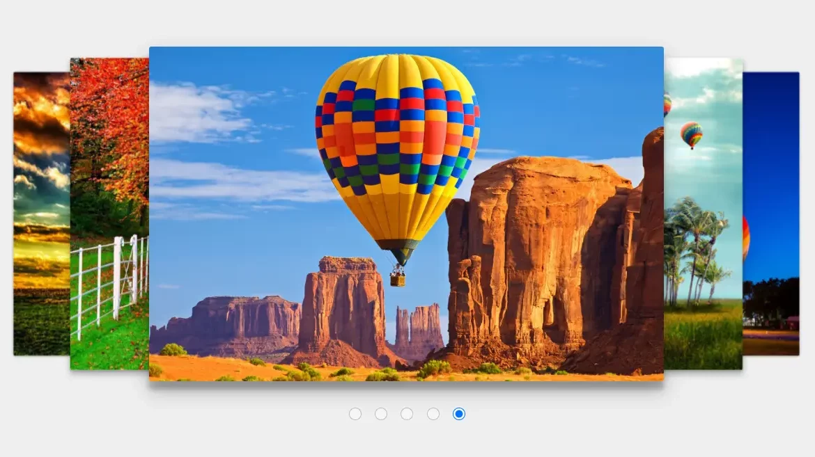
Each slide has its style defined based on whether its corresponding radio button is checked. The CSS uses the: checked pseudo-class to determine the active slide and applies specific transformations and box shadows to achieve the sliding effect.
For the active slide, a box shadow is added to give it depth, and it’s translated along the x-axis by 0%. The next slide is translated 20% to the right and slightly downward, giving the impression of moving towards the center.
The subsequent slides follow a similar pattern, with increasing translation values and decreasing box shadow intensity, to simulate a perspective effect as if the slides are moving away from the viewer.
Similarly, for the previous slides, the translation is to the left with negative percentages to simulate movement in the opposite direction. The box shadow is also applied to maintain consistency in the visual effect.
Woohooh, we just created a beautiful 3D image carousel using HTML and CSS only. These kinds of small projects help beginners gain command of frontend skills boost their confidence and also help in creating unique and interactive classes.
CSS Output:
Final Output
See the Pen 3d Image Slider with Carousel using HTML & CSS by Rare Programmer (@rareprogrammer) on CodePen.
Conclusion
I hope you got the idea of the project. We just attempted to make the entire thing more beginner-friendly by breaking it down step by step.
We advise beginners to follow along with our article. Try creating a different type of website on your own. With HTML and CSS, we have finished our 3D carousel website.
