Hey guys, Welcome to another awesome Web dev Project, today we will be creating an animated cartoon switch button with the help of HTML, CSS, and Javascript also using the font-awesome icons for adding the cartoons inside the toggle button.
Creating this type of project helps in adding a unique and interactive design to our websites. This project is completely for beginners where you will learn the major concepts of HTML, CSS, and Javascript.
Also Read – Multiple Window 3D Scene Using Three Js
Before starting our project we need to understand some basic concepts about the Toggle button.
What is a toggle button:
Simply put, a toggle button is like a switch with two sides. Just as you push up or down on a physical button, a toggle button in HTML allows users to switch between two states with ease. Whether it’s toggling modes, activating features, or changing views, it offers a straightforward way to make choices and trigger actions on a webpage.
What is the use of the toggle button?
Toggle buttons are commonly used when transitioning between different states is necessary. For instance, in a project, you might use toggle buttons to enable switching between dark and light themes easily.
Note: I’ll be sharing the link for the source code, and you need to follow the below steps to run the project in your system. I’ll be explaining all the necessary concepts. Just follow along with me through this article.
How to create a Dog and Cat toggle button using CSS
Creating the Structure: HTML
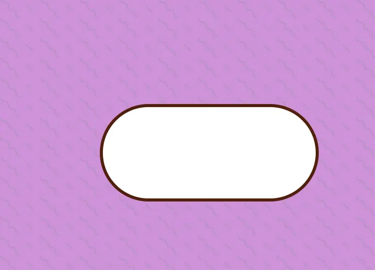
For creating the structure of our toggle button we will be creating a button container and inside the button tag we will create multiple span tags for creating the structure of the dog and cat face.
<button class="toggle-switch" data-pet="dog" aria-label="Switch to cat">
    <span class="pet">
        <span class="face"></span>
        <span class="cat-ear cat-ear-left"></span>
        <span class="cat-ear cat-ear-right"></span>
        <span class="dog-ear dog-ear-left"></span>
        <span class="dog-ear dog-ear-right"></span>
        <span class="eyebrow eyebrow-left"></span>
        <span class="eyebrow eyebrow-right"></span>
        <span class="eye eye-left"></span>
        <span class="eye eye-right"></span>
        <span class="mouth"></span>
        <span class="nose"></span>
        <span class="whiskers whiskers-left"></span>
        <span class="whiskers whiskers-right"></span>
    </span>
</button>
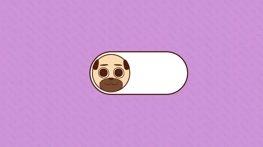
HTML Output:

Adding Styling to our project:
Using the universal tag selector we will set the margin and padding of the webpage as zero from the browser’s default padding and margin to completely cover each side of the webpage.
*, *::after, *::before {
	 margin: 0;
	 padding: 0;
	 box-sizing: border-box;
}
Now using the body tag selector we will add the styling to the body of our webpage using the min-height property we will set the minimum height of the body container 100vh and using the background color property we will add a background purple and the font color brown.
Here we will be using some SVG (scalable Graphic Vector ). This type of image does not get distorted while zooming in on the webpage which provides high-quality images.
body {
	 min-height: 100vh;
	 display: grid;
	 place-items: center;
	 background-color: #ce93d8;
	 color: #511f0b;
	/* SVG Here we will be using some SVG (scalable Graphic Vector ). This type of image does not get distorted while zooming in on the webpage which provides high-quality images.background by Hero Patterns */
	 background-image: url('data:image/svg+xml,%3Csvg width="52" height="26" viewBox="0 0 52 26" xmlns="http://www.w3.org/2000/svg"%3E%3Cg fill="none" fill-rule="evenodd"%3E%3Cg fill="%239C92AC" fill-opacity="0.4"%3E%3Cpath d="M10 10c0-2.21-1.79-4-4-4-3.314 0-6-2.686-6-6h2c0 2.21 1.79 4 4 4 3.314 0 6 2.686 6 6 0 2.21 1.79 4 4 4 3.314 0 6 2.686 6 6 0 2.21 1.79 4 4 4v2c-3.314 0-6-2.686-6-6 0-2.21-1.79-4-4-4-3.314 0-6-2.686-6-6zm25.464-1.95l8.486 8.486-1.414 1.414-8.486-8.486 1.414-1.414z" /%3E%3C/g%3E%3C/g%3E%3C/svg%3E');
}
Now using the button tag selector we will set the background of the button as none and using the cursor property we will set the cursor as a pointer.
button {
	 background: none;
	 border: 0;
	 cursor: pointer;
	 font-size: inherit;
	 color: inherit;
}
Styling toggle:
Using the class selector property, we will set the width and height of the toggle switch to 18rem and 8rem, and using the border property, we will add a border of 4px solid to our toggle button.
We will set the background color of the dog toggle switch to white. Then we will be styling the pet container and adding some styling to make it interactive.
.toggle-switch {
	 width: 18rem;
	 height: 8rem;
	 border: 4px solid;
	 border-radius: 4rem;
	 position: relative;
	 background-color: #fff;
}
 .toggle-switch *, .toggle-switch *::before, .toggle-switch *::after {
	 position: absolute;
}
 .pet {
	 top: 50%;
	 left: 0.25rem;
	 width: 7rem;
	 height: 7rem;
	 transform: translate(0, -50%) rotate(-360deg);
	 transition: 0.5s all ease-in-out;
}
 .pet::after, .pet::before {
	 visibility: hidden;
	 content: "";
	 width: 1.25rem;
	 height: 0.45rem;
	 background-color: #e91f40;
	 top: 65%;
	 border-radius: 50%;
	 opacity: 0.6;
	 z-index: 15;
}
 .pet::after {
	 left: 15%;
}
 .pet::before {
	 right: 15%;
}
 @media (prefers-reduced-motion: reduce) {
	 .pet {
		 transition: none;
	}
}
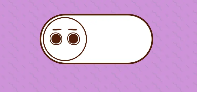
Adding Face, eye & eyebrow:
Using the class selector property, we will set the width and height of the face to 100%, and using the border-radius property, we will circle the face shape, and using the border property, we will add the border to the face of the 3px solid.
.face {
	 width: 100%;
	 height: 100%;
	 border-radius: 50%;
	 border: 3px solid currentcolor;
	 top: 0;
	 left: 0;
	 overflow: hidden;
}
 .face::after, .face::before {
	 visibility: hidden;
	 content: "";
	 width: 60%;
	 height: 65%;
	 background-color: #ff9343;
	 top: 0;
	 border-radius: var(--border-radius);
}
 .face::after {
	 --border-radius: 0 0 100% 0Array/0Array 0 40% 0;
	 left: 0;
}
 .face::before {
	 --border-radius: 0 0 0 100Array/0Array 0 0 40%;
	 right: 0;
}
Using the class selector property (.eye), we will set the width and height to 2rem, and using the background property, we will set the background to white of the eye. Using the before and after selectors, we will add the small eyeball inside our eyes.
You can learn more about CSS before and after selectors in the following article – CSS before and after pseudo elements
.eye {
	 width: 2rem;
	 height: 2rem;
	 background-color: #fff;
	 top: 35%;
	 border-radius: 43% 50% 42% 50%;
	 border: 2px solid;
}
 .eye.eye-left {
	 left: 16%;
}
 .eye.eye-right {
	 right: 16%;
}
 .eye::after {
	 content: "";
	 position: absolute;
	 top: 7.5%;
	 left: 7.5%;
	 width: 85%;
	 height: 85%;
	 background-color: currentcolor;
	 border-radius: 45%;
}
 .eyebrow {
	 width: 1.5rem;
	 height: 0.25rem;
	 background-color: currentcolor;
	 border-radius: 50%;
	 top: 27%;
	 transform: rotate(var(--rotate));
}
 .eyebrow.eyebrow-left {
	 --rotate: -4deg;
	 left: 21%;
}
 .eyebrow.eyebrow-right {
	 --rotate: 4deg;
	 right: 21%;
}
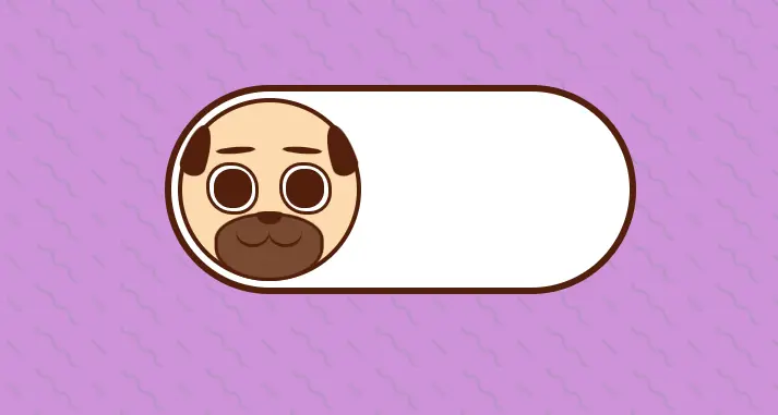
Mouth and Nose:
Now we will be creating the mouth of our pet, using the width and height properties we will set as 60% and 37.5%, and using the transform property we will rotate it 50% in the x-axis.
.mouth {
	 width: 60%;
	 height: 37.5%;
	 transform: translateX(-50%);
	 bottom: 0;
	 border-radius: 50% / 40% 40% 50% 50%;
}
 .mouth::before, .mouth::after {
	 content: "";
	 width: 1.25rem;
	 height: 1rem;
	 top: 50%;
	 border-radius: 50%;
	 box-shadow: 0 -2px currentcolor inset;
	 transform: translate(var(--translate));
}
 .mouth::before {
	 --translate: -100%, -100%;
	 left: 50%;
}
 .mouth::after {
	 --translate: 100%, -100%;
	 right: 50%;
}
Now using the class selector property we will set the (.nose) class selector we will set the width as 1rem and height as 0.5rem. Also using the transform property we will translate the nose in -50% in the x and 100% in the y direction.
.nose {
	 width: 1rem;
	 height: 0.5rem;
	 top: 54.5%;
	 left: 50%;
	 transform: translate(-50%, 100%);
	 border-radius: 35% 35% 50% 50% / 20% 20% 80% 80%;
}
 .whiskers {
	 visibility: hidden;
	 width: 45%;
	 height: 20%;
	 bottom: 20%;
	 border-top: 1px solid currentcolor;
}
 .whiskers.whiskers-left {
	 --border-radius: 25% 50% 0 0;
	 --rotate: -15deg;
	 left: -20%;
	 border-radius: var(--border-radius);
}
 .whiskers.whiskers-right {
	 --border-radius: 50% 25% 0 0;
	 --rotate: 15deg;
	 right: -20%;
	 border-radius: var(--border-radius);
}
 .whiskers::before {
	 content: "";
	 width: 100%;
	 height: 100%;
	 top: 0.35rem;
	 left: 0;
	 border-radius: var(--border-radius);
	 border-top: 1px solid currentcolor;
	 transform: rotate(var(--rotate));
}
 .whiskers::after {
	 content: "";
	 width: 100%;
	 height: 100%;
	 top: 0.75rem;
	 left: 0.1rem;
	 border-radius: var(--border-radius);
	 border-top: 1px solid currentcolor;
	 transform: rotate(var(--rotate));
}
 .dog-ear {
	 visibility: hidden;
	 width: 1rem;
	 height: 2rem;
	 background-color: currentcolor;
	 top: 14%;
	 border-radius: 50% / 80% 80% 20% 20%;
	 transform: rotate(var(--rotate));
}
 .dog-ear.dog-ear-left {
	 --rotate: 18deg;
	 left: 4%;
}
 .dog-ear.dog-ear-right {
	 --rotate: -18deg;
	 right: 4%;
}
 .cat-ear {
	 visibility: hidden;
	 z-index: -1;
	 width: 1.75rem;
	 height: 2rem;
	 background-color: #ff9343;
	 top: -2%;
	 border-radius: 50%/ 100% 100% 0% 0%;
	 border: 3px solid currentcolor;
}
 .cat-ear::before {
	 content: "";
	 top: 0;
	 left: 50%;
	 width: 80%;
	 height: 100%;
	 background-color: #e91f40;
	 border-radius: 50% / 100% 100% 0% 0%;
	 transform: translate(-50%, 25%);
}
 .cat-ear.cat-ear-left {
	 left: -1%;
	 transform: rotate(-42deg);
}
 .cat-ear.cat-ear-right {
	 right: -1%;
	 transform: rotate(42 deg);
}
 [data-pet="dog"] .face {
	 background-color: #fddaaf;
}
 [data-pet="dog"] .mouth {
	 background-color: #774a30;
	 border: 2px solid;
}
 [data-pet="dog"] .nose {
	 background-color: currentcolor;
}
 [data-pet="dog"] .dog-ear {
	 visibility: visible;
}
 [data-pet="cat"] .pet {
	 transform: translate(10rem, -50%) rotate(360deg);
}
 [data-pet="cat"] .pet::after, [data-pet="cat"] .pet::before {
	 visibility: visible;
}
 [data-pet="cat"] .face {
	 background-color: #fff;
}
 [data-pet="cat"] .face::after, [data-pet="cat"] .face::before {
	 visibility: visible;
}
 [data-pet="cat"] .nose {
	 background-color: #e91f40;
}
 [data-pet="cat"] .whiskers {
	 visibility: visible;
}
 [data-pet="cat"] .cat-ear {
	 visibility: visible;
}
Adding Javascript Functionality:
We will create a constant variable called toggleButton and use the document.querySelector, we will set the value of the toggle button using the toggle-switch class.
const toggleButton = document.querySelector(".toggle-switch");Now we will create a function to toggle pets. We will create a condition if the toggle button is equal to dog, then switch the button to cat as the user clicks on the button, or vice versa. This will happen with an event listener called button click, which will trigger the togglepet function, and the toggle class will change back and forth.
const togglePet = () => {
let pet = toggleButton.getAttribute("data-pet");
toggleButton.setAttribute("aria-label", `Switch to ${pet}`);
pet = pet === "dog" ? "cat" : "dog";
toggleButton.setAttribute("data-pet", pet);
};
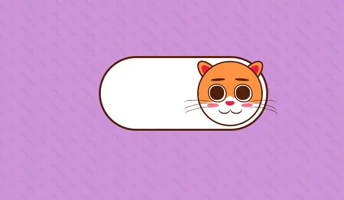
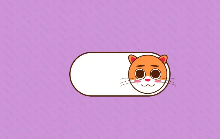
toggleButton.addEventListener("click", togglePet);Final Output:
See the Pen Dog/Cat toggle switch by Ines (@inescodes) on CodePen.
Conclusion
If you like our project and want more javascript projects then do comment in the comment section #moreprojects, and I’ll bring more javascript projects for you.