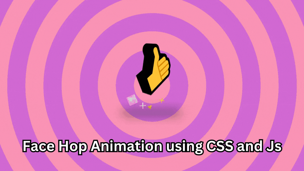
Here is the cool Face Hop animation using CSS and Js. This awesome is created by Steve Gardner on codepen.io
Output
See the Pen Face Hop by Steve Gardner (@ste-vg) on CodePen.
Now let’s understand how it’s made
HTML
Here is the HTML part
<!DOCTYPE html>
<html lang="en">
<head>
    <meta charset="UTF-8">
    <meta name="viewport" content="width=device-width, initial-scale=1.0">
    <link rel="stylesheet" href="style.css">
    <title>Face Hop Animation using CSS and Js</title>
</head>
<body>
    <div class="container">
        <div class="shadow"></div>
        <div class="squish">
          <h1 data-3d-text> </h1>
        </div>
        <div class="particles">
          <div class="floor"></div>
          <div class="air"></div>
        </div>
       </div>

       <script type="module" src="script.js"></script>
</body>
</html>
Here, the script type is the module
CSS
Now, let’s add some CSS
@charset "UTF-8";
@import url("https://cdn.skypack.dev/that-3d-text-library/lib/styles.css");
@import url("https://fonts.googleapis.com/css2?family=Bakbak+One&family=Caprasimo&family=Chonburi&family=Graduate&family=Righteous&display=swap");
:root {
  --font-size: clamp(100px, 40vmin, 200px);
}

html, body {
  overflow: hidden;
  width: 100%;
  height: 100%;
  margin: 0;
  padding: 0;
  position: relative;
}

body {
  display: flex;
  align-items: flex-end;
  justify-content: center;
  perspective: 700px;
}
body::after {
  position: absolute;
  background: linear-gradient(0deg, rgba(0, 0, 0, 0.04), rgba(0, 0, 0, 0));
  width: 100%;
  height: 45%;
  top: 0;
  left: 0;
  z-index: 1;
}
body > * {
  z-index: 2;
}

.container, .squish {
  transform-style: preserve-3d;
  position: relative;
}

.container {
  margin-bottom: calc(50vh - var(--font-size));
}

.squish {
  z-index: 2;
}

.shadow {
  transform-style: flat;
  z-index: 1;
  transform: translatex(-10%) translatez(-30px);
  position: absolute;
  bottom: calc(var(--font-size) * 0.25);
  left: 0;
  width: 120%;
  height: calc(var(--font-size) * 0.15);
  opacity: 1;
  background-color: var(--shadow-color, black);
  border-radius: 100vmin;
  filter: blur(25px);
}

h1 {
  --layers: 10;
  --depth: 30;
  font-size: var(--font-size);
}

.particles {
  position: absolute;
  left: 50%;
  z-index: 1;
  transform: translatez(-50px);
  bottom: calc(var(--font-size) * 0.3);
}
.particles .floor div,
.particles .air div {
  transform-style: preserve-3d;
  display: block;
  position: absolute;
  top: 0;
  left: 0;
}
.particles .floor div::after,
.particles .air div::after {
  content: "";
  position: absolute;
  top: 0;
  left: 0;
  transform: translate(-50%, -50%);
  border-radius: 50%;
}
.particles .floor {
  transform: rotatex(-60deg);
}
.particles .floor div::after {
  border: solid 1.5vmin var(--floor-particle, white);
  width: 8vmin;
  height: 8vmin;
}
.particles .air div::after {
  content: "★";
  color: var(--air-particle, white);
  font-size: 10vmin;
}
.particles .air div:nth-child(2n)::after {
  color: var(--air-particle-alt, hotpink);
}
.particles .air .p0::after {
  content: "●";
}
.particles .air .p1::after {
  content: "✖︎";
}
.particles .air .p2::after {
  content: "◼︎";
}
.particles .air .p3::after {
  content: "▲";
}

.style-0 {
  --color: white;
  --color-front: black;
  --floor-particle: black;
  --air-particle: black;
  --air-particle-alt: white;
  background-color: yellow;
}
.style-0 [data-mod-3] {
  --color: black;
}

.style-2 {
  --color: #3066BE;
  --color-front: #6D9DC5;
  --floor-particle: transparent;
  --air-particle: transparent;
  --air-particle-alt: transparent;
  background-color: #6D9DC5;
  background: url('data:image/svg+xml,%3Csvg xmlns="http://www.w3.org/2000/svg" width="200" height="200" viewBox="0 0 100 100"%3E%3Cg fill-rule="evenodd"%3E%3Cg fill="%23ffffff" fill-opacity="0.4"%3E%3Cpath opacity=".5" d="M96 95h4v1h-4v4h-1v-4h-9v4h-1v-4h-9v4h-1v-4h-9v4h-1v-4h-9v4h-1v-4h-9v4h-1v-4h-9v4h-1v-4h-9v4h-1v-4h-9v4h-1v-4H0v-1h15v-9H0v-1h15v-9H0v-1h15v-9H0v-1h15v-9H0v-1h15v-9H0v-1h15v-9H0v-1h15v-9H0v-1h15v-9H0v-1h15V0h1v15h9V0h1v15h9V0h1v15h9V0h1v15h9V0h1v15h9V0h1v15h9V0h1v15h9V0h1v15h9V0h1v15h4v1h-4v9h4v1h-4v9h4v1h-4v9h4v1h-4v9h4v1h-4v9h4v1h-4v9h4v1h-4v9h4v1h-4v9zm-1 0v-9h-9v9h9zm-10 0v-9h-9v9h9zm-10 0v-9h-9v9h9zm-10 0v-9h-9v9h9zm-10 0v-9h-9v9h9zm-10 0v-9h-9v9h9zm-10 0v-9h-9v9h9zm-10 0v-9h-9v9h9zm-9-10h9v-9h-9v9zm10 0h9v-9h-9v9zm10 0h9v-9h-9v9zm10 0h9v-9h-9v9zm10 0h9v-9h-9v9zm10 0h9v-9h-9v9zm10 0h9v-9h-9v9zm10 0h9v-9h-9v9zm9-10v-9h-9v9h9zm-10 0v-9h-9v9h9zm-10 0v-9h-9v9h9zm-10 0v-9h-9v9h9zm-10 0v-9h-9v9h9zm-10 0v-9h-9v9h9zm-10 0v-9h-9v9h9zm-10 0v-9h-9v9h9zm-9-10h9v-9h-9v9zm10 0h9v-9h-9v9zm10 0h9v-9h-9v9zm10 0h9v-9h-9v9zm10 0h9v-9h-9v9zm10 0h9v-9h-9v9zm10 0h9v-9h-9v9zm10 0h9v-9h-9v9zm9-10v-9h-9v9h9zm-10 0v-9h-9v9h9zm-10 0v-9h-9v9h9zm-10 0v-9h-9v9h9zm-10 0v-9h-9v9h9zm-10 0v-9h-9v9h9zm-10 0v-9h-9v9h9zm-10 0v-9h-9v9h9zm-9-10h9v-9h-9v9zm10 0h9v-9h-9v9zm10 0h9v-9h-9v9zm10 0h9v-9h-9v9zm10 0h9v-9h-9v9zm10 0h9v-9h-9v9zm10 0h9v-9h-9v9zm10 0h9v-9h-9v9zm9-10v-9h-9v9h9zm-10 0v-9h-9v9h9zm-10 0v-9h-9v9h9zm-10 0v-9h-9v9h9zm-10 0v-9h-9v9h9zm-10 0v-9h-9v9h9zm-10 0v-9h-9v9h9zm-10 0v-9h-9v9h9zm-9-10h9v-9h-9v9zm10 0h9v-9h-9v9zm10 0h9v-9h-9v9zm10 0h9v-9h-9v9zm10 0h9v-9h-9v9zm10 0h9v-9h-9v9zm10 0h9v-9h-9v9zm10 0h9v-9h-9v9z"/%3E%3Cpath d="M6 5V0H5v5H0v1h5v94h1V6h94V5H6z"/%3E%3C/g%3E%3C/g%3E%3C/svg%3E'), radial-gradient(#6D9DC5, #3066BE);
}
.style-2::after {
  content: none;
}
.style-2 .shadow {
  display: none;
}
.style-2 .front {
  text-shadow: -2px -2px 0 #fff, 2px -2px 0 #fff, -2px 2px 0 #fff, 2px 2px 0 #fff;
}

.style-3 {
  --color: #B79492;
  --color-front: #EAE1DF;
  --floor-particle: #B79492;
  --air-particle: orange;
  --air-particle-alt: #B79492;
  --background-color: #917C78;
}

.style-4 {
  --color: #DB504A;
  --color-front: #E3B505;
  --floor-particle: #E3B505;
  --air-particle: #DB504A;
  --air-particle-alt: #E3B505;
  background-color: #084C61;
}

.style-5 {
  background: repeating-linear-gradient(45deg, red, red 10vmin, white 10vmin, white 20vmin);
  --color: red;
  --color-front: white;
  --floor-particle: transparent;
  --air-particle: transparent;
  --air-particle-alt: transparent;
}
.style-5::after {
  content: none;
}

.style-6 {
  --color: #424C55;
  --color-front: #E3B505;
  --floor-particle: #E3B505;
  --air-particle: #424C55;
  --air-particle-alt: #E3B505;
  background-color: #D1CCDC;
}

.style-7 {
  --color: #6CCFF6;
  --color-front: #001011;
  --floor-particle: #FFFFFC;
  --air-particle: #FFFFFC;
  --air-particle-alt: #FFFFFC;
  background-color: #00393D;
}

.style-8 {
  --color: #F9DC5C;
  --color-front: #ED254E;
  --floor-particle: #ED254E;
  --air-particle: #ED254E;
  --air-particle-alt: #F9DC5C;
  background-color: #F4FFFD;
}

.style-9 {
  background-color: #42E2B8;
  background-image: url('data:image/svg+xml,%3Csvg fill="%23F3DFBF" width="100" height="100" viewBox="0 0 64 64" xmlns="http://www.w3.org/2000/svg"%3E%3Cpath d="M8 16c4.418 0 8-3.582 8-8s-3.582-8-8-8-8 3.582-8 8 3.582 8 8 8zm0-2c3.314 0 6-2.686 6-6s-2.686-6-6-6-6 2.686-6 6 2.686 6 6 6zm33.414-6l5.95-5.95L45.95.636 40 6.586 34.05.636 32.636 2.05 38.586 8l-5.95 5.95 1.414 1.414L40 9.414l5.95 5.95 1.414-1.414L41.414 8zM40 48c4.418 0 8-3.582 8-8s-3.582-8-8-8-8 3.582-8 8 3.582 8 8 8zm0-2c3.314 0 6-2.686 6-6s-2.686-6-6-6-6 2.686-6 6 2.686 6 6 6zM9.414 40l5.95-5.95-1.414-1.414L8 38.586l-5.95-5.95L.636 34.05 6.586 40l-5.95 5.95 1.414 1.414L8 41.414l5.95 5.95 1.414-1.414L9.414 40z"  fill-rule="evenodd"/%3E%3C/svg%3E');
  --color: #F3DFBF;
  --color-front: #EB8A90;
  --floor-particle: #EB8A90;
  --air-particle: #EB8A90;
  --air-particle-alt: #F3DFBF;
}
.style-9::after {
  content: none;
}

.style-10 {
  --color: #138A36;
  --color-front: #34403A;
  --floor-particle: #ffffff;
  --air-particle: #ffffff;
  --air-particle-alt: #ffffff;
  background-color: #18FF6D;
}

.style-11 {
  --color: #FFA69E;
  --color-front: #DDFFF7;
  --floor-particle: #AA4465;
  --air-particle: #AA4465;
  --air-particle-alt: #462255;
  background-color: #93E1D8;
}

.style-12 {
  --color: #64B6AC;
  --color-front: #FEE9E1;
  --floor-particle: #64B6AC;
  --air-particle: #64B6AC;
  --air-particle-alt: #64B6AC;
  background-color: #FEE9E1;
}

.style-13 {
  --color: #F4D58D;
  --color-front: #BF0603;
  --floor-particle: #708D81;
  --air-particle: #708D81;
  --air-particle-alt: #001427;
  background-color: #8D0801;
}

.style-14 {
  --color: #BB4430;
  --color-front: #7EBDC2;
  --floor-particle: #7EBDC2;
  --air-particle: #BB4430;
  --air-particle-alt: #7EBDC2;
  background-color: #231F20;
}

.style-15 {
  background: repeating-radial-gradient(circle farthest-side, #F487B6, #F487B6 10vmin, #CC59D2 10vmin, #CC59D2 20vmin);
  --color: #FDE12D;
  --color-front: #9046CF;
  --floor-particle: transparent;
  --air-particle: #FDE12D;
  --air-particle-alt: #FFF3F0;
}
.style-15::after {
  content: none;
}

.font-0 {
  font-family: "Bakbak One", cursive;
}

.font-1 {
  font-family: "Graduate", cursive;
}

.font-2 {
  font-family: "Chonburi", cursive;
}

.font-3 {
  font-family: "Righteous", cursive;
}
Javascript
Let’s add our Javascript module
import { Those3DTexts } from "https://cdn.skypack.dev/that-3d-text-library";
import { gsap } from "https://cdn.skypack.dev/gsap";
import { MotionPathPlugin } from "https://cdn.skypack.dev/gsap/MotionPathPlugin";

gsap.registerPlugin(MotionPathPlugin);

const letters = ['😀', '😆', '🥹', '🥰', '😎', '🤔', '🥸', '😡', '😱', '👍'];

new Those3DTexts();

const STYLE_COUNT = 16;
const FONT_COUNT = 1;
const BOUNCE_DURATION = 1.3;
const BOUNCE_HEIGHT = -90;
const BOUNCE_WOBBLE = 0.75; // lower = more wobble
const FLOOR_PARTICLE_COUNT = 1;
const AIR_PARTICLE_COUNT =4;

const LETTER = document.querySelector('h1')
const BODY = document.body

let count = 0;

BODY.classList.add('style-0');
LETTER.classList.add('font-0');

const setNextStyle = () => {

  BODY.classList.remove(`style-${count % (STYLE_COUNT)}`);
  LETTER.classList.remove(`font-${count % (FONT_COUNT)}`);
  count++;
  BODY.classList.add(`style-${count % (STYLE_COUNT)}`);
  LETTER.classList.add(`font-${count % (FONT_COUNT)}`);
}

const particles = {
  floor: [],
  air: []
}

const setupParticles = () => {

  const floor = document.querySelector('.floor');
  const air = document.querySelector('.air');

  for(let i = 0; i < FLOOR_PARTICLE_COUNT; i++) {
    let particle = document.createElement('div');
    floor.appendChild(particle)
    particles.floor.push(particle)
  }

  for(let i = 0; i < AIR_PARTICLE_COUNT; i++) {
    let particle = document.createElement('div');
    air.appendChild(particle)
    particles.air.push(particle)
  }
}

setupParticles()


let letterCount = 0

const nextLetter = () => {
  letterCount ++;
  const letterElements = LETTER.querySelectorAll('span')
  letterElements.forEach(l => l.innerText = letters[letterCount % letters.length])
}

const glitch = () => {
  gsap.to('h1 span', {keyframes: [{opacity: 'random(0, 1)', xPercent: 'random(-10, 10)', opacity: 'random(0, 1)', yPercent: 'random(-10, 10)'}, {opacity: 'random(0, 1)', xPercent: 'random(-20, 20)', yPercent: 'random(-20, 20)'}, {opacity: 'random(0, 1)', xPercent: 'random(-10, 10)', yPercent: 'random(-10, 10)'}, {opacity: 1, xPercent: 0, yPercent: 0}], yoyo: true, ease: 'power4.inOut', duration: BOUNCE_DURATION * 0.5})
}

const bounce = () => {
  const tl = gsap.timeline({defaults: { duration: BOUNCE_DURATION * 0.5}, onComplete: () => {
    setNextStyle();
    nextLetter();
    bounce();
  }})
  tl.set('.squish', {scaleY: BOUNCE_WOBBLE, scaleX: 1 + (1 - BOUNCE_WOBBLE)})
  tl.to('.squish', {scaleY: 1, scaleX: 1, duration: BOUNCE_DURATION * 0.6, ease: 'elastic'}, 0)
  tl.to(LETTER, {yPercent: BOUNCE_HEIGHT, ease: 'circ.out'}, 0)
  tl.to('.shadow', {opacity: 0.2, ease: 'circ.out'}, 0)
  tl.to(LETTER, {yPercent: 10, ease: 'circ.in'}, BOUNCE_DURATION * 0.5)
  tl.to('.shadow', {opacity: 1, ease: 'circ.in'}, BOUNCE_DURATION * 0.5)
  tl.to(LETTER, {rotationZ: "random(-150, 150)", rotationY: "random(-50, 50)", rotationX: "random(-50, 50)", duration: BOUNCE_DURATION, ease: 'none'}, 0)
  // tl.to('.squish', {scaleY: BOUNCE_WOBBLE, duration: 0.2}, '-=0.2')


  gsap.fromTo(particles.floor, {x: 0, y: 0,  scale: 1, opacity: 0.7}, {duration:  Math.min(BOUNCE_DURATION, 0.7 + Math.random() * 0.8), ease: 'power4.out', opacity: 0, scale: 2.5})

  particles.air.forEach((particle) => {
    particle.setAttribute('class', `p${Math.floor(Math.random() * 4)}`)
    gsap.fromTo(particle, {opacity: 1, x: 0, y: 0, z: 0, scale: 'random(0.3, 1)'}, {
      duration: Math.min(BOUNCE_DURATION, 0.3 + Math.random() * 0.3),
      ease: 'linear',
      opacity: 0,
      rotate: 'random(-100, 100)',
      x: 'random(-250, 250)',
      y: 'random(-200, -100)',
      z: 'random(-400, 400)',
    })
  })

  if(Math.random() > 0.95) glitch()
}

bounce();
Boom! There you have it.
