As a web developer, you know that CSS (Cascading Style Sheets) is a powerful tool for styling and animating web content. With CSS, you can change the color, size, and layout of HTML elements, as well as add transitions and animations to create dynamic and engaging websites.
Also Read – Color picker in HTML easy way
One of the most popular ways to use CSS is to animate text. By adding transitions and transformations with SVG-to-text elements, you can create eye-catching and attention-grabbing effects that will make your website stand out.
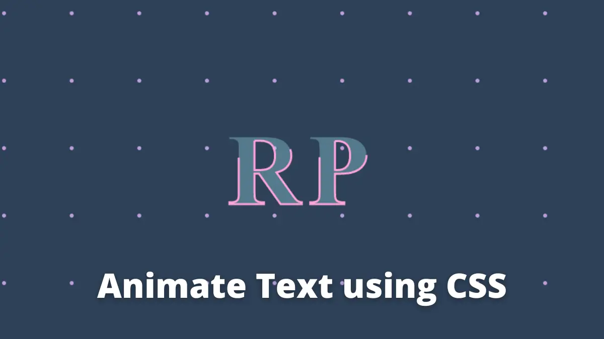
In this post, we’ll take a look at how to create animated text with SVG using CSS.
Here is the HTML
<body>
  <div class="patterns">
    <svg width="100%" height="100%">
      <defs>
        <pattern
          id="polka-dots"
          x="0"
          y="0"
          width="100"
          height="100"
          patternUnits="userSpaceOnUse"
        >
          <circle fill="#be9ddf" cx="25" cy="25" r="3"></circle>
        </pattern>
        <style>
          @import url("https://fonts.googleapis.com/css?  family=Lora:400,400i,700,700i");
        </style>
      </defs>

      <rect
        x="0"
        y="0"
        width="100%"
        height="100%"
        fill="url(#polka-dots)"
      ></rect>

      <text x="50%" y="60%" text-anchor="middle">RP</text>
    </svg>
  </div>
</body>
In the above code, we are using <text> an element to create SVG text, so that we can animate it.
Now we should animate it
Here is the CSS
body {
  background-color: #2e4057;
  margin: 0;
}

.patterns {
  height: 100vh;
}

svg text {
  font-family: Lora;
  letter-spacing: 10px;
  stroke: #ffa5d8;
  font-size: 150px;
  font-weight: 700;
  stroke-width: 3;

  animation: textAnimate 5s infinite alternate;
}

@keyframes textAnimate {
  0% {
    stroke-dasharray: 0 50%;
    stroke-dashoffset: 20%;
    fill: hsl(189, 68%, 75%);
  }

  100% {
    stroke-dasharray: 50% 0;
    stroke-dashoffstet: -20%;
    fill: hsla(189, 68%, 75%, 0%);
  }
}
Here in the CSS part, we are using @keyframes to create a stroke animation. The @keyframes is an at-rule used to create animations in CSS.
That is it for this post, Please share this post


