
Most developers increase their network of people by sharing their portfolios with their connections. A developer can showcase his/her skills to potential clients.
But, What is a Portfolio website? Let’s find out.
What is a Portfolio Website?
A portfolio website is a website that showcases your skills and the work you have done.
In the process of becoming a web developer, beginners should work on their portfolio website, as it helps them gain design skills and create their digital resume. They can use this website to showcase their work to different clients.
Also Read – Create a Blog Website Using HTML and CSS
In this article, we will be explaining the step-by-step process of creating a modern and responsive portfolio website using HTML, CSS, and JavaScript. We will be creating a visually appealing portfolio.
Before diving into the code, let’s discuss some benefits of having a portfolio and the need for a portfolio website.
Why create a Portfolio Website?
Before we dive into the coding and other details, it’s important to understand the importance of a portfolio website:
- Showcase Your Work: The most effective way to present your best work and showcase your skills to potential clients and management is through a portfolio website.
- Enhance Credibility: A professionally designed website can help you stand out and help establish trust with potential clients or employers.
- Improve Visibility: An online portfolio makes it easier for people to discover your work through search engines and social media.
Output
Before moving on to the coding part, Let’s have look at what we are creating.
See the Pen Modern Responsive Portfolio by AISTECHX International (@aistechxintl) on CodePen.
Now, let’s move on to the main part of this article.
How to create a Portfolio Website?
To create our portfolio website, we can start by setting up our development environment. (You can skip this step if you already have your development environment set)
Setting up the IDE (Integrated Development Environment)
Before coding, we need to follow some basic steps for creating the environment for writing the code for our portfolio website. Here are the steps that need to be followed before writing the code for our portfolio website:
- First, open a Visual Studio code editor for creating and writing the code for a portfolio website.
- Then create a folder inside by selecting the location and saving it as “portfolio website.”
- Inside the folder, create three files for HTML, CSS, and Javascript. And save them as “index.html”, “style.css”, and “main.js”.
Structure your website using HTML
Here is the boilerplate code that every web page needs.
<!DOCTYPE html>
<html lang="en">
  <head>
    <meta charset="UTF-8" />
    <meta name="viewport" content="width=device-width, initial-scale=1.0" />
    <title>Portfolio Website</title>
  </head>
  <body>

  </body>
</html>
Now, let’s move on to the next part.
<head> Section
Inside the portfolio page of index.html, using the <title> tag, we will create the title of the portfolio website, and using the link tag, we will add some of the most important links for the structure of our portfolio website.
<!DOCTYPE html>
<html lang="en">
<head>
<meta charset="UTF-8" />
<meta name="viewport" content="width=device-width, initial-scale=1.0" />
<title>Portfolio Website</title>
<link rel="stylesheet" href="style.css" />
<link
rel="stylesheet"
href="https://cdn.jsdelivr.net/npm/[email protected]/font/bootstrap-icons.css"
/>
<link
rel="stylesheet"
href="https://cdnjs.cloudflare.com/ajax/libs/OwlCarousel2/2.3.4/assets/owl.carousel.min.css"
/>
<link
rel="stylesheet"
href="https://fonts.googleapis.com/css2?family=Comfortaa:wght@300;400;500;600;700&family=Poppins:wght@100;300;400;500;600;700;800;900&family=Ubuntu:wght@300;400;500;700&display=swap"
rel="stylesheet"
/>
<link
rel="import"
href="https://cdnjs.cloudflare.com/ajax/libs/font-awesome/5.15.3/css/all.min.css.html"
/>
</head>
<body>
<!-- Scripts -->
<script src="https://kit.fontawesome.com/3b57a2a2a7.js"></script>
<script src="https://code.jquery.com/jquery-3.5.1.min.js"></script>
<script src="https://cdnjs.cloudflare.com/ajax/libs/typed.js/2.0.11/typed.min.js"></script>
<script src="https://cdnjs.cloudflare.com/ajax/libs/waypoints/4.0.1/jquery.waypoints.min.js"></script>
<script src="https://cdnjs.cloudflare.com/ajax/libs/OwlCarousel2/2.3.4/owl.carousel.min.js"></script>
<script src="main.js"></script>
</body>
</html>
Using the link and script tags, we have added links for Owl Carousel 2, Bootstrap, font-faces, icons, Google Fonts, and jQuery to our portfolio website.
Now, let’s move inside the <body> tag.
Important Buttons
Inside the body section of the website. We will use a div to create a block-level event, and we will create a scroll-up button using the font icon with the <i> class tag of Font Awesome icons.
<div class="scroll-up-btn">
  <i class="fas fa-angle-up"></i>
</div>
Header Section
Inside the header section, we will create a navbar for the header section of the portfolio website. Using the <nav> tag, we will create a section for the navbar of the website.
<!-- Header -->
<header>
  <nav class="navbar">
    <div class="max-width">
      <div class="logo">
        <a href="#"><span>AISTECHX</span><span>.com</span></a>
      </div>
      <ul class="menu">
        <li>
          <a href="#home" class="menu-btn"><strong>Home</strong></a>
        </li>
        <li>
          <a href="#about" class="menu-btn"><strong>About</strong></a>
        </li>
        <li>
          <a href="#services" class="menu-btn"><strong>Services</strong></a>
        </li>
        <li>
          <a href="#skills" class="menu-btn"><strong>Skills</strong></a>
        </li>
        <li>
          <a href="#projects" class="menu-btn"><strong>Projects</strong></a>
        </li>
        <li>
          <a href="#contact" class="menu-btn"><strong>Contact</strong></a>
        </li>
      </ul>
      <div class="menu-btn">
        <i class="fas fa-bars"></i>
      </div>
    </div>
  </nav>
</header>
Here, We have created a div for the logo of the portfolio website, and using the unordered list tag, we have created navbar link items for different sections of the portfolio website.
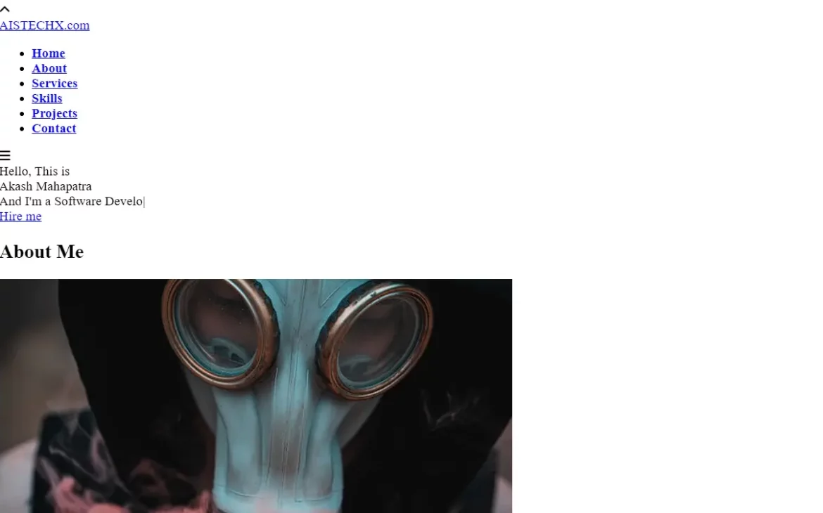
Home and About Me Section
In the Home and About Me sections, we will use the section as a semantic element for creating different sections of the portfolio website. So that it is easy for us to create content separately for different sections without confusion using the section tag with class home and about and inside these sections
<!-- Home -->
<section class="home" id="home">
<div class="max-width">
<div class="home-content">
<div class="text-1">Hello, This is</div>
<div class="text-2">Akash Mahapatra</div>
<div class="text-3">And I'm a <span class="typing"></span></div>
<a href="#">Hire me</a>
</div>
</div>
</section>
<!-- About -->
<section class="about" id="about">
<div class="max-width">
<h2 class="title">About Me</h2>
<div class="about-content">
<div class="column left">
<img
src="https://source.unsplash.com/626x626/?profile"
alt="Profile Image 626x626"
/>
</div>
<div class="column right">
<div class="text">
I'm Akash and I'm a <span class="typing-2"></span>
</div>
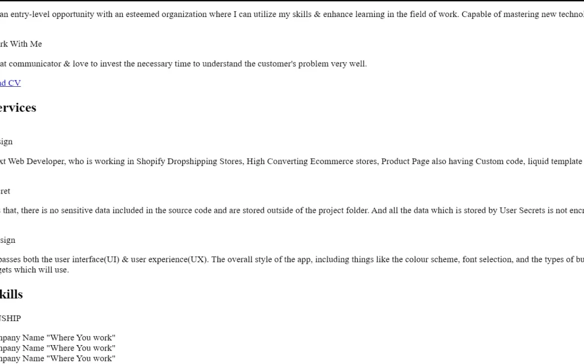
<p>
Seeking an entry-level opportunity with an esteemed organization where
I can utilize my skills & enhance learning in the field of work.
Capable of mastering new technologies.
</p>
<br />
<div class="text">Why Work With Me</div>
<p>
I'm a great communicator & love to invest the necessary time to
understand the customer's problem very well.
</p>
<a href="#link" target="blank">Download CV</a>
</div>
</div>
</div>
</section>
We have created a div, added some of the content for the home page and about me section of the developer. Also, We have added some important links and images to the About Me page.
Services and Skills Section
Similar to the home and about me sections of the portfolio website, we will be creating a section for the services and skills section to showcase the services that developers can provide to clients and align with that with a section that will display the skills of the developer.
We will create these two sections using the <section> tag, and inside the section using the <div> tag with class max-width, we will create the child container of the services section. Inside this section, use the div tag and font awesome tag with class to add the icons related to the services provided.
<!-- Services -->
<section class="services" id="services">
  <div class="max-width">
    <h2 class="title">My services</h2>
    <div class="serv-content">
      <div class="card">
        <div class="box">
          <i class="fas fa-laptop-code"></i>
          <div class="text">Web Design</div>
          <p>
            Your Next Web Developer, who is working in Shopify Dropshipping
            Stores, High Converting Ecommerce stores, Product Page also having
            Custom code, liquid template design.
          </p>
        </div>
      </div>
      <div class="card">
        <div class="box">
          <i class="fas fa-user-secret"></i>
          <div class="text">User Secret</div>
          <p>
            I ensures that, there is no sensitive data included in the source
            code and are stored outside of the project folder. And all the data
            which is stored by User Secrets is not encrypted.
          </p>
        </div>
      </div>
      <div class="card">
        <div class="box">
          <i class="fas fa-code"></i>
          <div class="text">Apps Design</div>
          <p>
            I encompasses both the user interface(UI) & user experience(UX). The
            overall style of the app, including things like the colour scheme,
            font selection, and the types of buttons and widgets which will use.
          </p>
        </div>
      </div>
    </div>
  </div>
</section>
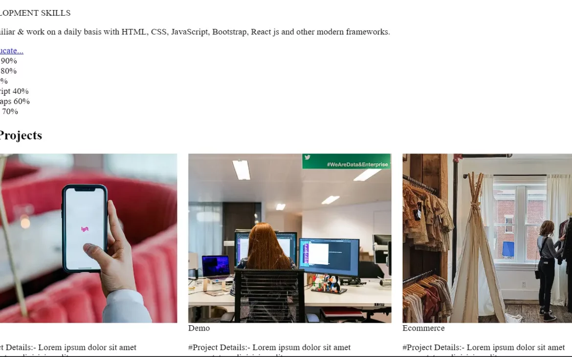
Skills section Inside this section, we will create a section to showcase the skills of the developer, and using the h2 tag, we will add the main heading of our skill section.
Inside the skills section, we will add the skills bar for different skills, and along with that, we will add a sub-section inside our skills section using the div tag for internship, project, and development skills.
<!-- Skills -->
<section class="skills" id="skills">
  <div class="max-width">
    <h2 class="title">My Skills</h2>
    <div class="skills-content">
      <div class="column left">
        <div class="text">INTERNSHIP</div>
        <p>
          <li class="intern">#Company Name "Where You work"</li>
          <li class="intern">#Company Name "Where You work"</li>
          <li class="intern">#Company Name "Where You work"</li>
        </p>

        <br />
        <div class="text">PROJECT</div>

        <p>
          <li class="project">Portfolio (HTML, CSS, js, Bootstraps)</li>
          <li class="project">
            eCommerce Website (Shopify liquid-code, HTML, CSS)
          </li>
          <li class="project">
            QuickShop - eCommerce Website (Like Amazon, Flipkart etc.)
          </li>
          <li class="project">Fully Responsive Design Email Subscribe form</li>
          <li class="project">Blog (HTML, CSS, Bootstraps)</li>
          <li class="project">
            Currently Working on a Messaging App (Like WhatsApp)
          </li>
        </p>

        <br />
        <div class="text">DEVELOPMENT SKILLS</div>

        <p>
          I'm familiar & work on a daily basis with HTML, CSS, JavaScript,
          Bootstrap, React js and other modern frameworks.
        </p>
        <a href="https://aistechx.com/" target="blank">Get Educate...</a>
      </div>
      <div class="column right">
        <div class="bars">
          <div class="info">
            <span>Python</span>
            <span>90%</span>
          </div>
          <div class="line python"></div>
        </div>
        <div class="bars">
          <div class="info">
            <span>HTML</span>
            <span>80%</span>
          </div>
          <div class="line html"></div>
        </div>
        <div class="bars">
          <div class="info">
            <span>CSS</span>
            <span>60%</span>
          </div>
          <div class="line css"></div>
        </div>
        <div class="bars">
          <div class="info">
            <span>JavaScript</span>
            <span>40%</span>
          </div>
          <div class="line js"></div>
        </div>
        <div class="bars">
          <div class="info">
            <span>Bootstraps</span>
            <span>60%</span>
          </div>
          <div class="line bootstraps"></div>
        </div>
        <div class="bars">
          <div class="info">
            <span>Django</span>
            <span>70%</span>
          </div>
          <div class="line django"></div>
        </div>
      </div>
    </div>
  </div>
</section>
Project and Contact Section
A portfolio major section is a project section, where the developer includes all those projects that they completed throughout their web development journey.
For adding the project inside the project section, we will use the section tag to create the project section, and then using the <h2> tag, we will create the main heading of the project section.
We will then use the div tag to create cards that help in displaying projects. These cards include an image and a small description of the project.
<!-- Projects -->
<section class="projects" id="projects">
  <div class="max-width">
    <h2 class="title">My Projects</h2>
    <div class="carousel owl-carousel">
      <div class="card">
        <div class="box">
          <img src="https://source.unsplash.com/720x600/?shopping" alt="" />
          <div class="text">Ecommerce</div>
          <p>
            #Project Details:- Lorem ipsum dolor sit amet consectetur
            adipisicing elit.
          </p>
        </div>
      </div>
      <div class="card">
        <div class="box">
          <img src="https://source.unsplash.com/720x600/?portfolio" alt="" />
          <div class="text">Portfolio</div>
          <p>
            #Project Details:- Lorem ipsum dolor sit amet consectetur
            adipisicing elit.
          </p>
        </div>
      </div>
      <div class="card">
        <div class="box">
          <img src="https://source.unsplash.com/720x600/?blog" alt="" />
          <div class="text">Blog</div>
          <p>
            #Project Details:- Lorem ipsum dolor sit amet consectetur
            adipisicing elit.
          </p>
        </div>
      </div>
      <div class="card">
        <div class="box">
          <img src="https://source.unsplash.com/720x600/?messanger" alt="" />
          <div class="text">Messaging App</div>
          <p>
            #Project Details:- Lorem ipsum dolor sit amet consectetur
            adipisicing elit.
          </p>
        </div>
      </div>
      <div class="card">
        <div class="box">
          <img src="https://source.unsplash.com/720x600/?app-clone" alt="" />
          <div class="text">Clone</div>
          <p>
            #Project Details:- Lorem ipsum dolor sit amet consectetur
            adipisicing elit.
          </p>
        </div>
      </div>
      <div class="card">
        <div class="box">
          <img src="https://source.unsplash.com/720x600/?code,demo" alt="" />
          <div class="text">Demo</div>
          <p>
            #Project Details:- Lorem ipsum dolor sit amet consectetur
            adipisicing elit.
          </p>
        </div>
      </div>
    </div>
  </div>
</section>
Inside the contact section, we mainly add some social media links using the font Awesome Icons.
We create the icons for different social media and then use the <a> tag along the icons to add the hyperlink to the social media, and other than that, we have also added the address of the developer for contact and contact form to send the message to developer directly.
<!-- Contact -->
<section class="contact" id="contact">
<div class="max-width">
<h2 class="title">Contact Me</h2>
<div class="contact-content">
<div class="column left">
<div class="text">Get in Touch</div>
<p>
Feel free to get in touch with me. I am always open to discussing new
projects, creative ideas or opportunities to be a part of your
visions. Email me with any questions or inquiries. I'll happy to
answer your questions and set up a meeting with you.
</p>
<div class="icons">
<a href="https://instagram.com/aistscience">
<div class="row">
<i class="fa-solid fa-user-large"></i>
<div class="info">
<div class="head">Name</div>
<div class="sub-title">
<a
href="https://aistechx.com/"
style="text-decoration: none; color: #333"
>
Akash Mahapatra</a
>
</div>
</div>
</div>
</a>
<div class="row">
<i class="fa-solid fa-location-dot"></i>
<div class="info">
<div class="head"> Address</div>
<div class="sub-title"> ABC, 123 Lane, India</div>
</div>
</div>
<div class="row">
<i class="fa-solid fa-envelope"></i>
<div class="info">
<div class="head">Email</div>
<div class="sub-title">
<a href="mailto:#" style="text-decoration: none; color: #333">
[email protected]</a
>
</div>
</div>
</div>
<div class="row">
<i class="bi bi-translate"></i>
<div class="info">
<div class="head">Language Known</div>
<div class="sub-title">Hindi, English, Odia, Bengali</div>
</div>
</div>
<br />
<!-- Social -->
<div class="social-menu">
<ul>
<li>
<a href="https://github.com/akashm47"
><i class="fa-brands fa-github"></i
></a>
</li>
<li>
<a href="https://www.linkedin.com/in/akashmahapatra/"
><i class="fa-brands fa-linkedin-in"></i
></a>
</li>
<li>
<a href="https://www.instagram.com/___kaaashx___/"
><i class="fa-brands fa-instagram"></i
></a>
</li>
<li>
<a href="https://twitter.com/___kaaashx___/"
><i class="fa-brands fa-twitter"></i
></a>
</li>
<li>
<a href="https://aistechx.com/" title="Get Educate with Us"
><i class="fa-solid fa-graduation-cap"></i
></a>
</li>
</ul>
</div>
</div>
</div>
<!-- Reach -->
<div class="column right">
<div class="text">Message me</div>
<form action="#">
<div class="fields">
<div class="field name">
<input type="text" placeholder="Your Name" required />
</div>
<div class="field email">
<input type="email" placeholder="Your Email" required />
</div>
</div>
<div class="field">
<input type="text" placeholder="Subject" required />
</div>
<div class="field textarea">
<textarea
cols="30"
rows="10"
placeholder="Message.."
required
></textarea>
</div>
<div class="button-area">
<button type="submit">Send message</button>
</div>
</form>
</div>
</div>
</div>
</section>
Footer Section
Using the footer tag, we will create a footer for our portfolio website. Inside the footer section, using the <a> tag, we will add the contact link of the developer, and using the inline element span tag, we will add the copyright content of the website.
<!-- Footer -->
<footer>
  <span>
    <a href="https://www.linkedin.com/in/akashmahapatra"> Akash Mahapatra</a> |
    <span class="far fa-copyright"></span> 2022 All Rights Reserved. Privacy
    Policy
  </span>
</footer>
We have also added all the necessary elements and links to our portfolio website.
Output
Here is what we have created so far.
Styling Your Content With CSS
Body and Background Styling
Using the universal selector, we will add up some of the basic styling to our portfolio webpage.
Next, we will set the padding and margin to “zero”, and text decoration is set to none on the webpage.
* {
  margin: 0;
  padding: 0;
  box-sizing: border-box;
  text-decoration: none;
}

html {
  scroll-behavior: smooth;
}

::-webkit-scrollbar {
  width: 6px;
}

::-webkit-scrollbar-track {
  background: #f1f1f1;
}
Using the class selector (.loader_bg), this class is used to load different backgrounds, and that functionality we will add through the javascript function.
.loader_bg {
  position: fixed;
  z-index: 9999999;
  background: #fff;
  width: 100%;
  height: 100%;
}

.loader {
  height: 100%;
  width: 100%;
  position: absolute;
  left: 0;
  top: 0;
  display: flex;
  justify-content: center;
  align-items: center;
}

.loader img {
  width: 280px;
}

::-webkit-scrollbar-thumb {
  border-radius: 12px;
  background: linear-gradient(135deg, #f57308, #fff, rgb(11, 242, 7));
}

::-webkit-scrollbar-thumb:hover {
  background: linear-gradient(135deg, #1a6ad2, #fff, rgb(245, 5, 53));
}
Here, we just set the position of the background as fixed, and the width and height are set to 100% of the background section.
Section Styling
In the tag selector section, we will add a padding of 100 pixels to the top and bottom of the section of the webpage. Then, using the class selector (.max-width), We will set the maximum width of the page to 1300px, the padding to 80px, and the margin of the page to auto.
Selecting the multiple class selector, we will add the font family of the section as poppins.
section {
  padding: 100px 0;
}

.max-width {
  max-width: 1300px;
  padding: 0 80px;
  margin: auto;
}

.about,
.services,
.skills,
.projects,
.contact,
footer {
  font-family: "Poppins", sans-serif;
}

.about .about-content,
.services .serv-content,
.skills .skills-content,
.contact .contact-content {
  display: flex;
  flex-wrap: wrap;
  align-items: center;
  justify-content: space-between;
}
Using the child selector (.title), we will set the position of the title relative to the section, and using the text align property, we will align the text to the center of the web page.
We will add the before and after properties of the section using the before and after selector.
section .title {
  position: relative;
  text-align: center;
  font-size: 40px;
  font-weight: 500;
  margin-bottom: 60px;
  padding-bottom: 20px;
  font-family: "Ubuntu", sans-serif;
}

section .title::before {
  content: "";
  position: absolute;
  bottom: 0px;
  left: 50%;
  width: 180px;
  height: 3px;
  transform: translateX(-50%);
}

section .title::after {
  position: absolute;
  bottom: -8px;
  left: 50%;
  font-size: 20px;
  color: #1e3551;
  padding: 0 5px;
  transform: translateX(-50%);
}
Using the class selector (.navbar), we will set the position of the navbar to be fixed to the top of the webpage, and using the width property, we will set the width of the webpage to 100%. Using the z-index property, we will set the position of the navbar along the z axis, and we will also add some transitions to the navbar links.
/*  Navbar  */
.navbar {
  position: fixed;
  width: 100%;
  z-index: 999;
  padding: 30px 0;
  font-family: "Ubuntu", sans-serif;
  transition: all 0.3s ease;
}

.navbar.sticky {
  padding: 15px 0;
  background: #1e3551;
}

.navbar .max-width {
  display: flex;
  align-items: center;
  justify-content: space-between;
}

.navbar .logo a {
  color: #fff;
  font-size: 35px;
  font-weight: 600;
}

/*  Nav Logo Span Linear-Gradient  */
.navbar .logo a span {
  background: linear-gradient(135deg, #041d3d, #fff, crimson);
  -webkit-background-clip: text;
  -webkit-text-fill-color: transparent;
  transition: all 0.3s ease;
}

.navbar.sticky .logo a span {
  color: #fff;
}

.navbar .menu li {
  list-style: none;
  display: inline-block;
}

.navbar .menu li a {
  display: block;
  color: #fff;
  font-size: 18px;
  font-weight: 500;
  margin-left: 25px;
  transition: color 0.3s ease;
}

.navbar .menu li a:hover {
  color: #1e3551;
}

.navbar.sticky .menu li a:hover {
  color: #fff;
}
Home and About section styling
Now, let’s add styling to the home and about sections of the webpage. Using the class selector (.menu-btn), we will add some basic styling to the menu button of the navbar.
Then, We will set the font color to “whiite,” the font size of the menu button to 23 pixels, and the cursor to the pointer.
/*  Menu Btn  */
.menu-btn {
  color: #fff;
  font-size: 23px;
  cursor: pointer;
  display: none;
}

.scroll-up-btn {
  position: fixed;
  height: 45px;
  width: 42px;
  background: #1e3551;
  right: 30px;
  bottom: 10px;
  text-align: center;
  line-height: 45px;
  color: #fff;
  z-index: 9999;
  font-size: 30px;
  border-radius: 6px;
  border-bottom-width: 2px;
  cursor: pointer;
  opacity: 0;
  pointer-events: none;
  transition: all 0.3s ease;
}

.scroll-up-btn.show {
  bottom: 30px;
  opacity: 1;
  pointer-events: auto;
}

.scroll-up-btn:hover {
  filter: brightness(90%);
}
Now, using the class selector (.home), we will set the display property to flex for responsive design, and using the background property, we will set the background to an image using a URL.
The height of the home section is set to 100vh and the font color to white. Then we will add some more styling to our home section, and also some hover properties to the home section to create some cool effects over the home tab.
/*  Home  */
.home {
  display: flex;
  background: url("https://source.unsplash.com/720x600/?dark,laptop") no-repeat
    center;
  height: 100vh;
  color: #fff;
  min-height: 500px;
  background-size: cover;
  background-attachment: fixed;
  font-family: "Ubuntu", sans-serif;
}

.home .max-width {
  width: 100%;
  display: flex;
}

.home .max-width .row {
  margin-right: 0;
}

.home .home-content .text-1 {
  font-size: 27px;
}

.home .home-content .text-2 {
  font-size: 75px;
  font-weight: 600;
  margin-left: -3px;
}

.home .home-content .text-3 {
  font-size: 40px;
  margin: 5px 0;
}

/* Linear Gradient */
.home .home-content .text-3 span {
  color: #1e3551;
  background: linear-gradient(135deg, #041d3d, #fff, crimson);
  -webkit-background-clip: text;
  -webkit-text-fill-color: transparent;
  font-weight: 500;
}

.home .home-content a {
  display: inline-block;
  background: #1e3551;
  color: #fff;
  font-size: 25px;
  padding: 12px 36px;
  margin-top: 20px;
  font-weight: 400;
  border-radius: 6px;
  border: 2px solid #1e3551;
  transition: all 0.3s ease;
}

.home .home-content a:hover {
  color: #1e3551;
  background: none;
  animation: pulsate 1s ease-in-out;
}

/* Animation for Button */
@keyframes pulsate {
  0% {
    box-shadow: 0 0 25px #888e8d, 0 0 50px #1e3551;
  }
}
Using the class selector (.about), we will set the background of the about section as a radial, gradual white combination of grey and white, and aligning with that will add some styling to the elements of the about section, such as images, width, height, etc. to give it a visually appealing look.
/*  About  */
.about {
  background: radial-gradient(#e1efff, white);
}
.about .title::after {
  content: "—Who I Am ?—";
  text-overflow: ellipsis;
  display: -webkit-inline-box;
  -webkit-line-clamp: 3;
  -webkit-box-orient: vertical;
}

.about .about-content .left {
  width: 45%;
}

.about .about-content .left img {
  height: 400px;
  width: 400px;
  object-fit: cover;
  border-radius: 6px;
}

.about .about-content .right {
  width: 55%;
}

.about .about-content .right .text {
  font-size: 25px;
  font-weight: 600;
  margin-bottom: 10px;
}

/* Linear Gradiant */
.about .about-content .right .text span {
  /* color: #1e3551; */
  background: linear-gradient(135deg, #041d3d, #fff, crimson);
  -webkit-background-clip: text;
  -webkit-text-fill-color: transparent;
}

.about .about-content .right p {
  text-align: justify;
}

.about .about-content .right a {
  display: inline-block;
  background: #1e3551;
  color: #fff;
  font-size: 20px;
  font-weight: 500;
  padding: 10px 30px;
  margin-top: 20px;
  border-radius: 6px;
  border: 2px solid #1e3551;
  transition: all 0.3s ease;
}

.about .about-content .right a:hover {
  color: #1e3551;
  background: none;
  animation: pulsate 1s ease-in-out;
}
Services and Skills Section
Using the class selectors (.services, .projects), we will set the font color to white and the background color to black.
Then, using child selector cards, we will add some width and height to the service cards. Also, using the border-radius property, we will set the border radius of the card to 10 pixels to give a soft corner edge look.
/* Service */
.services,
.projects {
  color: #fff;
  background: #111;
}

.services .title::before,
.projects .title::before {
  background: #fff;
}

.services .title::after,
.projects .title::after {
  background: #111;
  content: "What I Provide ?";
}

.services .serv-content .card {
  width: calc(33% - 20px);
  background: #222;
  text-align: center;
  border-radius: 10px;
  padding: 50px 25px;
  cursor: pointer;
  transition: all 0.3s ease;
}

.services .serv-content .card:hover {
  background: #1e3551;
}

.services .serv-content .card .box {
  transition: all 0.3s ease;
}

.services .serv-content .card:hover .box {
  transform: scale(1.05);
}

.services .serv-content .card i {
  font-size: 50px;
  color: #888e8d;
  background: linear-gradient(135deg, #041d3d, #fff, crimson);
  -webkit-background-clip: text;
  -webkit-text-fill-color: transparent;
  transition: color 0.3s ease;
}

.services .serv-content .card:hover i {
  color: #fff;
}

.services .serv-content .card .text {
  font-size: 25px;
  font-weight: 500;
  margin: 10px 0 7px 0;
}
Using the class selector (.skills), we will set the background color as a radial gradient with a combination of grey and white.
Also, using the child class, we will set the width of the column class element to 33%, and using the justify content property, we will justify the content.
Using the hover property, we will add a hover effect to the skills element, so as the user hovers over the skills bar, the hover property adds some of the transition to it.
/*  Skills  */
.skills {
  background: radial-gradient(#e1efff, white);
}
.skills .title::after {
  content: "—What I Know ?—";
}

.skills .skills-content .column {
  width: calc(50% - 30px);
}

.skills .skills-content .left .text {
  font-size: 20px;
  font-weight: 600;
  margin-bottom: 10px;
}

.skills .skills-content .left p {
  text-align: justify;
}

.skills .skills-content .left a {
  display: inline-block;
  background: #1e3551;
  color: #fff;
  font-size: 18px;
  font-weight: 500;
  padding: 8px 16px;
  margin-top: 20px;
  border-radius: 6px;
  border: 2px solid #1e3551;
  transition: all 0.3s ease;
}

.skills .skills-content .left a:hover {
  color: #1e3551;
  background: none;
  animation: pulsate 1s ease-in-out;
}

.intern,
.project {
  list-style: none;
}

.intern::before,
.project::before {
  content: "✪ ";
  color: #1e3551;
}

.skills .skills-content .right .bars {
  margin-bottom: 15px;
}

.skills .skills-content .right .info {
  display: flex;
  margin-bottom: 5px;
  align-items: center;
  justify-content: space-between;
}

.skills .skills-content .right span {
  font-weight: 500;
  font-size: 18px;
}

.skills .skills-content .right .line {
  height: 5px;
  width: 100%;
  background: lightgrey;
  position: relative;
}

.skills .skills-content .right .line::before {
  content: "";
  position: absolute;
  height: 100%;
  left: 0;
  top: 0;
  background: #1e3551;
}

.skills-content .right .python::before {
  width: 90%;
}

.skills-content .right .html::before {
  width: 80%;
}

.skills-content .right .css::before {
  width: 60%;
}

.skills-content .right .js::before {
  width: 40%;
}

.skills-content .right .bootstraps::before {
  width: 60%;
}

.skills-content .right .django::before {
  width: 70%;
}
Project, Contact Me and Footer Section
Using the CSS ::after pseudo selector, we will display the content inside the project section, and then, using the parent and child selectors, we will set the background to dark gray and the border radius of the cards to 6 pixels for a softer corner.
Now we will add some styling to it.
We will add a hover property to our project section. As the user hovers over it, the project section scales to 1.25 and the background color changes to blue.
/*  Projects  */
.projects .title::after {
  content: "What I did ?";
}

.projects .carousel .card {
  background: #222;
  border-radius: 6px;
  padding: 25px 35px;
  text-align: center;
  overflow: hidden;
  transition: all 0.3s ease;
}

.projects .carousel .card:hover {
  background: #1e3551;
}

.projects .carousel .card .box {
  display: flex;
  flex-direction: column;
  align-items: center;
  justify-content: center;
  transition: all 0.3s ease;
}

.projects .carousel .card:hover .box {
  transform: scale(1.05);
}

.projects .carousel .card .text {
  font-size: 25px;
  font-weight: 500;
  margin: 10px 0 7px 0;
}

.projects .carousel .card img {
  height: 150px;
  width: 150px;
  object-fit: cover;
  border-radius: 50%;
  border: 5px solid #888c8d;
  transition: all 0.3s ease;
}

.projects .carousel .card:hover img {
  border-color: #fff;
}

.owl-dots {
  text-align: center;
  margin-top: 20px;
}

.owl-dot {
  height: 13px;
  width: 13px;
  margin: 0 5px;
  outline: none !important;
  border-radius: 50%;
  border: 2px solid #888c8d !important;
  transition: all 0.3s ease;
}

.owl-dot.active {
  width: 35px;
  border-radius: 14px;
}

.owl-dot.active,
.owl-dot:hover {
  background: #18365a !important;
}

/*  Contact  */
.contact {
  background: radial-gradient(#e1efff, white);
}

.contact .title::after {
  content: "—Get in Touch—";
}

.contact .contact-content .column {
  width: calc(50% - 30px);
}

.contact .contact-content .text {
  font-size: 20px;
  font-weight: 600;
  margin-bottom: 10px;
}

.contact .contact-content .left p {
  text-align: justify;
}

.contact .contact-content .left .icons {
  margin: 10px 0;
}

.contact .contact-content .row {
  display: flex;
  height: 65px;
  align-items: center;
}

.contact .contact-content .row .info {
  margin-left: 30px;
}

.contact .contact-content .row i {
  font-size: 25px;
  color: #1e3551;
}

.contact .contact-content .info .head {
  font-weight: 500;
  color: #000;
}

.contact .contact-content .info .sub-title {
  color: #333;
}

.contact .right form .fields {
  display: flex;
}

.contact .right form .field,
.contact .right form .fields .field {
  height: 45px;
  width: 100%;
  margin-bottom: 15px;
}

.contact .right form .textarea {
  height: 80px;
  width: 100%;
}

.contact .right form .name {
  margin-right: 10px;
}

.contact .right form .field input,
.contact .right form .textarea textarea {
  height: 100%;
  width: 100%;
  border: 1px solid lightgrey;
  border-radius: 6px;
  outline: none;
  padding: 0 15px;
  font-size: 17px;
  font-family: "Poppins", sans-serif;
  transition: all 0.3s ease;
}

.contact .right form .field input:focus,
.contact .right form .textarea textarea:focus {
  border-color: #b3b3b3;
}

.contact .right form .textarea textarea {
  padding-top: 10px;
  resize: none;
}

.contact .right form .button-area {
  display: flex;
  align-items: center;
}

.right form .button-area button {
  color: #fff;
  display: block;
  width: 160px !important;
  height: 45px;
  outline: none;
  font-size: 18px;
  font-weight: 500;
  border-radius: 6px;
  cursor: pointer;
  flex-wrap: nowrap;
  background: #1e3551;
  border: 2px solid #1e3551;
  transition: all 0.3s ease;
}

.right form .button-area button:hover {
  color: #1e3551;
  background: none;
  animation: pulsate 1s ease-in-out;
}

/*  Social  */
.col-4 {
  background: #d8d8d8;
}

.social-menu ul {
  position: absolute;
  left: 20%;
  padding: 0;
  margin: 0;
  transform: translate(-50%, -50%);
  display: flex;
}

.social-menu ul li {
  list-style: none;
  margin: 0 15px;
}

.social-menu ul li .fa {
  font-size: 30px;
  line-height: 60px;
  transition: 0.6s;
  color: #000;
}

.social-menu ul li .fa:hover {
  color: #fff;
}

.social-menu ul li a {
  left: px;
  right: 12px;
  padding-top: 3px;
  position: relative;
  display: block;
  width: 30px;
  height: 30px;
  border-radius: 50%;
  background-color: #1e3551;
  text-align: center;
  transition: 0.6s;
  box-shadow: 0 5px 4px rgba(0, 0, 0, 0.5);
}

.social-menu ul li a:hover {
  transform: translate(0, -10px);
}

.social-menu ul li:nth-child(1) a:hover {
  background-color: #131418;
}

.social-menu ul li:nth-child(2) a:hover {
  background-color: #0a66c2;
}

.social-menu ul li:nth-child(3) a:hover {
  background-color: #e4405f;
}
.social-menu ul li:nth-child(4) a:hover {
  background-color: #1da1f2;
}

.social-menu ul li:nth-child(5) a:hover {
  background-color: #e33054;
}

.social-menu ul li:nth-child(6) a:hover {
  background-color: #fc4f08;
}

.fa-brands {
  color: #fff;
}

.fa-solid {
  color: #fff;
}
Using the footer tag selector, we will set the background of the footer to dark blue, and using the padding property, we will set the padding to 6 pixels and 16 pixels from the left and right, and using the text align property, we will align it to the center of the page.
/*  Footer  */
footer {
  background: #111;
  padding: 6px 16px;
  color: #888c8d;
  text-align: center;
}

footer span a {
  color: #1e3551;
  text-decoration: none;
}

footer span a:hover {
  text-decoration: underline;
}
Now, our next task is to make it responsive
Making it Resopnsive
To make it responsive, we will use the CSS @media rule. Using this rule we can set different set of styles for different size of screens.
/*  Media Query  */
@media (max-width: 1104px) {
  .about .about-content .left img {
    height: 350px;
    width: 350px;
  }
  section .title::after {
    bottom: -8px;
    font-size: 16px;
  }
}

@media (max-width: 991px) {
  .social-menu ul li a {
    left: 114px;
  }
}

@media (max-width: 947px) {
  .menu-btn {
    display: block;
    z-index: 999;
  }
  .menu-btn i.active:before {
    content: "\f00d";
  }
  .navbar .menu {
    position: fixed;
    height: 100vh;
    width: 100%;
    left: -100%;
    top: 0;
    background: #111;
    text-align: center;
    padding-top: 80px;
    transition: all 0.3s ease;
  }
  .navbar .menu.active {
    left: 0;
  }
  .navbar .menu li {
    display: block;
  }
  .navbar .menu li a {
    display: inline-block;
    margin: 20px 0;
    font-size: 25px;
  }
  .home .home-content .text-2 {
    font-size: 70px;
  }
  .home .home-content .text-3 {
    font-size: 35px;
  }
  .home .home-content a {
    font-size: 23px;
    padding: 10px 30px;
  }
  .max-width {
    max-width: 930px;
  }
  .about .about-content .column {
    width: 100%;
  }
  .about .about-content .left {
    display: flex;
    justify-content: center;
    margin: 0 auto 60px;
  }
  .about .about-content .right {
    flex: 100%;
  }
  .services .serv-content .card {
    width: calc(50% - 10px);
    margin-bottom: 20px;
  }
  .skills .skills-content .column,
  .contact .contact-content .column {
    width: 100%;
    margin-bottom: 35px;
  }
}

@media (max-width: 690px) {
  .max-width {
    padding: 0 23px;
  }
  .home .home-content .text-2 {
    font-size: 60px;
  }
  .home .home-content .text-3 {
    font-size: 32px;
  }
  .home .home-content a {
    font-size: 20px;
  }
  .services .serv-content .card {
    width: 100%;
  }
}

@media (max-width: 500px) {
  .home .home-content .text-2 {
    font-size: 50px;
  }
  .home .home-content .text-3 {
    font-size: 27px;
  }
  .about .about-content .right .text,
  .skills .skills-content .left .text {
    font-size: 19px;
  }
  .contact .right form .fields {
    flex-direction: column;
  }
  .contact .right form .name,
  .contact .right form .email {
    margin: 0;
  }
  .right form .error-box {
    width: 150px;
  }
  .scroll-up-btn {
    right: 15px;
    bottom: 15px;
    height: 38px;
    width: 35px;
    font-size: 23px;
    line-height: 38px;
  }
}
With that finished, we will move on to the Javascript part of this article.
Adding Functionality to our Website using Javascript
We will use the jQuery for this project. But, What is JQury?
What is jQury?
jQury is a Javascript liberty that makes writing Javascript easier. In another words “Write less, Do more”.
Now, let’s move on to the coding part.
Sticky Navbar
We will mke the Navbar strick to the top once the user starts scrolling. This can make our website easy to navigate.
$(document).ready(function () {
  $(window).scroll(function () {
    // sticky navbar on scroll
    if (this.scrollY > 20) {
      $(".navbar").addClass("sticky");
    } else {
      $(".navbar").removeClass("sticky");
    }

    // some other code here

  });

  // some other code here

});
When you scroll down 20 pixels or more, the code adds a “sticky” class to the navigation bar. This class causes the navbar to stay fixed at the top of the page, ensuring easy access to the menu and site navigation, even when you’ve scrolled further down the content.
Scroll-Up Button
Next, we show a scroll up button once the user scroll down a certen number of pixels. (500 pixels in this case)
$(document).ready(function () {
  $(window).scroll(function () {
    // some other code here

    // scroll-up button show/hide script
    if (this.scrollY > 500) {
      $(".scroll-up-btn").addClass("show");
    } else {
      $(".scroll-up-btn").removeClass("show");
    }
  });

  // some other code here

});
Once you’ve scrolled down 500 pixels or more, a “scroll-up” button is displayed. This button offers a convenient way to swiftly return to the top of the webpage with a single click.
It’s a practical feature for users who want to navigate through lengthy content more efficiently.
Scrolling and Navigation
When the “scroll-up” button with the class “.scroll-up-btn” is clicked, it triggers a smooth scroll effect that scrolls the webpage back to the top by animating the scrollTop property of the HTML element.
Additionally, it temporarily disables smooth scrolling by setting scroll behaviour to “auto”.
$(document).ready(function () {
  // some other code here

  // slide-up script
  $(".scroll-up-btn").click(function () {
    $("html").animate({ scrollTop: 0 });
    // removing smooth scroll on slide-up button click
    $("html").css("scrollBehavior", "auto");
  });

  // smooth scroll on navbar item clicked
  $(".navbar .menu li a").click(function () {
    // Smooth scroll on Menu Items click
    $("html").css("scrollBehavior", "smooth");
  });

  // some other code here


});
When menu items within the navbar are clicked, smooth scrolling is reactivated, creating a pleasing navigation experience.
Toggle Navbar
We also need to write a toggle feature for the navbar’s menu. When a button with the class menu-btn is clicked, it toggles the “active” class on both the menu itself and an associated icon.
$(document).ready(function () {
  // some other code here

  // Toggle Navbar
  $(".menu-btn").click(function () {
    $(".navbar .menu").toggleClass("active");
    $(".menu-btn i").toggleClass("active");
  });

  // some other code here

});
This allows users to easily show or hide the navigation menu, making the website more user-friendly.
Typing Text Animation
Lastly, We will utilize the Typed.js library to create a typing text animation effect.
$(document).ready(function () {
  // some other code here

  // Typing Text Animation
  var typed = new Typed(".typing", {
    strings: [
      "Fullstack Developer",
      "Software Developer",
      "Python Developer",
      "Founder",
      "Author",
    ],
    typeSpeed: 100,
    backSpeed: 60,
    loop: true,
  });

  var typed = new Typed(".typing-2", {
    strings: [
      "Fullstack Developer",
      "Software Developer",
      "Python Developer",
      "Founder",
      "Author",
    ],
    typeSpeed: 100,
    backSpeed: 60,
    loop: true,
  });

  // some other code here

});
It displays a series of predefined strings with a typing speed (typeSpeed) and a backspacing speed (backSpeed).
The text loop is set to repeat indefinitely, creating an engaging way to showcase various roles or titles, such as “Fullstack Developer” or “Author,” on the webpage.
Owl Carousel
The Owl Carousel is a responsive image slider that continuously cycles through items with a 2-second interval.
$(document).ready(function () {
  // some other code here

  // Owl Carousel
  $(".carousel").owlCarousel({
    margin: 20,
    loop: true,
    autoplay: true,
    autoplayTimeOut: 2000,
    autoplayHoverPause: true,
    responsive: {
      0: {
        items: 1,
        nav: false,
      },
      600: {
        items: 2,
        nav: false,
      },
      1000: {
        items: 3,
        nav: false,
      },
    },
  });

  // some other code here
});
It’s configured to display a different number of items and show/hide navigation buttons based on the screen size, creating an engaging and adaptable image presentation for the website.
Source Code
The source code is availabe on Codepen – Modern Responsive Portfolio
Conclusion
I hope you get the idea of the project. We just attempted to make the entire thing more beginner-friendly by breaking it down step by step. We advise novices to read and comprehend this material.
Try creating a different style for your portfolio website With HTML ,CSS and javascript, we have finished our portfolio website.Please feel free to leave a comment below if you have any doubts.