Creating a modern UI and responsive website is a big task. We need to create a UI that is easily accessible to all ages of the group.
While on the journey of learning web development, We practice web design by creating different website projects to enhance our skills. In this article, we will be creating a front-end project with a visually appealing UI and responsiveness. We will create a blog website.
What is a Blog Website
A blog website is a personal website where users can share their knowledge and experiences with the general public.
Anyone who is fond of writing articles and wants to share his thoughts with others can use a blog website to do so.
Also Read – How to Create Multiple Pages in HTML
We will be creating a blog website using only HTML and CSS, and this is a beginner-friendly project that will also help enhance our front-end skills.
We will be creating our blog step by step so that it will be easy for beginners to follow up with our article and create their own personal blog website.
Create a Blog Website using HTML and CSS
Step 1. Planning your Blog Website
Before we start coding, it is important to plan your blog’s structure, content, and design. It is necessary to plan what type of content you will be creating, what the design of the website will look like, and whom we want to target. Based on these parameters, we will be planning our blog site.
- First of all, we will create a wireframe for our website. It will include details about the structure of the website. How elements are going to be placed. The majority of the rough structure of the website will be created through wireframes.
- Then we will plan the type of content.
- Then we will write up the code for our website.
- At last, we will host our blog website.
These steps all help in creating a fully responsive blog website.
Step 2. Setting Up the IDE
Now we will choose an IDE for the code editor, and we will create a folder for our blog websites.
Inside the folder, we will create the files for the HTML structure for our blog website and the CSS file for styling our blog website.
Step 3. Building the HTML Structure
The HTML structure of our blog website is a combination of three sections Header, Content, and footer.
Inside the header we will add all the major links of our blog website in the navbar and in the content section we will add all the content and in the footer section, we will include the details about the website and owner.
<!DOCTYPE html>
<html lang="en">
  <head>
    <meta charset="UTF-8" />
    <meta name="viewport" content="width=device-width, initial-scale=1.0" />
    <title>Document</title>
  </head>
  <body>
    <!-- All the other Sections or Code goes here -->
  </body>
</html>
Let’s learn a bit about the above code first.
Basic HTML Tags
Basic HTML structure includes the major tags that tell the browser that the file contains the HTML code. HTML tag contains tags such as:
- <!Doctype HTML> – This tag is used to tell the browser that the file we are using is HTML 5 which is the latest version of HTML.
- <HTML lang=” en”> – The HTML is the root tag, which contains all the HTML tags, and lang is the attribute used to tell the browser that the supporting language is English.
- <head> – The head contains the meta information of the HTML, such as the title, links to external files, and some common meta tags.
- Meta tags – Meta tags are those tags that contain additional information and are not visible to the user, but they are important tags that are used for search engine optimization and for search engines and web browsers. Meta tags help search engines match keywords with relevant information and display the result to the user.
- <body> – The body tag contains all the content that is displayed to the user.
Now, let’s move on to the header section.
Header Section
The header section is a semantic tag that helps us create the structure of the website in a structured and more defined format. The header tag is specifically used for creating the header of the website.
<header>
  <div class="container container-flex">
    <div class="site-title">
      <h1>Living The Social Life</h1>
      <p class="subtitle">A blog exploring minimalism in life.</p>
    </div>
    <nav>
      <ul>
        <li><a href="#" class="current-page">Home</a></li>
        <li><a href="#">About Me</a></li>
        <li><a href="#">Recent Posts</a></li>
      </ul>
    </nav>
  </div>
</header>
Inside the header section, using the block-level tag <div>, we will create the container for the navbar, and using the <h1> tag, we will add the heading, and using the <p> tag, we will add the subtitle of our website.
Using the <nav> tag, we will create the navbar for our website, and using the unordered list, we will add the links inside our navbar for different sections of the website.
Content Section
Inside the content section, we will use the div tag with class container flex as the main container for the blog’s content and the <article> tag, which is specifically used for creating a particular article block that contains the name, image, paragraph, and links of the article using basic HTML tags.
In a similar manner, we can create multiple article tags inside our content section.
<div class="container container-flex">
  <main role="main">
    <article class="article-featured">
      <h2 class="article-title">Finding simplicity in life</h2>
      <img
        src="https://raw.githubusercontent.com/kevin-powell/reponsive-web-design-bootcamp/master/Module%202-%20A%20simple%20life/img/life.jpg"
        alt="simple white desk on a white wall with a plant on the far right side"
        class="article-image"
      />
      <p class="article-info">July 23, 2019 | 3 comments</p>
      <p class="article-body">
        Life can get complicated really quickly, but it doesn't have to be!
        There are many ways to simplify your life, a few of which we've explored
        in the past. This week we're taking a bit of a approach though, in how
        you can find simplicity in the life you already living.
      </p>
      <a href="#" class="article-read-more">CONTINUE READING</a>
    </article>

    <article class="article-recent">
      <div class="article-recent-main">
        <h2 class="article-title">Keeping cooking simple</h2>
        <p class="article-body">
          Food is a very important part of everyone's life. If you want to be
          healthy, you have to eat healthy. One of the easiest ways to do that
          is to keep your cooking nice and simple.
        </p>
        <a href="#" class="article-read-more">CONTINUE READING</a>
      </div>
      <div class="article-recent-secondary">
        <img
          src="https://raw.githubusercontent.com/kevin-powell/reponsive-web-design-bootcamp/master/Module%202-%20A%20simple%20life/img/food.jpg"
          alt="two dumplings on a wood plate with chopsticks"
          class="article-image"
        />
        <p class="article-info">July 19, 2019 | 3 comments</p>
      </div>
    </article>

    <article class="article-recent">
      <div class="article-recent-main">
        <h2 class="article-title">Simplicity and work</h2>
        <p class="article-body">
          Work is often a major source of stress. People get frustrated, it
          ruins their relationship with others and it leads to burnout. By
          keeping your work life as simple as possible, it will help balance
          everything out.
        </p>
        <a href="#" class="article-read-more">CONTINUE READING</a>
      </div>
      <div class="article-recent-secondary">
        <img
          src="https://raw.githubusercontent.com/kevin-powell/reponsive-web-design-bootcamp/master/Module%202-%20A%20simple%20life/img/work.jpg"
          alt="a chair white chair at a white desk on a white wall"
          class="article-image"
        />
        <p class="article-info">July 12, 2019 | 3 comments</p>
      </div>
    </article>

    <article class="article-recent">
      <div class="article-recent-main">
        <h2 class="article-title">Simple decorations</h2>
        <p class="article-body">
          A home isn't a home until you've decorated a little. People either
          don't decorate, or they go overboard and it doesn't have the impact
          they were hoping for. Staying simple will help draw the eye where you
          want it to and make things pop like never before.
        </p>
        <a href="#" class="article-read-more">CONTINUE READING</a>
      </div>
      <div class="article-recent-secondary">
        <img
          src="https://raw.githubusercontent.com/kevin-powell/reponsive-web-design-bootcamp/master/Module%202-%20A%20simple%20life/img/work.jpg"
          alt="a green plant in a clear, round vase with water in it"
          class="article-image"
        />
        <p class="article-info">July 3, 2019 | 3 comments</p>
      </div>
    </article>
  </main>

  <aside class="sidebar">
    <div class="sidebar-widget">
      <h2 class="widget-title">ABOUT ME</h2>
      <img
        src="https://raw.githubusercontent.com/kevin-powell/reponsive-web-design-bootcamp/master/Module%202-%20A%20simple%20life/img/about-me.jpg"
        alt="john doe"
        class="widget-image"
      />
      <p class="widget-body">
        I find life better, and I'm happier, when things are nice and simple.
      </p>
    </div>

    <div class="sidebar-widget">
      <h2 class="widget-title">RECENT POSTS</h2>
      <div class="widget-recent-post">
        <h3 class="widget-recent-post-title">Keeping cooking simple</h3>
        <img
          src="https://raw.githubusercontent.com/kevin-powell/reponsive-web-design-bootcamp/master/Module%202-%20A%20simple%20life/img/food.jpg"
          alt="two dumplings on a wood plate with chopsticks"
          class="widget-image"
        />
      </div>
      <div class="widget-recent-post">
        <h3 class="widget-recent-post-title">Simplicity and work</h3>
        <img
          src="https://raw.githubusercontent.com/kevin-powell/reponsive-web-design-bootcamp/master/Module%202-%20A%20simple%20life/img/work.jpg"
          alt="a chair white chair at a white desk on a white wall"
          class="widget-image"
        />
      </div>
      <div class="widget-recent-post">
        <h3 class="widget-recent-post-title">Simple decorations</h3>
        <img
          src="https://raw.githubusercontent.com/kevin-powell/reponsive-web-design-bootcamp/master/Module%202-%20A%20simple%20life/img/deco.jpg"
          alt="a green plant in a clear, round vase with water in it"
          class="widget-image"
        />
      </div>
    </div>
  </aside>
</div>
<!-- container ends -->
As you can see I have created more than one article section.
Footer Section
Similar to the header tag, the footer is also a semantic element, which is a new feature of HTML 5 that helps in dedicatedly making the footer of the website.
The footer is a section where we can add all the necessary details related to the website and contact information of the website, along with all copyrights to the website.
<!-- footer starts -->
<footer>
  <p><strong>Living the Simple Life</strong></p>
  <p>
    Copyright 2021,
    <a href="akramnarejo.github.io" target="_blank">Akram Narejo</a>
  </p>
</footer>
<!-- footer ends -->
We have created the footer using the footer tag and inside the footer tag. We have used the <p> and <a> tags for adding the contact details and copyright details for the blog website.
Now, Let’s take a look at the structure of our blog website.
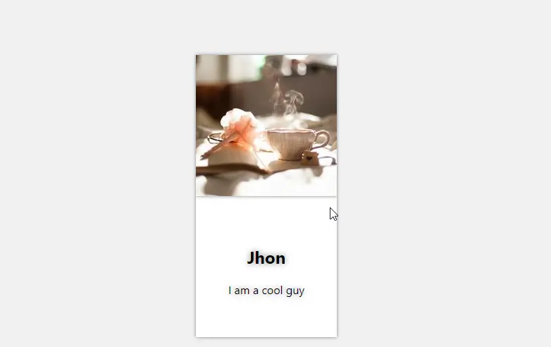
Output
Here is a screenshot of our Blog website.
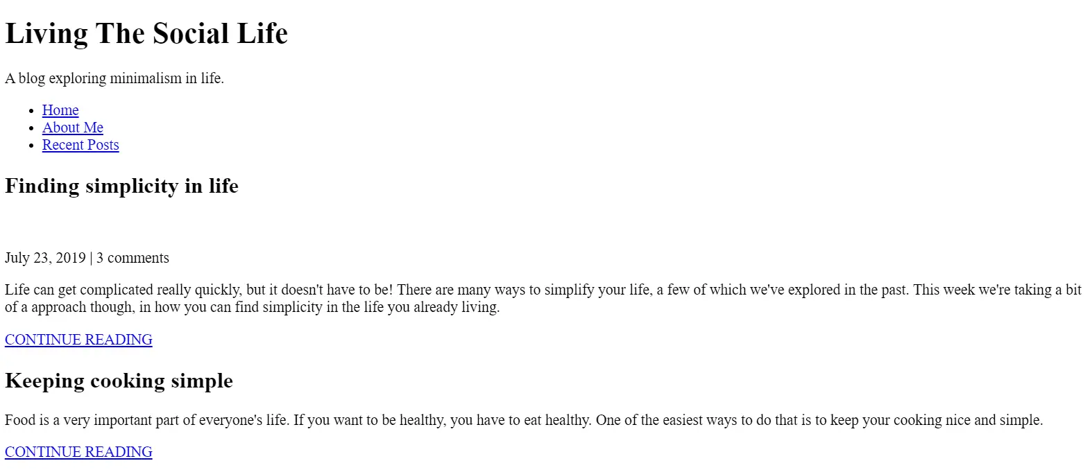
This is how our Blog website looks now. But We can show this to our readers. Let’s style it a bit.
Step 4. Styling our Blog Website
We will start with some basic styling and then move on to the responsive side of it.
Adding Basic Styling
First of all, we have imported some new font faces for our blog website from Google, and then, using the body tag, we have set the padding and margin to zero from the default padding and margin of the web browser.
/* Typography */
@import url("https://fonts.googleapis.com/css2?family=Lora&display=swap");
@import url("https://fonts.googleapis.com/css2?family=Lora&family=Ubuntu:wght@300;400;700&display=swap");

body {
  margin: 0;
  font-family: "Ubuntu", sans-serif;
  font-size: 1.125rem;
  font-weight: 300;
}
Using a tag selector, we will now design our blog website’s components and apply styling to each of its headers. The website’s headers will have their font family, color, padding, and margin configured.
h1,
h2,
h3 {
  font-family: "Lora", serif;
  font-weight: 400;
  color: #143774;
  margin-top: 0;
}

h1 {
  font-size: 2rem;
  margin: 0;
}

a {
  color: #1792d2;
}

a:hover,
a:focus {
  color: #143774;
}

strong {
  font-weight: 700;
}

.subtitle {
  font-size: 0.85rem;
  font-weight: 700;
  margin: 0;
  color: #1792d2;
  letter-spacing: 0.05em;
  font-family: "Ubuntu Bold", sans-serif;
}
Now, let’s move on to the Header section.
Header Section Styling
Using the header tag selector, we will align the text of the header, and using the background property, we will set the background to white for the header. Also, the font family is San Serif. Using the class selector (.navbar), we will add styling to the navbar of the blog website.
header {
  padding: 2em 0;
  text-align: center;
  background: #f0f8ff;
  font-family: sans-serif;
  margin-bottom: 3em;
}

.container-flex {
  max-width: 70vw;
  margin: 0 auto;
  display: flex;
  justify-content: space-between;
  margin-bottom: 1em;
}

nav ul {
  display: flex;
  justify-content: center;
  list-style: none;
  padding: 0;
}

nav li {
  margin: 0 1em;
}

nav a {
  text-decoration: none;
  color: #707070;
  font-weight: 700;
  padding: 0.25em 0;
}

nav a:hover,
nav a:focus {
  color: #143774;
  border-bottom: 1px solid black;
  transition: 0.3s ease;
}

img {
  max-width: 100%;
  display: block;
}

main {
  max-width: 75%;
}

.sidebar {
  max-width: 23%;
}
Next is the Article Section.
Article Section Styling
Here We will style the Article section of our Blog website. We will style our Featured articles a little differently from the recent articles. This will make our Blog website more beautiful and easy to navigate.
/* articles */
.article-body {
  width: 100%;
  text-align: justify;
}

.article-featured {
  border-bottom: #707070 1px solid;
  padding-bottom: 2em;
  margin-bottom: 2em;
}
.article-recent {
  display: flex;
  flex-direction: column;
  margin-bottom: 2em;
}

.article-recent-main {
  order: 2;
}

.article-recent-secondary {
  order: 1;
}

.article-title {
  font-size: 1.5rem;
}

.article-read-more,
.article-info {
  font-size: 0.875rem;
}

.article-read-more {
  color: #1792d2;
  text-decoration: none;
  font-weight: 700;
}
.article-read-more:hover,
.article-read-more:focus {
  color: #143774;
  text-decoration: underline;
}
.article-info {
  margin: 2em 0;
}
Now, we need to style our Footer as well.
Footer Styling
Here we will style up the footer of the blog website using the footer tag selector. We will set the background of our footer to “blue,” and using the color property, we will set the font color to “white”. Using the text-align property, we will set the text-align to center.
footer {
  background: #143774;
  color: white;
  text-align: center;
  padding: 3em 0;
}
footer a {
  text-decoration: none;
  color: white;
}
footer a:hover {
  text-decoration: underline;
  color: white;
}
We also use the hover property on the elements of our footers, and as the user hovers over the elements of the footer section, the elements get automatically underlined and the font color changes to white.
Making the Website Responsive
To make our blog website responsive we will use the CSS @media rule. This rule helps us to apply different CSS styles on different screen (or device) sizes.
@media (max-width: 1050px) {
  .container-flex {
    flex-direction: column;
  }
  .site-title,
  .subtitle {
    width: 100%;
  }
  main {
    max-width: 100%;
  }
  .sidebar {
    max-width: 100%;
  }
}

@media (max-width: 500px) {
  nav ul {
    display: flex;
    flex-direction: column;
  }
  nav li {
    margin: 0.5em 0;
  }
}

@media (min-width: 675px) {
  .article-recent {
    flex-direction: row;
    justify-content: space-between;
  }

  .article-recent-main {
    width: 68%;
  }

  .article-recent-secondary {
    width: 30%;
  }
}
These are the major steps that we have taken to style our blog website. I would personally suggest using your styling skills to add some styling to your own websites and sharing your design with us in the comment box.
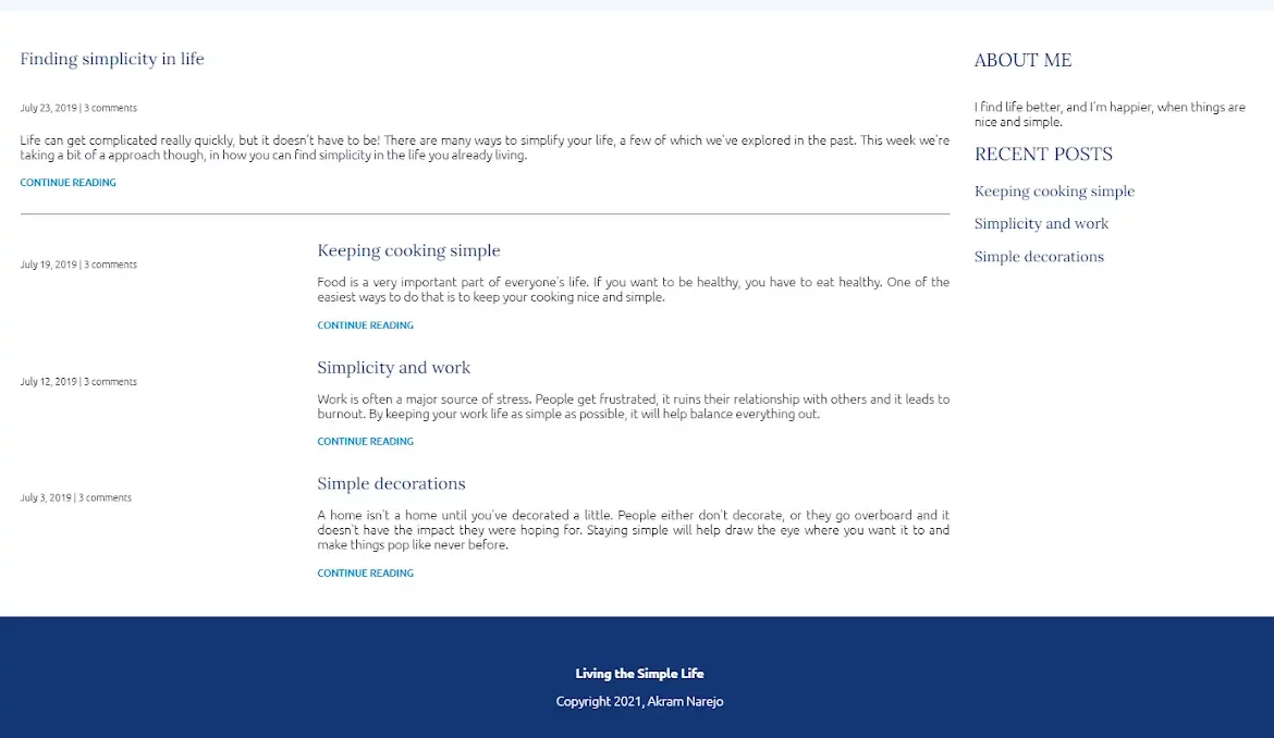
Let’s take a look at the final output of our blog website.
Output
Here is the Codepen output for a live experience.
See the Pen responsive blog website by Rare Programmer (@rareprogrammer) on CodePen.
And here is a screenshot of our blog website in case the above output does not load.
Woohooh, we just created a beautiful blog website using HTML and CSS only. These kinds of small projects help beginners gain command of frontend skills and boost their confidence.
Source Code
The Source Code of this project is available on CodePen – Responsive Blog Website
Conclusion
I hope you got the idea of the project. We just attempted to make the entire thing more beginner-friendly by breaking it down step by step. My advice to beginners is to read and comprehend this material.
Try creating a different type of website on your own. With HTML and CSS, we have finished our blog website. Please feel free to leave a remark below if you are unsure.
