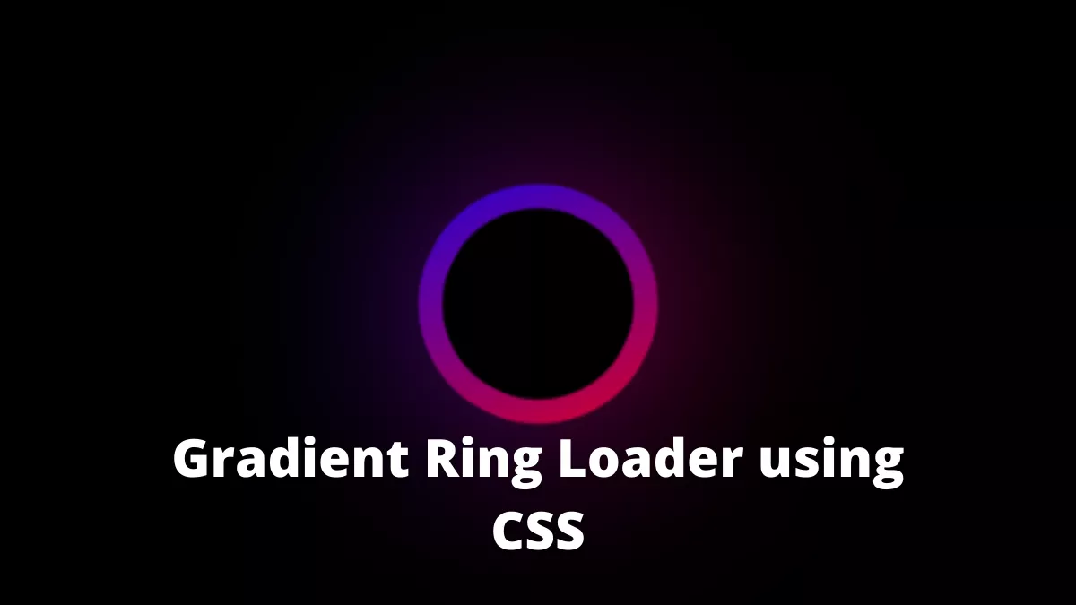
The Gradient Ring Loader using CSS is perfect for the dark mode website. It is a glowing gradient ring rotating 360 degrees. I created this loader while I was trying to create something else but created this one.
Also Read- Morphing Submit Button using CSS
How to create a gradient ring loader using CSS?
To create this, we will first divide this into separate pieces.
- Create a circle
- Create a background gradient
- Create a Ring
- Add the glow
- Animate the ring
Create a Circle
First, we will have to create a circle. We can do this using CSS.
To create a circle we will first create an empty div
<div class="loader"></div>
Here this div has a class named loader. We will add some width and height to it and then make the border-radius 50%
.loader {
  width: 100px;
  height: 100px;
  border-radius: 50%;
}
Create a gradient background
Now, we will create a gradient background for the circle.
To do that we will use a linear gradient as its background image
.loader {
  width: 100px;
  height: 100px;
  border-radius: 50%;
  background-image: linear-gradient(45deg, red, blue);
}
Create a ring
To create a ring, we will add a small circle on top of it with the same background color as the body.
.loader {
  width: 100px;
  height: 100px;
  border-radius: 50%;
  background-image: linear-gradient(45deg, red, blue);
  position: relative;
  z-index: 1;
}

.loader::before {
  content: "";
  width: 80px;
  height: 80px;
  background: var(--bg-color);
  border-radius: 50%;
  position: absolute;
  z-index: 2;
  top: 10px;
  left: 10px;
}
Here we used the ::before pseudo-element for the inner circle.
Learn more about CSS before and after pseudo elements.
Add the glow
To add the glow to the ring we can create another circle with the same background gradient and add the blur filter to it
.loader,
.loader::after {
  width: 100px;
  height: 100px;
  border-radius: 50%;
  background-image: linear-gradient(45deg, red, blue);
  position: relative;
  z-index: 1;
  animation: rotate 2s linear infinite;
}

.loader::after {
  content: "";
  filter: blur(40px);
  display: block;
  position: relative;
  z-index: -1;
}
For the glowing circle, we used the ::after pseudo-element.
Learn more about CSS before and after pseudo elements.
Animate the ring
Finally, we will have to animate it. We can do that by using keyframes in CSS
@keyframes rotate {
  from {
    transform: rotateZ(0deg);
  }
  to {
    transform: rotateZ(360deg);
  }
}
There you have it.
Here is the full CSS
:root {
  --bg-color: black;
}

html,
body {
  margin: 0;
  padding: 0;
  height: 100%;
}

body {
  display: flex;
  justify-content: center;
  align-items: center;
  background: var(--bg-color);
}

.loader,
.loader::after {
  width: 100px;
  height: 100px;
  border-radius: 50%;
  background-image: linear-gradient(45deg, red, blue);
  position: relative;
  z-index: 1;
  animation: rotate 2s linear infinite;
}

.loader::after {
  content: "";
  filter: blur(40px);
  display: block;
  position: relative;
  z-index: -1;
}

@keyframes rotate {
  from {
    transform: rotateZ(0deg);
  }
  to {
    transform: rotateZ(360deg);
  }
}

.loader::before {
  content: "";
  width: 80px;
  height: 80px;
  background: var(--bg-color);
  border-radius: 50%;
  position: absolute;
  z-index: 2;
  top: 10px;
  left: 10px;
}
The source code is available on Github.
If you find this post helpful then please share it with your friends.