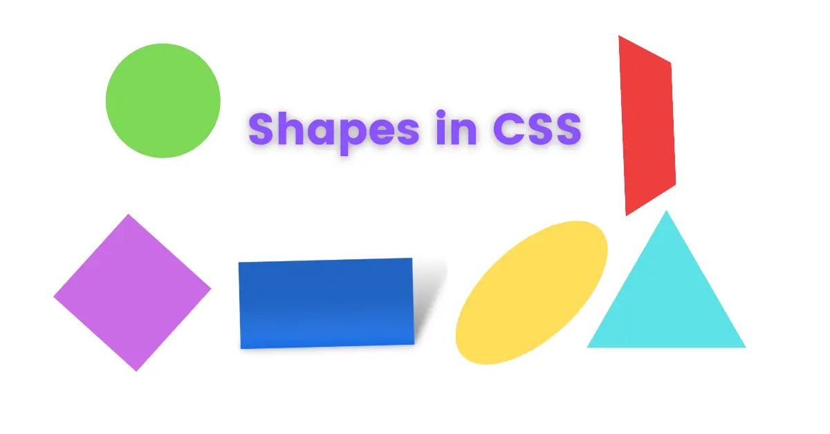
Today we will learn how to create shapes in CSS.
What is CSS?
CSS is a Cascading style sheet. We can create UI for modern web pages with CSS. W3C first introduced CSS on December 17, 1996. And Håkon Wium Lie is the father of CSS.
What is a shape in CSS?
In Math, You can define a shape as the outline or as the form of an object, This is true for CSS as well, but in CSS it is in 2D form.
Why do we need to create shapes in CSS?
Shapes are an important part of the UI. If you are a UI designer, then you should know that how important are shapes.
Everything in the UI is some kind of a shape. It is very helpful when creating the UI.
You can create new and complex shapes using some simple shapes.
Let’s learn how to create shapes in CSS
Square shapes in CSS
First of all, we have to write some HTML code for our CSS to work.
<div>
      <div class="square">
      </div>
</div>
Let’s break it down. First, we write a tag, and inside that, we write another which has the square class attribute.
Why do I write inside a <div> tag? Well, it is a personal preference. I like to have my HTML code sectioned by tags.
Next, we write CSS to create a square.
.square {
	height: 50px;
	width: 50px;
	background-color: blue;
}
Let’s Understand this code.
First, we selected our square class. And then we give it a Height of 50 pixels and a width of 50 pixels.
Why 50 pixels in height and width?
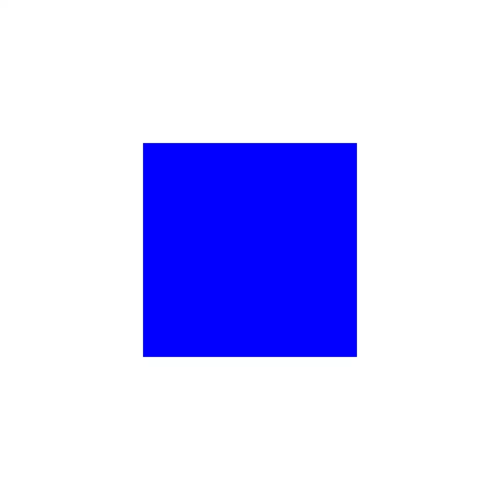
you can replace 50 with any number but since it is a square its height and width must be equal.
Then we give it a background color which is blue, to see the shape on a white webpage.
Rectangle shape in CSS
The code is the same for both square and rectangle, but now you have the freedom to change height and width.
First, we write HTML
<div>
	<div class="rectangle">
	</div>
</div>
this time we changed the class name to the rectangle. again it is a personal preference.
Now its CSS time
.rectangle {
	height: 50px;
	width: 200px;
	background-color: green;
}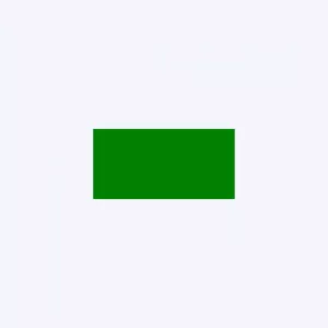
Now as you can see we can give different heights and widths. And we get a rectangle.
Now comes some tricky shapes. Let’s learn them together
Circle shape in CSS
As always we have to write HTML code, so let’s write it
<div>
	<div class="circle">
	</div>
</div>
Now you have learned enough that I don’t need to explain this code.
Let’s head over to our CSS section.
.circle{
	height: 50px;
	width: 50px;
	border-radius: 50%;
	background-color: red;
}
Woh! I know what’s in your mind, but let me explain it to you.
First, we set height and width to 50 pixels and background color to red.

With only height and width set to 50 pixels, we get a square.
but when we set border-radius to 50% we get a circle.
Here border-radius is 50% of height and width which is 25 pixels.
Means we get a perfect circle.
Oval shape in CSS
We will write HTML
<div>
	<div class="oval">
	</div>
</div>
Now its CSS turn
.oval {
	height: 50px;
	width: 100px;
	border-radius: 50%;
	background-color: black;
}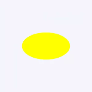
Here we increased the width of the circle and we got an oval shape. This is a horizontal oval but what if we wanted a verticle oval shape.
No problem We need to increase the height.
Triangle shape in CSS
As always HTML
<div>
	<div class="triangle">
	</div>
</div>
This is gonna be a tricky one
.triangle {
	height: 0;
	width: 0;
	border: 25px solid transparent;
	border-bottom: 50px solid orange;
}
You might be thinking of “What?”
In CSS borders are a trapezoid shape.
Let’s understand this
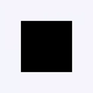
First, we will create a rectangle
<div>
	<div clas="shape">
	</div>
</div>
It’s CSS time
.shape{
	height: 50px;
	width: 50px;
	background-color: black;
}
Now Let’s give its borders some width and different colors
.shape{
	height: 50px;
	width: 50px;
	background-color: black;
	border-top: 5px solid red;
	border-bottom: 5px solid green;
	border-left: 5px solid yellow;
	border-right: 5px solid blue;
}
Now, as you can see borders are in a trapezoid shape.
Let’s set height and width to 0 pixels.
.shape{
	height: 0;
	width: 0;
	background-color: black;
	border-top: 5px solid red;
	border-bottom: 5px solid green;
	border-left: 5px solid yellow;
	border-right 5px solid blue;
}
At this point, you get that how triangles in CSS works. if not, then bear with me.
Let me remove the background color since it has no use.
Let’s make all borders, transparent except the bottom one.
.shape{
	height: 0;
	width: 0;
	border-top: 5px solid transparent;
	border-left: 5px solid transparent;
	border-right 5px solid transparent;
	border-bottom: 5px solid green;
}
And we get a tringle. Cool huh!
If you still didn’t understand then do a comment I will make a video on this topic.
Trapezoid shape in CSS
Since borders are trapezoid shape we can make a trapezoid shape as well.
Let’s do it
<div>
	<div class="trapzoid">
	</div>
</div>
We need to increase the width in our previs example
.trapzoid{
	height: 0;
	width: 100px;
	border: 25px solid transparent;
	border-bottom: 50px solid green;
}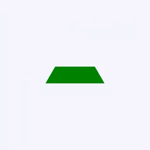
Boom! We have a trapezoid shape. It is a bottom border with a length of 100 pixels.
Parallelogram shape in CSS
Let me do the boring task
<div>
	<div class="parallelogram">
	</div>
</div>
Now here is the CSS for a Parallelogram shape
.parallelogram{
	height: 50px;
	width: 100px;
	background-color: red;
	transform: skew(20deg);
}
In CSS skew() function distorts every point in an element by a certain angle.
Its syntax is skew(ax, ay) or skews (ax) where ax is an angle along the x-axis and ay is an angel along the y-axis.
Here we distorted a rectangle by 20 degrees to get a Parallelogram shape.
Conclusion
This is not over yet, you can create new shapes by combining these shapes. It all depends on your creativity. Like we can create a diamond shape by using two tringles or a parallelogram and a tringle.
Remember CSS is vast and we still don’t know its full power. CSS has many properties and we will discover them together. You should practice CSS every day, You will get better at it.
With that said, This lesson ends here and if you find this post useful then please share this post and do comment. It helps a lot by motivating me.
