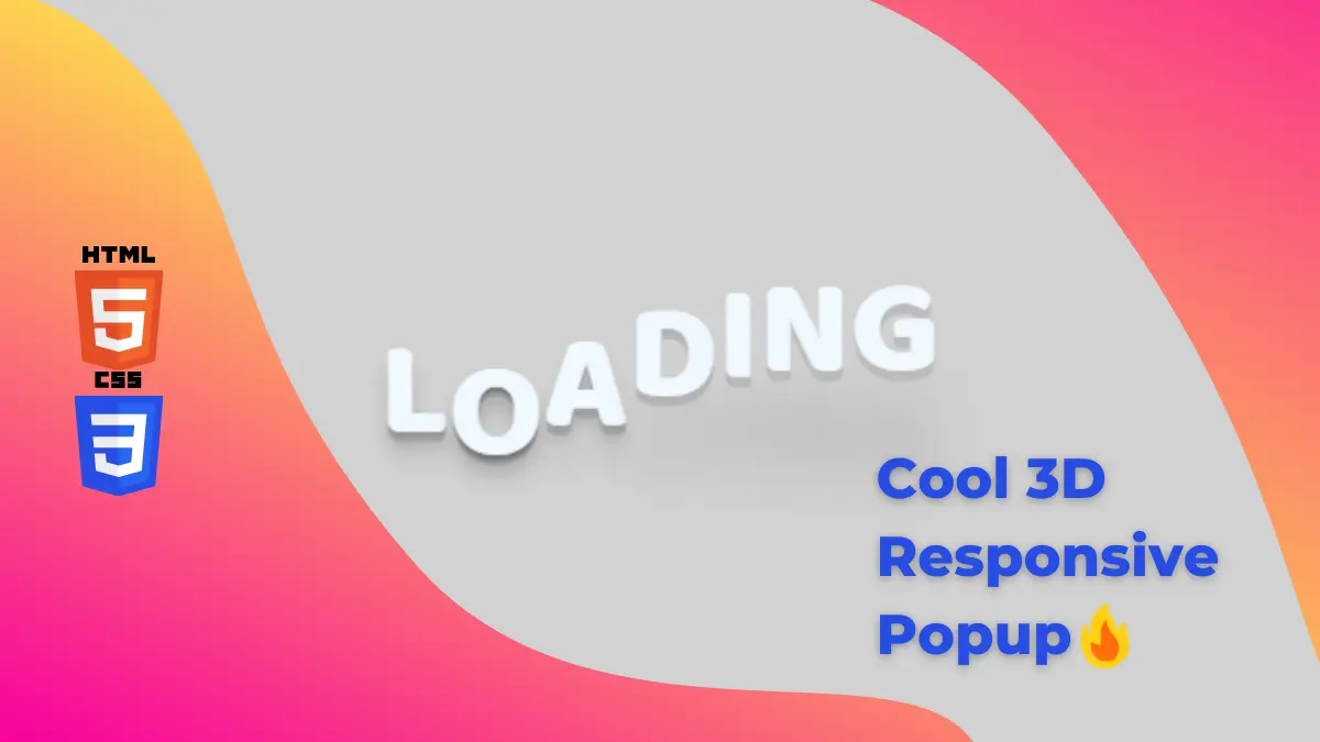
3D Bounce loading animation using CSS is a cool loading animation that brings attention to the website.
Also Read- 3D Responsive popup in CSS
How to create 3D Bounce Loading animation using CSS?
Step 1:
First, we will create an HTML file and write the below code.
<!DOCTYPE html>
<html lang="en">
  <head>
    <meta charset="UTF-8" />
    <meta http-equiv="X-UA-Compatible" content="IE=edge" />
    <meta name="viewport" content="width=device-width, initial-scale=1.0" />
    <link rel="stylesheet" href="style.css" />
    <title>3D Bounce Loading</title>
  </head>
  <body>
    <div class="loading">Loading</div>
    <script src="main.js"></script>
  </body>
</html>
Step 2:
Now, we will create a style.css file so we can give our animation some style and cool look. You can copy the below code
@import url("https://fonts.googleapis.com/css?family=Baloo+Bhaijaan&display=swap");
html,
body {
  padding: 0;
  margin: 0;
  height: 100%;
}
body {
  display: flex;
  justify-content: center;
  align-items: center;
  background: rgb(209, 209, 209);
}

.loading {
  display: flex;
  color: aliceblue;
  font-size: 4em;
  font-family: "Baloo Bhaijaan", cursive;
  text-transform: uppercase;
}
.loading span {
  text-shadow: 0 1px rgba(0, 0, 0, 0.1), 0 2px rgba(0, 0, 0, 0.1),
    0 3px rgba(0, 0, 0, 0.1), 0 4px rgba(0, 0, 0, 0.1), 0 5px rgba(0, 0, 0, 0.1),
    0 6px transparent, 0 7px transparent, 0 8px transparent, 0 9px transparent,
    0 10px 10px rgba(0, 0, 0, 0.2);
  transform: translateY(20px);
  animation: bounce 0.5s ease infinite alternate;
}

@keyframes bounce {
  to {
    text-shadow: 0 1px #bbb, 0 2px #bbb, 0 3px #bbb, 0 4px #bbb, 0 5px #bbb,
      0 6px #bbb, 0 7px #bbb, 0 8px #bbb, 0 9px #bbb,
      0 50px 25px rgba(0, 0, 0, 0.1);
    transform: translateY(-20px);
  }
}
Step 3:
Finally, we will add some javascript to animate our loading animation. The trick here is to animate every character with some delay.
let loading = document.querySelector(".loading");
let letters = loading.textContent.split("");
loading.textContent = "";
letters.forEach((letter, i) => {
  let span = document.createElement("span");
  span.textContent = letter;
  span.style.animationDelay = `${i / 10}s`;
  loading.append(span);
});
Boom! We did it.
Thanks for reading. If you find this article helpful then, please do share it with your friends and comment. It motivates me to write more articles.


