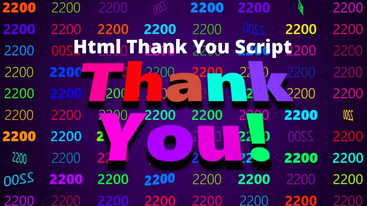
Today we will create a beautiful thank you page with the help of javascript. This HTML thank you script is a step-by-step tutorial. We will learn the basics of DOM manipulation using Javascript.
Also, Read- Animated Tab Bar Using JavaScript
HTML thank you Script
We can start by writing some HTML.
Step 1: HTML
First, create an index.html page and write the below code.
Note– click the below code to copy it.
<!DOCTYPE html>
<html lang="en">
  <head>
    <meta charset="UTF-8" />
    <meta http-equiv="X-UA-Compatible" content="IE=edge" />
    <meta name="viewport" content="width=device-width, initial-scale=1.0" />
    <link rel="stylesheet" href="style.css" />
    <script src="main.js" defer></script>
    <title>Thank You for 2200 Followers</title>
  </head>
  <body>
    <h1>
      <p>
        <span>T</span><span>h</span><span>a</span><span>n</span><span>k</span>
        <br />
        <span>Y</span><span>o</span><span>u</span><span>!</span>
      </p>
    </h1>
  </body>
</html>
Step 2: CSS
Next, We will create a style.css file and write the below code.
html {
  overflow: hidden;
  line-height: calc(100vh / 10);
  text-align: center;
  font-family: system-ui, sans-serif;
  font-size: 3vw;
  background: radial-gradient(circle, transparent, black), indigo;
  color: white;
}

body {
  margin: 0;
  perspective: 1000px;
}

h1 {
  position: absolute;
  top: 50%;
  left: 50%;
  z-index: 1;
  margin: 0;
  color: gold;
  font-size: calc(10vw + 10vh + 2vmin);
  line-height: 90%;
  font-weight: 900;
  transform: translate(-50%, -50%) rotateX(35deg);
  text-shadow: 0px 25px 0 black, 0px 25px 10px black;
  transition: 0.3s ease-in-out;
}

div {
  width: calc(100vw / 10);
  height: calc(100vh / 10);
  padding: 0;
  display: inline-block;
  box-sizing: border-box;
  z-index: -1;
}

span {
  transition: 1s;
}

.spin {
  animation: spin 2s linear forwards;
}

@keyframes spin {
  100% {
    transform: rotateY(360deg);
  }
}
Here we defined the web page style and the animation.
Step 3: Javascript
Now, we will create the main.js file and copy the below code.
const body = document.body;
for (var i = 0; i < 100; i++) {
  var div = document.createElement("div");
  div.innerText = "2200";
  div.style.color = "hsl(" + Math.random() * 360 + "deg, 100%, 50%)";
  div.style.fontWeight = Math.floor(Math.random() * 10) * 100;
  body.appendChild(div);
}

function spin(eName) {
  var elementName = document.querySelectorAll(eName);
  var num = Math.floor(Math.random() * elementName.length);
  elementName[num].classList.add("spin");
  elementName[num].onanimationend = function () {
    elementName[num].classList.remove("spin");
  };

  setTimeout(function () {
    spin(eName);
  }, 100);
}

function changeSpanColor() {
  var spans = document.querySelectorAll("span");
  var num = Math.floor(Math.random() * spans.length);
  spans[num].style.color = "hsl(" + Math.random() * 360 + "deg, 100%, 50%)";

  setTimeout(changeSpanColor, 200);
}

spin("div");
changeSpanColor();
In the above code, we are creating 100 div elements and adding the spin animation to them.
Full code
The source code is available on Github.
I hope you will find this tutorial helpful. Please share this with your friends.
Until Next time.