Hello, today we are going to create a confetti button. This is used as a playful design choice that adds a touch of joy and engagement to the user interface, creating a positive and memorable interaction for users.
What is a Confetti Button?
The term “Confetti Button” typically refers to a virtual button or feature in digital platforms, applications, or websites. When activated, it initiates a celebratory animation where virtual confetti falls or bursts onto the screen.
HTML
We can divide the code of HTML into three parts to understand it,
Let’s break: –
Button Element
<button id="button" class="ready" onclick="clickButton();">This is a button element with the ID “button” and the class “ready”. The “onclick” attribute is set to call the JavaScript function “clickButton()” when the button is clicked.
Message Division within the Button
<div class="message submitMessage">
      <svg xmlns="http://www.w3.org/2000/svg" viewBox="0 0 13 12.2">
        <polyline stroke="currentColor" points="2,7.1 6.5,11.1 11,7.1 "/>
        <line stroke="currentColor" x1="6.5" y1="1.2" x2="6.5" y2="10.3"/>
      </svg> <span class="button-text">Submit</span>
    </div>

    <div class="message loadingMessage">
      <svg xmlns="http://www.w3.org/2000/svg" viewBox="0 0 19 17">
        <circle class="loadingCircle" cx="2.2" cy="10" r="1.6"/>
        <circle class="loadingCircle" cx="9.5" cy="10" r="1.6"/>
        <circle class="loadingCircle" cx="16.8" cy="10" r="1.6"/>
      </svg>
    </div>

    <div class="message successMessage">
      <svg xmlns="http://www.w3.org/2000/svg" viewBox="0 0 13 11">
        <polyline stroke="currentColor" points="1.4,5.8 5.1,9.5 11.6,2.1 "/>
      </svg> <span class="button-text">Success</span>
    </div>
The Button has three different states represented by three “<div>” elements with classes: –
“submitMessage”
“loadingMessage”
“successMessage”
Each state has an associated SVG icon and text.
Canvas Element
<canvas id="canvas"></canvas>An HTML5 “<canvas>” element with the ID “canvas” is included. This canvas is likely used to render and display the confetti animation using JavaScript.
CSS
We can divide the CSS code into 10 parts to design the confetti button and also set the animation for the confetti button.
Let’s Start: –
CSS Variables
:root{
  --bgColor: #f4f7ff;
  --btnTxtColor: #f4f7ff;
  --btnBgPreColor: #1f2335;
  --btnSubmitColor: #5c86ff;
  --successColor: #5cffa1;
  --loadingColor: #5c86ff;
}
These variables are placeholders for colors, allowing for easy consistent color adjustments.
KeyFrames Animation
@keyframes loading {
  0% {
    cy: 10;
  }
  25% {
    cy: 3;
  }
  50% {
    cy: 10;
  }
}
Here we define a keyframe animation named “loading”. It is used to animate an SVG circle’s vertical position (cy) to create a loading effect.
Body and Canvas Style
body {
  -webkit-font-smoothing: antialiased;
  background-color: var(--bgColor);
}

canvas {
  height: 100vh;
  pointer-events: none;
  position: fixed;
  width: 100%;
  z-index: 2;
}
Here we define the background color for the body and provide styling for the confetti animation canvas, such as fixed positioning and dimensions.
Button Styling
button {
  background: none;
  border: none;
  color: var(--btnTxtColor);
  cursor: pointer;
  font-family: "Quicksand", sans-serif;
  font-size: 14px;
  font-weight: 500;
  height: 40px;
  left: 50%;
  outline: none;
  overflow: hidden;
  padding: 0 10px;
  position: fixed;
  top: 50%;
  transform: translate(-50%, -50%);
  width: 190px;
  -webkit-tap-highlight-color: transparent;
  z-index: 1;
}
button::before {
  background: var(--btnBgPreColor);
  border-radius: 50px;
  box-shadow: 0 2px 5px rgba(0, 0, 0, 0.4) inset;
  content: "";
  display: block;
  height: 100%;
  margin: 0 auto;
  position: relative;
  transition: width 0.2s cubic-bezier(0.39, 1.86, 0.64, 1) 0.3s;
  width: 100%;
}
Here we define the styles for the main button and its pseudo-element, including positioning, dimensions, and transitions.
Button States Styling
button.ready .submitMessage svg {
  opacity: 1;
  top: 1px;
  transition: top 0.4s ease 600ms, opacity 0.3s linear 600ms;
}
button.ready .submitMessage .button-text span {
  top: 0;
  opacity: 1;
  transition: all 0.2s ease calc(var(--dr) + 600ms);
}

button.loading::before {
  transition: width 0.3s ease;
  width: 80%;
}
button.loading .loadingMessage {
  opacity: 1;
}
button.loading .loadingCircle {
  animation-duration: 1s;
  animation-iteration-count: infinite;
  animation-name: loading;
  cy: 10;
}

button.complete .submitMessage svg {
  top: -30px;
  transition: none;
}
button.complete .submitMessage .button-text span {
  top: -8px;
  transition: none;
}
button.complete .loadingMessage {
  top: 80px;
}
button.complete .successMessage .button-text span {
  left: 0;
  opacity: 1;
  transition: all 0.2s ease calc(var(--d) + 1000ms);
}
button.complete .successMessage svg {
  stroke-dashoffset: 0;
  transition: stroke-dashoffset 0.3s ease-in-out 1.4s;
}
Here we provide a style for different states of the button, such as “ready”, “loading”, and “complete”. Each state has specific styles for the SVG icons, loading animation, and other visual elements.
Text and Messaging Styling
.button-text span {
  opacity: 0;
  position: relative;
}

.message {
  left: 50%;
  position: absolute;
  top: 50%;
  transform: translate(-50%, -50%);
  width: 100%;
}

.message svg {
  display: inline-block;
  fill: none;
  margin-right: 5px;
  stroke-linecap: round;
  stroke-linejoin: round;
  stroke-width: 2;
}
Here we define the style of text within the button and styles for messages container and SVG icons inside these messages.
Submit Message Style
.submitMessage .button-text span {
  top: 8px;
  transition: all 0.2s ease var(--d);
}
.submitMessage svg {
  color: var(--btnSubmitColor);
  margin-left: -1px;
  opacity: 0;
  position: relative;
  top: 30px;
  transition: top 0.4s ease, opacity 0.3s linear;
  width: 14px;
}
Here we define:
- The span element within the submit message is positioned 8 pixels from the top and undergoes a transition with a duration of 0.2 seconds and an ease-in-out timing function, with a delay specified by the –d CSS variable
- The SVG icon within the submit message has a color set by the –btnSubmitColor variable. It starts with an initial opacity of 0, positioned 30 pixels from the top, and transitions both its top position and opacity over time.
Loading Message Style
.loadingMessage {
  opacity: 0;
  transition: opacity 0.3s linear 0.3s, top 0.4s cubic-bezier(0.22, 0, 0.41, -0.57);
}
.loadingMessage svg {
  fill: var(--loadingColor);
  margin: 0;
  width: 22px;
}
Here we define:
- The loading message container initially has an opacity of 0, and its opacity transitions linearly over 0.3 seconds with a delay of 0.3 seconds. Additionally, its top position undergoes a cubic-bezier transition for 0.4 seconds, creating a specific timing effect.
- The SVG icon within the loading message is filled with a color specified by the –loadingColor variable. It has no margin, and its width is set to 22 pixels.
Success Message Style
.successMessage svg {
  color: var(--successColor);
  stroke-dasharray: 20;
  stroke-dashoffset: 20;
  transition: stroke-dashoffset 0.3s ease-in-out;
  width: 14px;
}
Here we define:
- The span within the success message is positioned 5 pixels from the left and undergoes a transition with a duration of 0.2 seconds and an ease-in-out timing function, with a delay specified by the –dr CSS variable.
- The SVG icon within the success message has a color set by the –successColor variable. It has a stroke-dasharray and stroke-dashoffset set initially to 20, and the stroke-dashoffset transitions over 0.3 seconds with an ease-in-out timing function.
Animation Delay
.loadingCircle:nth-child(2) {
  animation-delay: 0.1s;
}

.loadingCircle:nth-child(3) {
  animation-delay: 0.2s;
}
Here we add animation delays for specific loading circles, creating a staggered effect in the loading animation.
JavaScript
We can divide the JavaScript code into parts to create a functional confetti Button.
Let’s Start: –
Initialization and Constants
const confettiCount = 20
const sequinCount = 10
const gravityConfetti = 0.3
const gravitySequins = 0.55
const dragConfetti = 0.075
const dragSequins = 0.02
const terminalVelocity = 3
Here we define constant variables that are declared to set the initial configuration for the confetti and sequins. The counts of confetti and sequins, along with various physics-related parameters like gravity, drag, and terminal velocity, are defined here.
Global Elements and Canvas Setup
const button = document.getElementById('button')
var disabled = false
const canvas = document.getElementById('canvas')
const ctx = canvas.getContext('2d')
canvas.width = window.innerWidth
canvas.height = window.innerHeight
let cx = ctx.canvas.width / 2
let cy = ctx.canvas.height / 2
Here we initialize global elements such as the button and canvas. The canvas is set to fill the entire window, and the context (ctx) is obtained for drawing.
Confetti and Sequin Setup
let confetti = []
let sequins = []

const colors = [
  { front : '#7b5cff', back: '#6245e0' }, // Purple
  { front : '#b3c7ff', back: '#8fa5e5' }, // Light Blue
  { front : '#5c86ff', back: '#345dd1' }  // Darker Blue
]
Here we define arrays (confetti and sequins) that are initialized to store instances of Confetto and Sequin objects. Additionally, an array of colors is defined, specifying front and back colors for the confetti.
Helper Function
randomRange = (min, max) => Math.random() * (max - min) + min

// helper function to get initial velocities for confetti
// this weighted spread helps the confetti look more realistic
initConfettoVelocity = (xRange, yRange) => {
  const x = randomRange(xRange[0], xRange[1])
  const range = yRange[1] - yRange[0] + 1
  let y = yRange[1] - Math.abs(randomRange(0, range) + randomRange(0, range) - range)
  if (y >= yRange[1] - 1) {
    // Occasional confetto goes higher than the max
    y += (Math.random() < .25) ? randomRange(1, 3) : 0
  }
  return {x: x, y: -y}
}
Here we define helper functions. “randomRange” generates a random number within a specified range, while “initConfettoVelocity” calculates initial velocities for confetti, providing a weighted spread for a more realistic appearance.
Confetto Class
function Confetto() {
  this.randomModifier = randomRange(0, 99)
  this.color = colors[Math.floor(randomRange(0, colors.length))]
  this.dimensions = {
    x: randomRange(5, 9),
    y: randomRange(8, 15),
  }
  this.position = {
    x: randomRange(canvas.width/2 - button.offsetWidth/4, canvas.width/2 + button.offsetWidth/4),
    y: randomRange(canvas.height/2 + button.offsetHeight/2 + 8, canvas.height/2 + (1.5 * button.offsetHeight) - 8),
  }
  this.rotation = randomRange(0, 2 * Math.PI)
  this.scale = {
    x: 1,
    y: 1,
  }
  this.velocity = initConfettoVelocity([-9, 9], [6, 11])
}
Confetto.prototype.update = function() {
  // apply forces to velocity
  this.velocity.x -= this.velocity.x * dragConfetti
  this.velocity.y = Math.min(this.velocity.y + gravityConfetti, terminalVelocity)
  this.velocity.x += Math.random() > 0.5 ? Math.random() : -Math.random()

  // set position
  this.position.x += this.velocity.x
  this.position.y += this.velocity.y

  // spin confetto by scaling y and set the color, .09 just slows cosine frequency
  this.scale.y = Math.cos((this.position.y + this.randomModifier) * 0.09)
}
Here we define a constructor function for the Confetto class. Instances of Confetto represent individual pieces of confetti, each with properties like position, color, dimensions, rotation, and velocity. The update method handles the physics of the confetti, including movement and rotation.
Sequin Class
function Sequin() {
  this.color = colors[Math.floor(randomRange(0, colors.length))].back,
  this.radius = randomRange(1, 2),
  this.position = {
    x: randomRange(canvas.width/2 - button.offsetWidth/3, canvas.width/2 + button.offsetWidth/3),
    y: randomRange(canvas.height/2 + button.offsetHeight/2 + 8, canvas.height/2 + (1.5 * button.offsetHeight) - 8),
  },
  this.velocity = {
    x: randomRange(-6, 6),
    y: randomRange(-8, -12)
  }
}
Sequin.prototype.update = function() {
  // apply forces to velocity
  this.velocity.x -= this.velocity.x * dragSequins
  this.velocity.y = this.velocity.y + gravitySequins

  // set position
  this.position.x += this.velocity.x
  this.position.y += this.velocity.y
}
Similar to Confetto, this is a constructor function for the Sequin class. Sequin instances represent individual sequins with properties like color, position, radius, and velocity. The update method handles the physics of the sequin.
Initialization Function
initBurst = () => {
  for (let i = 0; i < confettiCount; i++) {
    confetti.push(new Confetto())
  }
  for (let i = 0; i < sequinCount; i++) {
    sequins.push(new Sequin())
  }
}
Render Function
render = () => {
  ctx.clearRect(0, 0, canvas.width, canvas.height)

  confetti.forEach((confetto, index) => {
    let width = (confetto.dimensions.x * confetto.scale.x)
    let height = (confetto.dimensions.y * confetto.scale.y)

    // move canvas to position and rotate
    ctx.translate(confetto.position.x, confetto.position.y)
    ctx.rotate(confetto.rotation)

    // update confetto "physics" values
    confetto.update()

    // get front or back fill color
    ctx.fillStyle = confetto.scale.y > 0 ? confetto.color.front : confetto.color.back

    // draw confetto
    ctx.fillRect(-width / 2, -height / 2, width, height)

    // reset transform matrix
    ctx.setTransform(1, 0, 0, 1, 0, 0)

    // clear rectangle where button cuts off
    if (confetto.velocity.y < 0) {
      ctx.clearRect(canvas.width/2 - button.offsetWidth/2, canvas.height/2 + button.offsetHeight/2, button.offsetWidth, button.offsetHeight)
    }
  })

  sequins.forEach((sequin, index) => {
    // move canvas to position
    ctx.translate(sequin.position.x, sequin.position.y)

    // update sequin "physics" values
    sequin.update()

    // set the color
    ctx.fillStyle = sequin.color

    // draw sequin
    ctx.beginPath()
    ctx.arc(0, 0, sequin.radius, 0, 2 * Math.PI)
    ctx.fill()

    // reset transform matrix
    ctx.setTransform(1, 0, 0, 1, 0, 0)

    // clear rectangle where button cuts off
    if (sequin.velocity.y < 0) {
      ctx.clearRect(canvas.width/2 - button.offsetWidth/2, canvas.height/2 + button.offsetHeight/2, button.offsetWidth, button.offsetHeight)
    }
  })

  // remove confetti and sequins that fall off the screen
  // must be done in seperate loops to avoid noticeable flickering
  confetti.forEach((confetto, index) => {
    if (confetto.position.y >= canvas.height) confetti.splice(index, 1)
  })
  sequins.forEach((sequin, index) => {
    if (sequin.position.y >= canvas.height) sequins.splice(index, 1)
  })

  window.requestAnimationFrame(render)
}
Here we define the “render” function as responsible for drawing the confetti and sequins on the canvas. It utilizes the HTML5 canvas API to create a dynamic animation. The function clears the canvas, updates the position and appearance of each confetti and sequin, and then renders them. It uses transformations and rotations to achieve a visually appealing effect.
Button Click Function
clickButton = () => {
  if (!disabled) {
    disabled = true
    // Loading stage
    button.classList.add('loading')
    button.classList.remove('ready')
    setTimeout(() => {
      // Completed stage
      button.classList.add('complete')
      button.classList.remove('loading')
      setTimeout(() => {
        window.initBurst()
        setTimeout(() => {
          // Reset button so user can select it again
          disabled = false
          button.classList.add('ready')
          button.classList.remove('complete')
        }, 4000)
      }, 320)
    }, 1800)
  }
}
Here we define the “clickButton” function simulates a button click event. It sets the button to a loading state, transitions to a completed state, triggers the confetti burst, and finally resets the button for user interaction.
Canvas Resize Function
resizeCanvas = () => {
  canvas.width = window.innerWidth
  canvas.height = window.innerHeight
  cx = ctx.canvas.width / 2
  cy = ctx.canvas.height / 2
}
Here we define the “resizeCanvas” function adjusts the canvas size when the window is resized to ensure responsiveness.
Event Listeners
window.addEventListener('resize', () => {
  resizeCanvas()
})

document.body.onkeyup = (e) => {
  if (e.keyCode == 13 || e.keyCode == 32) {
    clickButton()
  }
}
These event listeners handle window resizing and key presses. Resizing the window triggers the “resizeCanvas” function, and pressing the Enter or Spacebar keys triggers the “clickButton” function.
Text Transition Setup
textElements = button.querySelectorAll('.button-text')
textElements.forEach((element) => {
  characters = element.innerText.split('')
  let characterHTML = ''
  characters.forEach((letter, index) => {
    characterHTML += `<span class="char${index}" style="--d:${index * 30}ms; --dr:${(characters.length - index - 1) * 30}ms;">${letter}</span>`
  })
  element.innerHTML = characterHTML
})
This part sets up transition timings for individual characters in the button text, creating a visually appealing text effect.
Text Transition Setup
window.initBurst()
render()
Here we define the script initialize the confetti and sequins using “initBurst” and then start the animation loop with render. The animation continuously updates and renders the confetti and sequins on the canvas, creating an engaging visual experience.
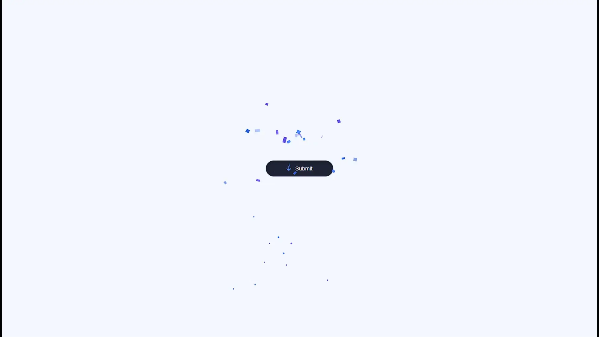
Output
See the Pen Confetti Button by Cooper Goeke (@coopergoeke) on CodePen.
Conclusion
Now we are ending this project with an amazing confetti button, which attracts people to click on it and make it more engageable.