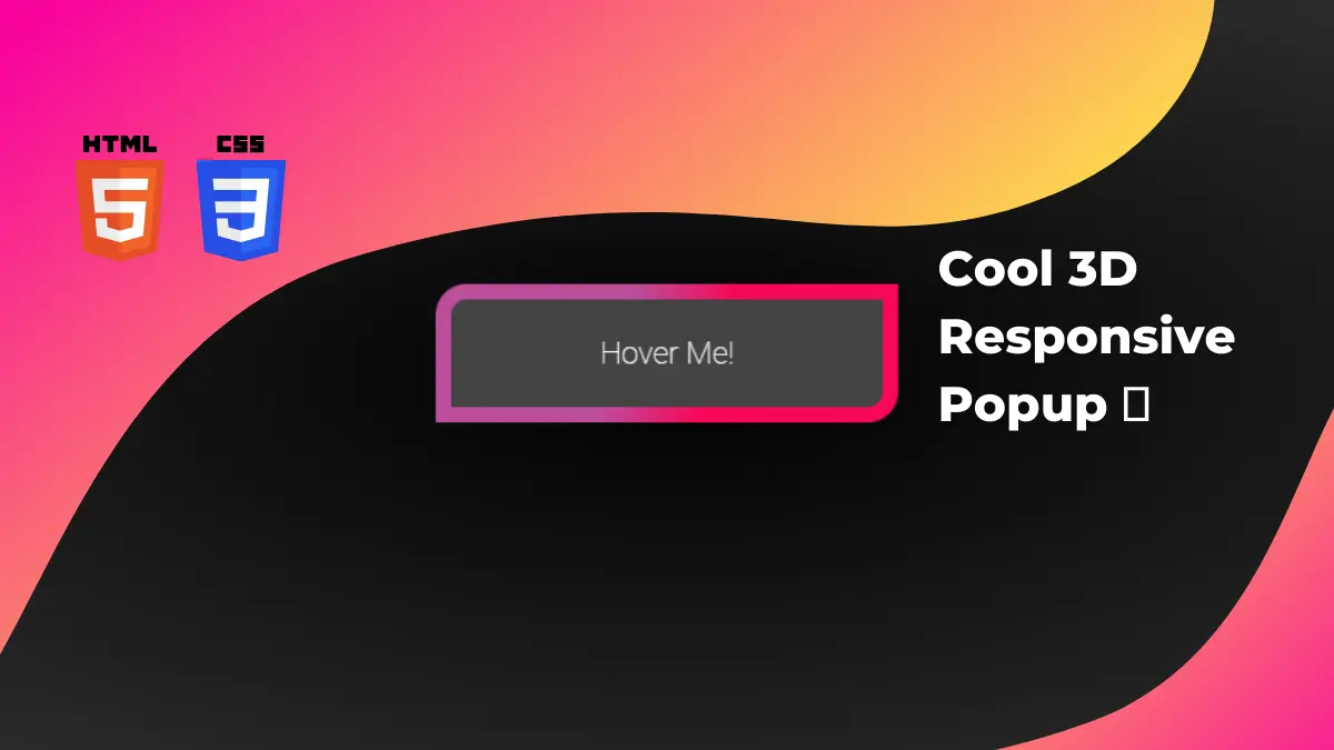
3D Responsive popup in CSS is a cool effect on your website. This is a 3D effect we can create using CSS and JavaScript.
How to create a 3D responsive popup in CSS and JavaScript?
Step 1:
First, we will create our HTML file and copy the below code
<!DOCTYPE html>
<html lang="en">
  <head>
    <meta charset="UTF-8" />
    <meta http-equiv="X-UA-Compatible" content="IE=edge" />
    <meta name="viewport" content="width=device-width, initial-scale=1.0" />
    <link rel="stylesheet" href="style.css" />
    <title>3D Responsive Popup</title>
  </head>
  <body>
    <div class="moving-zone">
      <div class="popup">
        <div class="popup-content">
          <div class="popup-text">Hover Me!</div>
        </div>
      </div>
    </div>

    <script src="https://cdnjs.cloudflare.com/ajax/libs/jquery/2.1.3/jquery.min.js"></script>
    <script src="main.js"></script>
  </body>
</html>
Step 2:
Next, we will create style.css file with the below code
html,
body {
  height: 100%;
}
body {
  margin: 0;
  background: radial-gradient(#000, #333);
  overflow: hidden;
}

.moving-zone {
  position: absolute;
  top: 50%;
  left: 50%;
  width: 300px;
  height: 120px;
  margin: -60px 0 0 -150px;
  perspective: 1000px;
}
.popup {
  position: absolute;
  width: 300px;
  padding: 10px;
  box-sizing: border-box;
  border-radius: 20px 0 20px 0;
  cursor: pointer;
  transform-style: preserve-3d;
  background: -webkit-linear-gradient(top left, #bc4e9c 40%, #f80759 60%);
}
.popup:before {
  content: "";
  position: absolute;
  left: 5%;
  top: 5%;
  width: 90%;
  height: 90%;
  border-radius: inherit;
  background: rgba(0, 0, 0, 0.1);
  box-shadow: 0 0 40px 20px rgba(0, 0, 0, 0.1);
  transform: translateZ(-100px);
}
.popup-content {
  background: #444;
  padding: 20px;
  box-sizing: border-box;
  border-radius: 10px 0 10px 0;
}
.popup-text {
  color: white;
  font-family: "Roboto", sans-serif;
  font-size: 20px;
  line-height: 30px;
  font-weight: 100;
  text-align: center;
  transform: translateZ(15px);
}
Step 3:
Now, we will create main.js file and copy the below code
var moveForce = 30; // max popup movement in pixels
var rotateForce = 20; // max popup rotation in deg

$(document).mousemove(function (e) {
  var docX = $(document).width();
  var docY = $(document).height();

  var moveX = ((e.pageX - docX / 2) / (docX / 2)) * -moveForce;
  var moveY = ((e.pageY - docY / 2) / (docY / 2)) * -moveForce;

  var rotateY = (e.pageX / docX) * rotateForce * 2 - rotateForce;
  var rotateX = -((e.pageY / docY) * rotateForce * 2 - rotateForce);

  $(".popup")
    .css("left", moveX + "px")
    .css("top", moveY + "px")
    .css(
      "transform",
      "rotateX(" + rotateX + "deg) rotateY(" + rotateY + "deg)"
    );
});
Boom! You have it.
If you find this post helpful then please do share and comment.