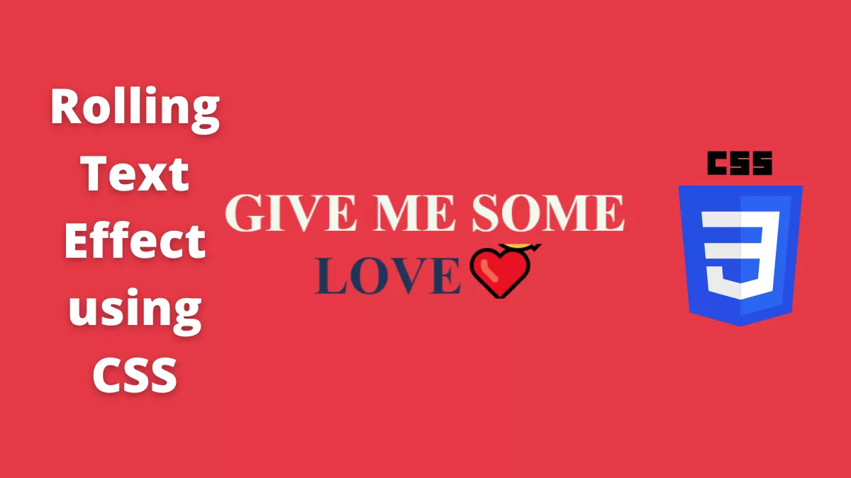
Today, we will learn how to create a rolling text effect using CSS. This effect is a cool-looking effect, you can try and learn from it.
Also, Read- Colossal Titan using CSS
How to create a Rolling text effect using CSS?
This is a simple CSS effect. We use some animation to achieve this effect.
Step 1:
We will start by creating an HTML file and writing the below code
<!DOCTYPE html>
<html lang="en">
  <head>
    <meta charset="UTF-8" />
    <meta http-equiv="X-UA-Compatible" content="IE=edge" />
    <meta name="viewport" content="width=device-width, initial-scale=1.0" />
    <link rel="stylesheet" href="style.css" />
    <title>CSS Rolling Text</title>
  </head>
  <body>
    <div class="main">
      <h1>
        Give me Some
        <div class="roller">
          <span id="rolltext">
            Hugs🤗<br />
            Kisses😘<br />
            Love❤️<br />
            <span id="spare-time">Chocolates🍫</span><br />
          </span>
        </div>
      </h1>
    </div>
  </body>
</html>
Step 2:
Next, we will create a style.css file and copy the below code
* {
  margin: 0;
  padding: 0;
  font-family: "Arvo";
}

body {
  background-color: #e63946;
}

.main {
  height: 100vh;
  width: 100%;
  display: flex;
  align-items: center;
  justify-content: center;
  text-align: center;
}
h1 {
  text-align: center;
  text-transform: uppercase;
  color: #f1faee;
  font-size: 4rem;
}

.roller {
  height: 4.125rem;
  line-height: 4rem;
  position: relative;
  overflow: hidden;
  width: 100%;
  display: flex;
  justify-content: center;
  align-items: center;

  color: #1d3557;
}

#spare-time {
  font-size: 1rem;
  font-style: italic;
  letter-spacing: 1rem;
  margin-top: 0;
  color: #a8dadc;
}

.roller #rolltext {
  position: absolute;
  top: 0;
  animation: slide 5s infinite;
}

@keyframes slide {
  0% {
    top: 0;
  }
  25% {
    top: -4rem;
  }
  50% {
    top: -8rem;
  }
  72.5% {
    top: -12.25rem;
  }
}

@media screen and (max-width: 600px) {
  h1 {
    font-size: 2.125rem;
  }

  .roller {
    height: 2.6rem;
    line-height: 2.125rem;
  }

  #spare-time {
    letter-spacing: 0.1rem;
  }

  .roller #rolltext {
    animation: slide-mob 5s infinite;
  }

  @keyframes slide-mob {
    0% {
      top: 0;
    }
    25% {
      top: -2.125rem;
    }
    50% {
      top: -4.25rem;
    }
    72.5% {
      top: -6.375rem;
    }
  }
}
The source code is available on Github.
If you find this post helpful, then please share and comment.