Colossal titan using CSS is a cool and challenging thing to do. You can say this has no use, But it’s a great mini project to practice CSS.
Also, Read- How to link CSS to HTML easy
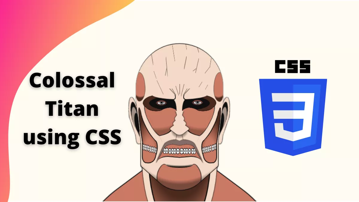
Who is Colossal Titan?
Colossal Titan is an Anime character from the series Attack on Titan. It is a great series to watch for adults.
How to create Colossal Titan using CSS?
We will create this beautiful art with the help of HTML and CSS.
Step 1:
First, We will create an HTML file with the below code.
<div class="head">
  <div class="back"></div>
  <div class="back-t"></div>
  <div class="ear-r"></div>
  <div class="ear-l"></div>
  <div class="cheek-r"></div>
  <div class="cheek-l"></div>
  <div class="lig-rr"></div>
  <div class="lig-ll"></div>
  <div class="top">
    <div class="eye-r"><div></div></div>
    <div class="eye-l"><div></div></div>
  </div>
  <div class="b-eye-r"></div>
  <div class="b-eye-l"></div>
  <div class="u-nose"></div>
  <div class="nose">
    <div class="n1"></div>
    <div class="n2"></div>
    <div class="n3"></div>
  </div>
  <div class="lig-r"></div>
  <div class="lig-r1"></div>
  <div class="lig-r2"></div>
  <div class="lig-l"></div>
  <div class="lig-l1"></div>
  <div class="lig-l2"></div>
  <div class="bottom"></div>
  <div class="mouth"></div>
  <div class="t-mouth"></div>
  <div class="t-mouth-l"></div>
  <div class="t-mouth-r"></div>
  <div class="t-mouth-t"></div>   <div class="edge"></div>
  <div class="edge-e"></div>
</div>Step 2:
Next, We will create style.css file and copy the below code
body {
  margin: 0;
  height: 100vh;
  display:grid;
  background-color: #fffbf2; /*#fff7e4;*/
  overflow:hidden;
}

.head {
   --sk:#f5dac7; /*#f7ceb2 #e6c6b7*/
   --sb:#ca7a64; /*#cf5341*/
   height: min(430px,100vmin);
   aspect-ratio: 295/430;
   position:relative;
   filter:drop-shadow(0 0px 1px black);
   margin: auto auto 0;
}
.top {
    position: absolute;
    overflow: hidden;
    width: 78%;
    height: 42%;
    left: 50%;
    top: 3%;
    transform: translate(-50%);
    --c1: #5f5149;
    background:
      linear-gradient(var(--c1) 0 0) 50% 70%/1px 15%,
      linear-gradient(to bottom left,#0000 40%,var(--c1),#0000 50%) 47% 74%/4% 16%,
      linear-gradient(to bottom right,#0000 40%,var(--c1),#0000 50%) 54% 74%/4% 20%,
      linear-gradient(to bottom right,#0000 40%,var(--c1),#0000 50%) 59% 74%/8% 11%,
      linear-gradient(to bottom left,#0000 40%,var(--c1),#0000 50%) 41% 74%/8% 11%,
      linear-gradient(to bottom left,#0000 40%,var(--c1),#0000 50%) 43% 74%/5% 11%,
      linear-gradient(to bottom right,#0000 40%,var(--c1),#0000 50%) 57% 74%/5% 11%,
      linear-gradient(to bottom left,#0000 40%,var(--c1),#0000 50%) 57% -15%/3% 22%,
      linear-gradient(to bottom left,#0000 40%,var(--c1),#0000 50%) 71% -5%/4% 19%,
      linear-gradient(to bottom right,#0000 45%,var(--c1),#0000 55%) 82% 65%/3% 7%,
      linear-gradient(to bottom right,#0000 45%,var(--c1),#0000 54%) 75% 61%/4% 8%,
      linear-gradient(to bottom left,#0000 45%,var(--c1),#0000 54%) 21% 45%/3% 11%,
      linear-gradient(to bottom left,#0000 48%,var(--c1),#0000 52%) 26% 69%/8% 22%,
      linear-gradient(to bottom right,#0000 41%,var(--c1),#0000 58%) 57% 23%/3% 19%,
      linear-gradient(to bottom right,#0000 41%,var(--c1),#0000 58%) 86.5% 23%/2% 15%,
      linear-gradient(to bottom right,#0000 46%,var(--c1),#0000 53%) 84% 37%/6% 10%,
      linear-gradient(to bottom right,#0000 42%,var(--c1),#0000 58%) 68% 38%/4% 4%,
      linear-gradient(to bottom right,#0000 45%,var(--c1),#0000 55%) 71% 27%/4% 22%,
      linear-gradient(to bottom right,#0000 40%,var(--c1),#0000 60%) 34% 40%/2% 12%,
      linear-gradient(to bottom left,#0000 40%,var(--c1),#0000 60%) 35% 27%/2% 29%,
      linear-gradient(to bottom left,#0000 40%,var(--c1),#0000 60%) 18% 18%/2% 16%,
      linear-gradient(to bottom left,#0000 45%,var(--c1),#0000 55%) 43% 2%/3% 24%,
      linear-gradient(var(--sk) 0 0) top/100% 77%,
      linear-gradient(var(--sk) 0 0) bottom/88% 28%;
    background-repeat: no-repeat;
    border-radius: 50% 50% 0 0/65% 63% 0 0;
    border-top: 1px solid;
    border-bottom: 0;
}
.top:before,
.top:after{
    content: "";
    position: absolute;
    width: 13%;
    height: 43%;
    background: radial-gradient(120% 89% at 41% 0,#0000 93%,#4b2a1e ),var(--sb);
    right: -2%;
    top: 42%;
    border-radius: 53% 47% 46% 54% / 58% 30% 70% 42%;
    border: 1px solid #5f5149;
}
.top:before {
  left:-2%;
  right:auto;
  transform:scaleX(-1);
}
.top [class*=eye]{
    position: absolute;
    width: 34%;
    height: 24%;
    background:
      radial-gradient(farthest-side,#000 32%,#88878d 50% 87%,#000,#0000) 34.5% 44%/15% 24%,
      radial-gradient(farthest-side,#fff 98%,#0000) 32% 47%/29% 25%,
      radial-gradient(80% 46% at left,#0f0f0f 98%,#0000)#49281c;
    right: 8%;
    background-repeat: no-repeat;
    top: 75%;
    border-radius: 0 50% 50% 0;
    border: 1px solid #0f0f0f;
}
.eye-l {
  left:8%;
  right:auto;
  transform:scaleX(-1);
}
.top [class*=eye] div:before,
.top [class*=eye] div:after {
    content: "";
    position: absolute;
    width: 27%;
    top: 21%;
    right: 50%;
    aspect-ratio: 1;
    border-radius: 100% 0 0;
    border: 2px solid #994d40;
    box-shadow: 1px 1px 2px inset #0f0f0f;
    border-right: 0;
    border-bottom: 0;
    transform: rotate(45deg);
}
.top [class*=eye] div:after {
    transform: rotate(-135deg);
    top: 24%;
    border-width: 1.5px;
}
.top [class*=eye]:before {
    content: "";
    position: absolute;
    width: 84%;
    top: -9%;
    left: -13%;
    height: 33%;
    background: var(--sk);
    border-radius: 6px 0 100% 8px;
    border: 2px solid #0f0f0f;
    border-top: 0;
    border-right: 0;
    transform-origin: right bottom;
    transform: rotate(-2deg);
}
.top [class*=eye]:after {
    content: "";
    position: absolute;
    right: 100%;
    width: 16%;
    top: 25%;
    height: 75%;
    background: #0f0f0f;
    border-radius: 100% 0 0 0;
}
.b-eye-r,
.b-eye-l{
    position: absolute;
    width: 28.5%;
    height: 18%;
    background:
      radial-gradient(107% 82% at 63% 0,#0000 84%,#4b2a1e70 ),
      linear-gradient(var(--sb) 0 0)bottom/100% 81%,
      radial-gradient(84% 95% at 24% 100%,var(--sb) 98%,#0000) 0 0/50% 20%,
      radial-gradient(71% 103% at 30% -33%,#0000 98%,var(--sb)) 100% 0/50% 20%;
    background-repeat: no-repeat;
    right: 19%;
    top: 42%;
    border-radius: 39% 0 50% 50%/15% 0 50% 50%;
    filter: drop-shadow(0 -1px 0 #0f0f0f);
}
.b-eye-l {
  left:19%;
  right:auto;
  transform:scaleX(-1)
}
.nose {
  position:absolute;
  inset:0;
  filter: drop-shadow(0 0 1px #0f0f0f) drop-shadow(0 0 1px #0f0f0f);
    clip-path: inset(44.5% 0 0 0);
}
.nose:after {
    content: "";
    position: absolute;
    left: 50%;
    transform: translate(-50%);
    background:
      radial-gradient(35% 92% at bottom left,#0000 89%,var(--sk)) left/51% 100%,
      radial-gradient(35% 92% at bottom right,#0000 89%,var(--sk)) right/51% 100%;
    background-repeat: no-repeat;
    width: 7%;
    top: 44.5%;
    height: 4%;
}
.n1 {
  position: absolute;
  width: 13%;
  aspect-ratio:1/1;
  top: 51%;
  background: var(--sk);
  left: 50%;
  transform: translate(-50%) rotate(45deg) rotate3d(1, -1, 0, 41deg);
  border-radius: 0 5px 13px 5px;
}
.n2 {
   position: absolute;
   width: 9%;
   aspect-ratio: 1/1;
   top: 49%;
   background: var(--sk);
   left: 50%;
   transform: translate(-50%) rotate(45deg) rotate3d(1, -1, 0, 9deg);
  border-radius: 0 5px 13px 5px;
}
.n3 {
    position: absolute;
    width: 9%;
    aspect-ratio: 1/1;
    top: 46%;
    background: var(--sk);
    left: 50%;
    transform: translate(-50%) rotate(45deg) rotate3d(1, 1, 0, 44deg);
    border-radius: 0 5px 13px 5px;
}
.u-nose {
    position: absolute;
    left: 50%;
    top: 56%;
    transform: translate(-50%);
    width: 37%;
    height: 17%;
    background:
      radial-gradient(50% 107% at top,#0005 72%,#0000) top/45% 30%,
      linear-gradient(to bottom right,#0000 40%,#5f5149,#0000 50%) 40% 36%/8% 57%,
      linear-gradient(to bottom left,#0000 40%,#5f5149,#0000 50%) 60% 36%/8% 57%,
      radial-gradient(116% 32% at 150% -6%,#0000 93%,#0f0f0f 95% 98%,var(--sk)) right/50.5% 100%,
      radial-gradient(116% 32% at -50% -6%,#0000 93%,#0f0f0f 95% 98%,var(--sk)) left/50.4% 100%;
    background-repeat: no-repeat;
}
.lig-r,
.lig-l{
    position: absolute;
    height: 28%;
    width: 7.5%;
    background: radial-gradient(67% 40% at -24% 44%,#0000 90%,#0f0f0f 92% 96%,var(--sk));
    border-radius: 0 100% 100% 0/0 50% 50% 0;
    right: 10%;
    top: 41%;
    transform-origin: top;
    transform: rotate(27deg);
    border-right: 2px solid #0f0f0f;
    clip-path:polygon(0 0,100% 21%,100% 84%,-20% 100%);
}
.lig-l {
  right:auto;
  left:10%;
  transform:scaleX(-1) rotate(27deg);
}
.lig-rr,
.lig-ll {
    position: absolute;
    height: 32%;
    width: 4%;
    right: 15.3%;
    top: 42%;
    border-radius: 100% 100% 0 0;
    border: 2px solid #0f0f0f;
    transform: rotate(9deg);
    box-shadow: 0 0 0 33px var(--sk);
    clip-path: polygon(-90% -30%,87% -21%,136% 90%,33% 42%,45% 18%,0% 18%);
}
.lig-ll {
  left: 15.3%;
  right:auto;
  transform:scaleX(-1) rotate(9deg);
}
.lig-r1,
.lig-l1{
    position: absolute;
    height: 15%;
    width: 18%;
    right: 12%;
    top: 61.2%;
    border-radius: 15px 0 0 20px/32px 0 0 20px;
    transform: rotate(-15deg);
    border: 2px solid #0f0f0f;
    box-shadow: 0 0 0 300px var(--sk);
    clip-path: polygon(-14% 0,24% -4%,38% 34%,41% 120%,-38% 100%);
}
.lig-l1{
    left: 12%;
   right:auto;
    transform:scaleX(-1) rotate(-15deg);
}
.lig-r2,
.lig-l2 {
    position: absolute;
    height: 12.5%;
    width: 4%;
    right: 16.5%;
    top: 64%;
    border-radius: 0 0 100% 0/0 0 32% 0;
    border: 2px solid #0f0f0f;
    border-top: 0;
    border-left: 0;
    box-shadow: 0 0 0 300px var(--sk);
    clip-path: polygon(13% 0%,125% 0,125% 115%,13% 103%);
}
.lig-l2{
  left: 16.5%;
  right:auto;
  transform:scaleX(-1)
}
.bottom {
    position: absolute;
    width: 50%;
    aspect-ratio: 1/1;
    background: radial-gradient(circle at 67% 68%,var(--sb) 41%,#0f0f0f,#0000 43%),var(--sk);
    top: 61%;
    left: 50%;
    transform: translate(-50%) rotateX(28deg) rotate(45deg);
    border-radius: 0 5px 50% 5px;
    border-right: 2px solid #0f0f0f;
    border-bottom: 2px solid #0f0f0f;
    clip-path:polygon(95% 0,100% 0,100% 100%,0 100%,0 95%);
    overflow:hidden;
}
.bottom:before {
    content: "";
    position: absolute;
    inset: -20%;
    background: radial-gradient(72% 78% at top,#0000 92%,#0006);
    transform: rotate(-45deg);
}
.cheek-r,
.cheek-l {
    position: absolute;
    width: 20%;
    height: 34%;
    --c: #e9e9e9 79%,#0f0f0f 82% 98%,#0000;
    background:
      radial-gradient(65% 89% at 51% 100%,#0000 50%,#4b2a1e ),
      radial-gradient(57% 52% at 50% 50%,var(--c)) 19% 79%/8% 12%,
      radial-gradient(57% 52% at 50% 50%,var(--c)) 28% 78%/8% 12%,
      radial-gradient(57% 52% at 50% 50%,var(--c)) 37% 77%/8% 12%,
      radial-gradient(57% 52% at 50% 50%,var(--c)) 46% 76%/8% 12%,
      radial-gradient(57% 52% at 50% 50%,var(--c)) 54% 75%/6% 12%,
      radial-gradient(57% 52% at 50% 50%,var(--c)) 62% 74%/6% 12%,
      radial-gradient(57% 52% at 50% 50%,var(--c)) 69% 73%/6% 12%,
      radial-gradient(57% 52% at 50% 50%,var(--c)) 76% 72%/6% 12%,
      radial-gradient(57% 52% at 50% 50%,var(--c)) 81% 71%/6% 12%,
      var(--sb);
    background-repeat: no-repeat;
    right: 13%;
    top: 43%;
    clip-path: polygon(0 0,100% 0,78% 100%,0 100%);
}
.cheek-l{
    left: 13%;
    right:auto;
    transform:scaleX(-1);
}
.cheek-r:before,
.cheek-l:before {
    content: "";
    position: absolute;
    width: 100%;
    height: 1px;
    bottom: 27.5%;
    background: #0f0f0f;
    transform: rotate(-17deg);
}
.ear-r,
.ear-l {
    position: absolute;
    height: 29%;
    width: 10%;
    background:
      linear-gradient(to bottom right,#0f0f0f 50%,#0000 54%)31% 81%/28% 22% ,
      radial-gradient(farthest-side,#0f0f0f 91%,#0000) 0 59%/55% 43%,
      radial-gradient(farthest-side,#a39185 92%,#0000) 35% 38%/61% 47%,
      radial-gradient(farthest-side,#0f0f0f 97%,#0000) 33% 20%/69% 53%,
      radial-gradient(farthest-side,var(--sk) 95%,#0000) bottom/32% 23%,
      linear-gradient(102deg,var(--sk) 71%,#0000 72%),
      linear-gradient(var(--sk) 0 0)top /100% 42%;
    background-repeat: no-repeat;
    right: 2.5%;
    top: 36%;
    border-radius: 100% 100% 0 0;
    transform-origin: top;
    transform: rotateY(32deg) rotate(10deg);
    filter: drop-shadow(0 0 0px #000) drop-shadow(0 0 0px #000);
}
.ear-l{
  right:auto;
  left:2%;
  transform:scaleX(-1) rotateY(32deg) rotate(10deg);
}
.mouth {
    position: absolute;
    width: 40%;
    height: 10%;
   --c:#e9e9e9 79%,#0f0f0f 82% 98%,#0000;
    background:
      linear-gradient(#0f0f0f 0 0) 50% 50.5%/100% 1.5px,
      radial-gradient(57% 52% at 50% 50%,var(--c)) 14% 47%/6% 38%,
      radial-gradient(57% 52% at 50% 50%,var(--c)) 20% 47%/6% 38%,
      radial-gradient(57% 52% at 50% 50%,var(--c)) 27% 50%/6% 38%,
      radial-gradient(57% 52% at 50% 50%,var(--c)) 33% 50%/6% 38%,
      radial-gradient(57% 52% at 50% 50%,var(--c)) 39% 50%/6% 38%,
      radial-gradient(57% 52% at 50% 50%,var(--c)) 46.5% 50%/8% 38%,
      radial-gradient(57% 52% at 50% 50%,var(--c)) 55% 50%/8% 38%,
      radial-gradient(57% 52% at 50% 50%,var(--c)) 62% 50%/6% 38%,
      radial-gradient(57% 52% at 50% 50%,var(--c)) 68% 50%/6% 38%,
      radial-gradient(57% 52% at 50% 50%,var(--c)) 74% 50%/6% 38%,
      radial-gradient(57% 52% at 50% 50%,var(--c)) 81% 50%/6% 38%,
      radial-gradient(57% 52% at 50% 50%,var(--c)) 86% 50%/6% 38%,
      var(--sb);
    background-repeat: no-repeat;
    left: 50%;
    top: 64%;
    transform: translate(-50%);
    clip-path: polygon(21% 0,79% 0,100% 100%,0 100%);
}
.t-mouth {
    position: absolute;
    width: 28%;
    height: 4%;
    background:
      conic-gradient(from -80deg at bottom,#836b65 0 160deg,#0000 0) 0 40%/100% 80%,
      radial-gradient(43% 39% at bottom,#0000 98%,#836b65);
    background-repeat:no-repeat;
    left: 50%;
    transform: translate(-50%);
    top: 62%;
    border-radius: 1000px 1000px 0 0/500px 500px 0 0;
    clip-path:polygon(-30% -40%,31% -19%,50% 17%,68% -19%,130% -40%,130% 500%,-30% 500%);
    filter: drop-shadow(0 0 1px #0f0f0f) drop-shadow(0 0 0 #0f0f0f);
}
.t-mouth:before {
    content: "";
    position: absolute;
    right: 3%;
    width: 72%;
    height: 40%;
    bottom: 59%;
    transform-origin: right bottom;
    transform: rotate(-113deg);
    background: #836b65;
    clip-path: polygon(0 100%,100% 0,100% 100%);
    border-radius: 0 50% 50% 0;
}
.t-mouth:after {
    content: "";
    position: absolute;
    left: 3%;
    width: 72%;
    height: 40%;
    bottom: 59%;
    transform-origin: left bottom;
    transform: rotate(113deg);
    background: #836b65;
    clip-path: polygon(0 0,100% 100%,0 100%);
    border-radius: 50% 0 0 50%;
}
.t-mouth-l,
.t-mouth-r{
    position: absolute;
    right: 30%;
    width: 20%;
    height: 8%;
    background: radial-gradient(90% 60% at 0 100%,#0000 98%,var(--sk));
    top: 72%;
    border-top: 2px solid #0f0f0f;
    border-left: 0;
    border-bottom: 0;
    border-radius: 0 55% 0 0;
    transform: rotate(-5deg);
}
.t-mouth-r{
    left: 30%;
    right:auto;
    transform:scaleX(-1) rotate(-5deg);
}
.t-mouth-t {
    position: absolute;
    left: 50%;
    transform: translate(-50%);
    top: 74.7%;
    width: 24%;
    height: 4.5%;
    background: radial-gradient(97% 95% at top,#0000 72%,#0f0f0f) var(--sk);
    border-radius: 0 0 60% 60%/0 0 50% 50%;
    border-bottom: 1px solid #0f0f0f;
}
.t-mouth-t:before,
.t-mouth-t:after{
    content: "";
    position: absolute;
    width: 17%;
    height: 54%;
    border-radius: 50%;
    top: 55%;
    left: 96%;
    border-top: 1px solid #0f0f0f;
    box-shadow: 0 -5px 0 var(--sk);
}
.t-mouth-t:after{
    left:auto;
    right:98%;
}
.head .edge:before,
.head .edge:after{
    content: "";
    position: absolute;
    width: 1px;
    height: 15%;
    background: #0f0f0f;
    bottom: 22%;
    left: 15%;
    z-index: 1;
}
.head .edge:after{
   right:15%;
   left:auto;
}
.head .edge-e:before,
.head .edge-e:after {
    content: "";
    position: absolute;
    width: 1px;
    height: 21%;
    background: #0f0f0f;
    bottom: 37%;
    left: 15%;
    z-index: 1;
    transform: rotate(-7deg);
    transform-origin: bottom;
}
.head .edge-e:after {
    left:auto;
    right:15%;
    transform: rotate(7deg);
}
.back {
    width: 130%;
    left: 50%;
    position: absolute;
    aspect-ratio: 1;
    background: var(--sb);
    transform: translate(-50%) rotate(45deg)rotate3D(1,-1,0,42deg);
    top: 66%;
    border: 2px solid #0f0f0f;
    border-radius: 0 40% 0 15%/0 15% 0 40%;
}
.back-t {
    position: absolute;
    width: 67%;
    height: 80%;
    left: 50%;
    transform: translate(-50%);
    background: radial-gradient(86% 100% at 51% 0%,#4b2a1e 70%,#0000 ) var(--sb);
    bottom: -23%;
    border-radius: 0 0 80% 80%/0 0 100% 100%;
    border: 16px solid var(--sk);
    box-shadow: 3px 0 0 #0f0f0f inset,-3px 0 0 #0f0f0f inset;
    filter: drop-shadow(0px 0px 1px #0f0f0f) drop-shadow(0px 0px 1px #0f0f0f);
}
*,
*:before,
*:after{
  box-sizing:border-box;
}With that said I hope you enjoyed this post. If you find this post helpful then please share and comment.


