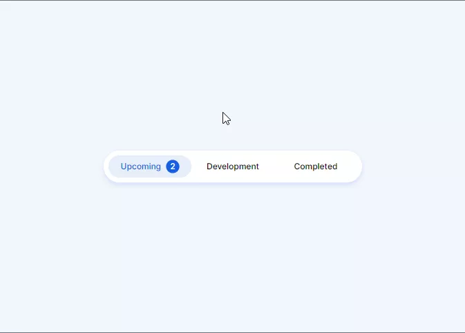
Sliding tabs using CSS can be helpful when creating a tab bar on a website. This Tab bar uses purely created using CSS and HTML.
Also, Read – 3D Red Switch
How to create Sliding Tabs using CSS?
To create a sliding Tab bar we first need to write the HTML code for it
Step 1: HTML
First, We will create an index.html file with the below code.
<!DOCTYPE html>
<html lang="en">
  <head>
    <meta charset="UTF-8" />
    <meta http-equiv="X-UA-Compatible" content="IE=edge" />
    <meta name="viewport" content="width=device-width, initial-scale=1.0" />
    <link rel="stylesheet" href="style.css" />
    <title>Sliding Tabs using CSS</title>
  </head>
  <body>
    <div class="container">
      <div class="tabs">
        <input type="radio" id="radio-1" name="tabs" checked />
        <label class="tab" for="radio-1"
          >Upcoming<span class="notification">2</span></label
        >
        <input type="radio" id="radio-2" name="tabs" />
        <label class="tab" for="radio-2">Development</label>
        <input type="radio" id="radio-3" name="tabs" />
        <label class="tab" for="radio-3">Completed</label>
        <span class="glider"></span>
      </div>
    </div>
  </body>
</html>
Step 2: CSS
Now, create a style.css file and copy the below code to it
@import url("https://fonts.googleapis.com/css2?family=Inter:wght@400;500;600&display=swap");
:root {
  --primary-color: #185ee0;
  --secondary-color: #e6eef9;
}

*,
*:after,
*:before {
  box-sizing: border-box;
}

body {
  font-family: "Inter", sans-serif;
  background-color: rgba(230, 238, 249, 0.5);
}

.container {
  position: absolute;
  left: 0;
  top: 0;
  right: 0;
  bottom: 0;
  display: flex;
  align-items: center;
  justify-content: center;
}

.tabs {
  display: flex;
  position: relative;
  background-color: #fff;
  box-shadow: 0 0 1px 0 rgba(24, 94, 224, 0.15),
    0 6px 12px 0 rgba(24, 94, 224, 0.15);
  padding: 0.75rem;
  border-radius: 99px;
}
.tabs * {
  z-index: 2;
}

input[type="radio"] {
  display: none;
}

.tab {
  display: flex;
  align-items: center;
  justify-content: center;
  height: 54px;
  width: 200px;
  font-size: 1.25rem;
  font-weight: 500;
  border-radius: 99px;
  cursor: pointer;
  transition: color 0.15s ease-in;
}

.notification {
  display: flex;
  align-items: center;
  justify-content: center;
  width: 2rem;
  height: 2rem;
  margin-left: 0.75rem;
  border-radius: 50%;
  background-color: var(--secondary-color);
  transition: 0.15s ease-in;
}

input[type="radio"]:checked + label {
  color: var(--primary-color);
}
input[type="radio"]:checked + label > .notification {
  background-color: var(--primary-color);
  color: #fff;
}

input[id="radio-1"]:checked ~ .glider {
  transform: translateX(0);
}

input[id="radio-2"]:checked ~ .glider {
  transform: translateX(100%);
}

input[id="radio-3"]:checked ~ .glider {
  transform: translateX(200%);
}

.glider {
  position: absolute;
  display: flex;
  height: 54px;
  width: 200px;
  background-color: var(--secondary-color);
  z-index: 1;
  border-radius: 99px;
  transition: 0.25s ease-out;
}

@media (max-width: 700px) {
  .tabs {
    transform: scale(0.6);
  }
}
Boom! It’s done
The source code is available on GitHub.
If you find this post helpful then please share it with your friends.
