Create a stunning radio button in CSS with the below steps. The radio buttons are useful when there are a lot of options and the user must select a single option.
Why style radio button with CSS?
The default radio button will make your website look old and ugly. We use CSS to solve UI-related problems and give animation to HTML elements. That is why we use CSS to style our HTML elements.
Let’s start
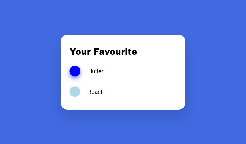
First here is the output
See the Pen beautiful radio button in css by Rare Programmer (@rareprogrammer) on CodePen.
Also read: CSS hover effect on Image
How to create a stunning radio button in CSS?
Step 1:
First, we will write HTML code to make the default radio button
Here is the HTML code
<div class="container">
  <h2>Your Favourite</h2>
  <div class="inner-container">
    <div class="btn-container">
      <input type="radio" name="language" id="flutter" checked>
      <label for="flutter">Flutter</label>
      <div class="check"></div>
      <br>
    </div>
    <div class="btn-container">
      <input type="radio" name="language" id="react">
      <label for="react">React</label>
      <div class="check"></div>
      <br>
    </div>
  </div>
</div>
Altho this code is self-explanatory, I will explain the work of this code.
First, we created a container, then we have a group of radio buttons with the same name.
Step 2:
Next, we will write some CSS to give it stunning animation.
html, body {
  height: 100%;
  padding: 0;
  margin: 0;
}

body {
  display: flex;
  justify-content: center;
  align-items: center;
  font-family: "Raleway", sans-serif;
  background-color: royalblue;
}

.container {
  display: flex;
  flex-direction: column;
  padding: 20px 25px;
  width: 300px;
  background-color: white;
  border-radius: 20px;
  box-shadow: 0 19px 38px rgba(0, 0, 0, 0.13);
}

.inner-container {
  padding-left: 50px;
  margin: 0;
}

.btn-container {
  display: block;
  position: relative;
  padding: 20px 0;
}

h2 {
  margin: 10px 0;
  font-weight: 900;
}

input[type="radio"] {
  position: absolute;
  visibility: hidden;
}

label {
  cursor: pointer;
  font-weight: 400;
}

.check {
  width: 30px;
  height: 30px;
  position: absolute;
  border-radius: 50%;
  transition: transform 0.6s cubic-bezier(0.68, -0.55, 0.27, 1.55);
}
First, we will give Html and body elements 100% height and then give 0 margins and 0 paddings.
We give a display type of flex to the body element,
So we can use justify-content and align-items property to the center container. Then we give it a background color.
Next, we make the container look like a card by giving it a border radius and box shadow.
Step 3:
Now, we will give it some animation with the below code
input#flutter ~ .check {
  transform: translate(-50px, -25px);
  background-color: lightblue;
}

input#react ~ .check {
  transform: translate(-50px, -83px);
  background-color: blue;
  box-shadow: 0 6px 12px rgba(0, 0, 255, 0.5);
}

input#flutter:checked ~ .check {
  transform: translate(-50px, 33px);
}

input#react:checked ~ .check {
  transform: translate(-50px, -25px);
}
Here we used a div to make those circles and then animated them.
How does this CSS animation work?
Here we first position option 1 circle to option 2 circles and option 2 circles to option 1 circle,
When the use clicks option 2 then we change option 2 circle position to its original position.
When the user clicks option 1 then we change option 1 circle position to option 2 circle position.
Boom! you have it. A Stunning radio button in CSS.
Please do comment and share this post. This motivates me to write more posts/tutorials.