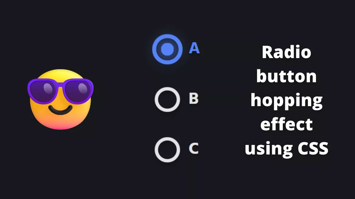
Today, we will learn how to create a Radio button hopping effect using CSS. It is a very cool effect to try.
Also, Read- Cool Ghost card using Three js
How to create a radio button hopping effect using CSS?
Step 1:
First, we will create an HTML file with the below code
<form>
	<input id="a" type="radio" name="hopping" value="a" checked>
	<label for="a"><span></span>A</label>
	<input id="b" type="radio" name="hopping" value="b">
	<label for="b"><span></span>B</label>
	<input id="c" type="radio" name="hopping" value="c">
	<label for="c"><span></span>C</label>
	<div class="worm">
		<div class="worm__segment"></div>
		<div class="worm__segment"></div>
		<div class="worm__segment"></div>
		<div class="worm__segment"></div>
		<div class="worm__segment"></div>
		<div class="worm__segment"></div>
		<div class="worm__segment"></div>
		<div class="worm__segment"></div>
		<div class="worm__segment"></div>
		<div class="worm__segment"></div>
		<div class="worm__segment"></div>
		<div class="worm__segment"></div>
		<div class="worm__segment"></div>
		<div class="worm__segment"></div>
		<div class="worm__segment"></div>
		<div class="worm__segment"></div>
		<div class="worm__segment"></div>
		<div class="worm__segment"></div>
		<div class="worm__segment"></div>
		<div class="worm__segment"></div>
		<div class="worm__segment"></div>
		<div class="worm__segment"></div>
		<div class="worm__segment"></div>
		<div class="worm__segment"></div>
		<div class="worm__segment"></div>
		<div class="worm__segment"></div>
		<div class="worm__segment"></div>
		<div class="worm__segment"></div>
		<div class="worm__segment"></div>
		<div class="worm__segment"></div>
	</div>
</form>
Step 2:
Now, we will create a CSS file and copy the below code
* {
  border: 0;
  box-sizing: border-box;
  margin: 0;
  padding: 0;
}

:root {
  font-size: calc(32px + (40 - 32)*(100vw - 320px)/ (1024 - 320));
}

body {
  background: #e3e4e8;
  color: #17181c;
  display: flex;
  font: 1em Hind, sans-serif;
  height: 100vh;
  line-height: 1.5;
  padding: 1.5em 0;
}

form {
  display: block;
  margin: auto;
  max-width: 10em;
  position: relative;
}

input {
  position: fixed;
  top: -1.5em;
  left: -1.5em;
}

label {
  cursor: pointer;
  display: block;
  font-weight: bold;
  text-shadow: 0 0.1em 0.1em rgba(0, 0, 0, 0.2);
  transition: color 0.2s cubic-bezier(0.45, 0.05, 0.55, 0.95);
}
label:not(:last-of-type) {
  margin-bottom: 1.5em;
}
label span {
  box-shadow: 0 0 0 0.2em currentColor inset, 0 0.2em 0.2em rgba(0, 0, 0, 0.2), 0 0.3em 0.2em rgba(0, 0, 0, 0.2) inset;
  display: inline-block;
  margin-right: 0.5em;
  vertical-align: bottom;
  width: 1.5em;
  height: 1.5em;
  transition: transform 0.2s cubic-bezier(0.5, 0, 0.5, 2), box-shadow 0.2s cubic-bezier(0.45, 0.05, 0.55, 0.95), color 0.2s cubic-bezier(0.45, 0.05, 0.55, 0.95);
}

label span,
.worm__segment:before {
  border-radius: 50%;
}

input:checked + label,
input:checked + label span,
.worm__segment:before {
  color: #255ff4;
}

input:checked + label, input:checked + label span {
  transition-delay: 0.4s;
}
input:checked + label span {
  transform: scale(1.2);
}

.worm {
  top: 0.375em;
  left: 0.375em;
}
.worm, .worm__segment {
  position: absolute;
}
.worm__segment {
  top: 0;
  left: 0;
  width: 0.75em;
  height: 0.75em;
  transition: transform 0.4s cubic-bezier(0.45, 0.05, 0.55, 0.95);
}
.worm__segment:before {
  animation-duration: 0.4s;
  animation-timing-function: cubic-bezier(0.45, 0.05, 0.55, 0.95);
  background: currentColor;
  content: "";
  display: block;
  width: 100%;
  height: 100%;
}
.worm__segment:first-child:before, .worm__segment:last-child:before {
  box-shadow: 0 0 1em 0 currentColor;
}

.worm__segment:nth-child(2) {
  transition-delay: 0.004s;
}
.worm__segment:nth-child(2):before {
  animation-delay: 0.004s;
}

.worm__segment:nth-child(3) {
  transition-delay: 0.008s;
}
.worm__segment:nth-child(3):before {
  animation-delay: 0.008s;
}

.worm__segment:nth-child(4) {
  transition-delay: 0.012s;
}
.worm__segment:nth-child(4):before {
  animation-delay: 0.012s;
}

.worm__segment:nth-child(5) {
  transition-delay: 0.016s;
}
.worm__segment:nth-child(5):before {
  animation-delay: 0.016s;
}

.worm__segment:nth-child(6) {
  transition-delay: 0.02s;
}
.worm__segment:nth-child(6):before {
  animation-delay: 0.02s;
}

.worm__segment:nth-child(7) {
  transition-delay: 0.024s;
}
.worm__segment:nth-child(7):before {
  animation-delay: 0.024s;
}

.worm__segment:nth-child(8) {
  transition-delay: 0.028s;
}
.worm__segment:nth-child(8):before {
  animation-delay: 0.028s;
}

.worm__segment:nth-child(9) {
  transition-delay: 0.032s;
}
.worm__segment:nth-child(9):before {
  animation-delay: 0.032s;
}

.worm__segment:nth-child(10) {
  transition-delay: 0.036s;
}
.worm__segment:nth-child(10):before {
  animation-delay: 0.036s;
}

.worm__segment:nth-child(11) {
  transition-delay: 0.04s;
}
.worm__segment:nth-child(11):before {
  animation-delay: 0.04s;
}

.worm__segment:nth-child(12) {
  transition-delay: 0.044s;
}
.worm__segment:nth-child(12):before {
  animation-delay: 0.044s;
}

.worm__segment:nth-child(13) {
  transition-delay: 0.048s;
}
.worm__segment:nth-child(13):before {
  animation-delay: 0.048s;
}

.worm__segment:nth-child(14) {
  transition-delay: 0.052s;
}
.worm__segment:nth-child(14):before {
  animation-delay: 0.052s;
}

.worm__segment:nth-child(15) {
  transition-delay: 0.056s;
}
.worm__segment:nth-child(15):before {
  animation-delay: 0.056s;
}

.worm__segment:nth-child(16) {
  transition-delay: 0.06s;
}
.worm__segment:nth-child(16):before {
  animation-delay: 0.06s;
}

.worm__segment:nth-child(17) {
  transition-delay: 0.064s;
}
.worm__segment:nth-child(17):before {
  animation-delay: 0.064s;
}

.worm__segment:nth-child(18) {
  transition-delay: 0.068s;
}
.worm__segment:nth-child(18):before {
  animation-delay: 0.068s;
}

.worm__segment:nth-child(19) {
  transition-delay: 0.072s;
}
.worm__segment:nth-child(19):before {
  animation-delay: 0.072s;
}

.worm__segment:nth-child(20) {
  transition-delay: 0.076s;
}
.worm__segment:nth-child(20):before {
  animation-delay: 0.076s;
}

.worm__segment:nth-child(21) {
  transition-delay: 0.08s;
}
.worm__segment:nth-child(21):before {
  animation-delay: 0.08s;
}

.worm__segment:nth-child(22) {
  transition-delay: 0.084s;
}
.worm__segment:nth-child(22):before {
  animation-delay: 0.084s;
}

.worm__segment:nth-child(23) {
  transition-delay: 0.088s;
}
.worm__segment:nth-child(23):before {
  animation-delay: 0.088s;
}

.worm__segment:nth-child(24) {
  transition-delay: 0.092s;
}
.worm__segment:nth-child(24):before {
  animation-delay: 0.092s;
}

.worm__segment:nth-child(25) {
  transition-delay: 0.096s;
}
.worm__segment:nth-child(25):before {
  animation-delay: 0.096s;
}

.worm__segment:nth-child(26) {
  transition-delay: 0.1s;
}
.worm__segment:nth-child(26):before {
  animation-delay: 0.1s;
}

.worm__segment:nth-child(27) {
  transition-delay: 0.104s;
}
.worm__segment:nth-child(27):before {
  animation-delay: 0.104s;
}

.worm__segment:nth-child(28) {
  transition-delay: 0.108s;
}
.worm__segment:nth-child(28):before {
  animation-delay: 0.108s;
}

.worm__segment:nth-child(29) {
  transition-delay: 0.112s;
}
.worm__segment:nth-child(29):before {
  animation-delay: 0.112s;
}

.worm__segment:nth-child(30) {
  transition-delay: 0.116s;
}
.worm__segment:nth-child(30):before {
  animation-delay: 0.116s;
}

/* States */
input:nth-of-type(1):checked ~ .worm .worm__segment:before {
  animation-name: hop1;
}

@keyframes hop1 {
  from, to {
    transform: translateX(0);
  }
  50% {
    transform: translateX(-1.5em);
  }
}
input:nth-of-type(2):checked ~ .worm .worm__segment {
  transform: translateY(3em);
}
input:nth-of-type(2):checked ~ .worm .worm__segment:before {
  animation-name: hop2;
}

@keyframes hop2 {
  from, to {
    transform: translateX(0);
  }
  50% {
    transform: translateX(-1.5em);
  }
}
input:nth-of-type(3):checked ~ .worm .worm__segment {
  transform: translateY(6em);
}
input:nth-of-type(3):checked ~ .worm .worm__segment:before {
  animation-name: hop3;
}

@keyframes hop3 {
  from, to {
    transform: translateX(0);
  }
  50% {
    transform: translateX(-1.5em);
  }
}
/* Dark mode */
@media screen and (prefers-color-scheme: dark) {
  body {
    background: #17181c;
    color: #e3e4e8;
  }

  input:checked + label,
input:checked + label span,
.worm__segment:before {
    color: #5583f6;
  }
}
That’s it. Here is the Codepen demo and the source code
See the Pen Radio Hopping by Jon Kantner (@jkantner) on CodePen.
I hope you find this post helpful. Please share this post.


