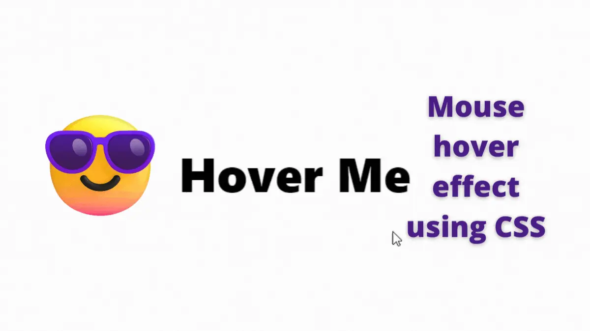
Hello, My fellow coders. Now, we will learn to create a cool mouse-in and mouse-out hover effect using CSS. It is a step-by-step guide. This kind of effect is helpful when we need to highlight something important.
When wondering about the new project idea on Codepen, My eyes stuck on this one.
Also, Read- Folding Card Using CSS
How to create a mouse-in and mouse-out hover effect using CSS?
This one is the simple one. First, let’s divide it into parts.
- Give a background to the text
- Make it appear when the mouse hover
- Add the animation to it
Step 1:
Let’s first create an element with some text in it. I will go for a div tag.
<div>Hover Me</div>Here we add a div tag, and inside that, we have a “Hover Me” text. You can write whatever you want. ie. “Don’t hover on me!”
Step 2:
The default font size is too small. Let’s make it bigger. In CSS, we use the font-size property to change the height and size of the font.
div {
 font-size: 70px; /* The px stands for pixels */
}
Here, 70 pixels are enough for the font size. Let’s change the font as well. In CSS, we use the font-family property to specify a list of fonts, from highest priority to lowest.
div {
 font-size: 70px; /* The px stands for pixels */
 font-family: system-ui, sans;
}
system-ui is the primary font, and sans is the secondary font.
Let’s make it bold by using the font-weight property.
div {
 font-size: 70px;
 font-family: system-ui, sans;
 font-weight: 800; /*Font weight of 800 is enough */
}
It is looking fine now. For the sake of this tutorial, Let’s center it on the screen.
body {
 display: grid;
 height: 100vh;
 place-items: center;
}
You can find out more on how to center a div tag in HTML on this post.
Let’s change its position type to the relative.
div {
 position: relative;
 font-family: system-ui, sans;
 font-size: 60px;
 font-weight: 800;
}
you can find out more about the CSS position property here.
Step 3: Give a background to the text
We want to set a background that we can animate on mouse hover. But, we can not do this with the text background.
How about the pseudo-elements. We can use ::before pseudo-element to create the effect. You can find out more about ::before and ::after pseudo-elements on this post- CSS before and after pseudo elements
Let’s add a ::before pseudo-element to the div tag.
div::before {
 content: "";
}
The content property is empty because we don’t need to put any content. We need it for the background effect. Let’s give it a background.
div::before {
 content: "";
 background: yellow;
}
But, nothing happened. That’s because we need to set some property before it appears.
Add the position type to absolute and the inset to 0.
Find out more about inset CSS property.
div::before {
 content: "";
 background: yellow;
 inset: 0;
 position: absolute;
}
Now it’s working. But, The text disappeared. That’s because the ::before element is in front of the text. We need to put it back by setting its z index to -1.
div::before {
 content: "";
 background: yellow;
 inset: 0;
 position: absolute;
 z-index: -1;
}
Step 4: On mouse hover effect
Now, it’s time to make it interactive. We can make it appear on mouse hover and disappear on mouse out.
To make it happen. First, we have to hide it. We will use the transform property to set its size to 0. We set the x-axis to 0 to make it disappear.
div::before {
 content: "";
 background: yellow;
 inset: 0;
 position: absolute;
 z-index: -1;
 transform: scaleX(0); /* we use scaleX() to set the x-axis size */
}
sizeX – To resize an element on its x-axis we use scaleX() CSS function.
Now, we can set its x-axis scale to 1 on mouse hover to make it appear.
div:hover::before {
 transform: scaleX(1);
}
Whenever we hover on the div element, it sets the ::before element scale to 1.
Step 5: Animate it
Finally, we have to animate it. To do this, we can use the transition property.
div::before {
 content: "";
 background: yellow;
 inset: 0;
 position: absolute;
 z-index: -1;
 transform: scaleX(0);
 transition: transform 0.5s ease-in-out; /* We set animation time to 0.5 seconds */
}
We first set the transition property to the transform, duration to 0.5 seconds, and the animation to”ease-in-out. You can find more information about transition property here.
As we can see, it’s appearing and disappearing from the center. But, we can make it appear from the left when the mouse-in and disappear to the right on the mouse-out.
For that, we can use the transform-origin property. Learn more about the transform-origin property here.
div:hover::before {
 transform: scaleX(1);
 transform-origin: left; /* we set its origin to the left on mouse hover */
}
Now it appears from the left. But disappear in the center.
Let’s change its origin to the right when mouse out.
div::before {
 content: "";
 background: yellow;
 inset: 0;
 position: absolute;
 z-index: -1;
 transform: scaleX(0);
 transform-origin: right; /* we set its origin to right on mouse out */
 transition: transform 0.5s ease-in-out;
}
It’s working! Here is the output
See the Pen mouse out and in effect by Rare Programmer (@rareprogrammer) on CodePen.
Here is the whole CSS file In case you want to copy it.
body {
  display: grid;
  height: 100vh;
  place-items: center;
}

div {
  position: relative;
  font-family: system-ui, sans;
  font-size: 60px;
  font-weight: 800;
}

div::before {
  content: "";
  background: yellow;
  inset: 0;
  position: absolute;
  z-index: -1;
  transform-origin: right;
  transform: scaleX(0);
  transition: transform 0.5s ease-in-out;
}

div:hover::before {
  transform: scaleX(1);
  transform-origin: left;
}
Summary
In CSS, we use simple tricks to make complex animations and UI. It is the power of CSS. Here we used CSS ::hover pseudo-element and scaleX() function to make this cool animation.

