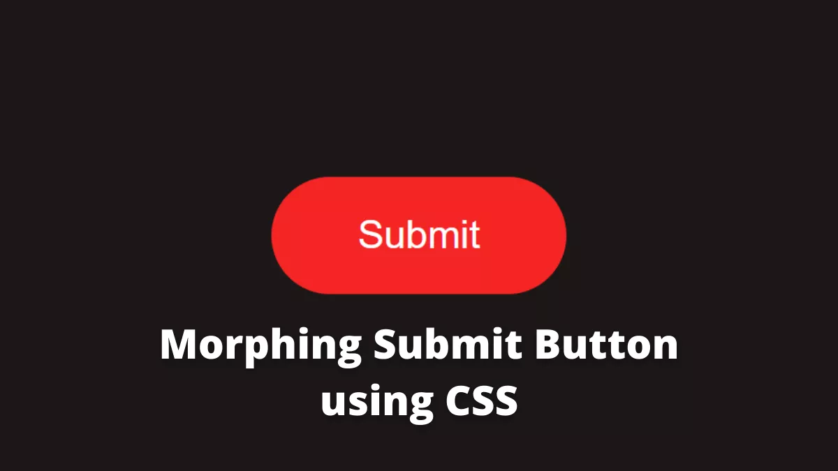
The Morphing Submit button using CSS is a cool submit button with animation. It has an animation when we click it. It can be helpful when submitting a form and waiting for a response from the server.
Also, Read – 3D Preloader Using CSS
How to create a Morphing submit button using CSS?
To create a morphing submit button we will follow the below steps
Step 1: HTML
First, we will create an index.html file and copy the below code
<!DOCTYPE html>
<html lang="en">
  <head>
    <meta charset="UTF-8" />
    <meta http-equiv="X-UA-Compatible" content="IE=edge" />
    <meta name="viewport" content="width=device-width, initial-scale=1.0" />
    <link rel="stylesheet" href="style.css" />
    <title>Morphing Submit Button using CSS</title>
  </head>
  <body>
    <button class="btn" type="button">
      <span class="btn__text">Submit</span>
      <svg class="btn__progress" viewBox="0 0 48 48" width="48px" height="48px">
        <circle
          class="btn__progress-track"
          r="20"
          cx="24"
          cy="24"
          fill="none"
          stroke="#c7cad1"
          stroke-width="8"
        />
        <circle
          class="btn__progress-fill"
          r="20"
          cx="24"
          cy="24"
          fill="none"
          stroke="#000000"
          stroke-width="8"
          transform="rotate(-90,24,24)"
          stroke-dasharray="125.66 125.66"
          stroke-dashoffset="125.66"
        />
        <polyline
          class="btn__progress-check"
          points="12,24 20,32 36,16"
          fill="none"
          stroke="#fff"
          stroke-width="4"
          stroke-linecap="round"
          stroke-linejoin="round"
          stroke-dasharray="34 34"
          stroke-dashoffset="34"
        />
      </svg>
    </button>
    <script src="main.js"></script>
  </body>
</html>
Here we used SVG to create a button. SVG is perfect for the animation we are going to create.
Step 2: CSS
Next, we will create a style.css file and write the below code to it.
* {
  border: 0;
  box-sizing: border-box;
  margin: 0;
  padding: 0;
}
:root {
  --hue: 0;
  --bg1: hsl(var(--hue), 10%, 90%);
  --bg2: hsl(var(--hue), 10%, 80%);
  --fg1: hsl(var(--hue), 10%, 10%);
  --fg2: hsl(var(--hue), 10%, 20%);
  --primary1: hsl(var(--hue), 90%, 55%);
  --primary2: hsl(var(--hue), 90%, 45%);
  font-size: calc(20px + (40 - 20) * (100vw - 320px) / (1280 - 320));
}
body,
button {
  font: 1em/1.5 Nunito, sans-serif;
}
body {
  background-color: var(--bg1);
  color: var(--fg1);
  height: 100vh;
  display: grid;
  place-items: center;
}

/* Main button styles */
.btn {
  background-color: transparent;
  border-radius: 1.5em;
  display: block;
  position: relative;
  width: 7.5em;
  height: 3em;
  transition: width 0.3s ease-in-out;
}
.btn:not(:disabled):active {
  transform: translateY(0.1em);
}
.btn__text {
  background-color: var(--primary1);
  border-radius: inherit;
  color: hsl(0, 0%, 100%);
  display: inline-block;
  padding: 0.75em 1.5em;
  transition: background-color 0.15s linear, color 0.15s 0.3s ease-in-out;
  width: 100%;
}
.btn:not(:disabled):focus .btn__text,
.btn:not(:disabled):hover .btn__text {
  background-color: var(--primary2);
}
.btn__progress {
  overflow: visible;
  position: absolute;
  top: 0;
  left: 0;
  width: 3em;
  height: 3em;
  visibility: hidden;
}
.btn__progress-track {
  r: 12px;
  stroke: var(--bg2);
  stroke-width: 24;
}
.btn__progress-fill {
  stroke: var(--primary1);
  stroke-dashoffset: 125.66;
}
.btn__progress-check {
  stroke: hsl(0, 0%, 100%);
  stroke-dashoffset: 34;
}

/* Both states */
.btn--running,
.btn--done {
  outline: none;
  pointer-events: none;
  width: 3em;
  user-select: none;
  -moz-user-select: none;
  -webkit-user-select: none;
}
.btn--running .btn__text,
.btn--done .btn__text {
  color: transparent;
  transition: background-color 0.3s ease-in-out, visibility 0.3s steps(1);
}
.btn--running .btn__progress,
.btn--done .btn__progress {
  visibility: visible;
}

/* Running state */
.btn--running .btn__text {
  background-color: var(--bg2);
  visibility: hidden;
}
.btn--running .btn__progress {
  transition: visibility 0.3s 0.3s steps(1, start);
}
.btn--running .btn__progress-track {
  r: 20px;
  stroke-width: 8;
  transition: r 0.3s 0.3s ease-in-out, stroke-width 0.3s 0.3s ease-in-out;
}
.btn--running .btn__progress-fill {
  stroke-dashoffset: 0;
  transition: stroke-dashoffset 2s 0.6s linear;
}

/* Done state */
.btn--done .btn__progress-track {
  stroke: var(--primary1);
  transition: r 0.3s ease-in-out, stroke-width 0.3s ease-in-out;
}
.btn--done .btn__progress-check {
  stroke-dashoffset: 0;
  transition: stroke-dashoffset 0.3s 0.3s ease-out;
}

/* Dark theme */
@media (prefers-color-scheme: dark) {
  :root {
    --bg1: hsl(var(--hue), 10%, 10%);
    --bg2: hsl(var(--hue), 10%, 20%);
    --fg1: hsl(var(--hue), 10%, 90%);
    --fg2: hsl(var(--hue), 10%, 80%);
  }
}
Here we gave it some style.
Step 3: Javascript
Now, we will create a main.js file and then copy the below code
window.addEventListener("DOMContentLoaded", () => {
  const btn = document.querySelector("button");
  var doneTimeout = null,
    resetTimeout = null;

  if (btn) {
    btn.addEventListener("click", function () {
      const runClass = "btn--running";
      const doneClass = "btn--done";
      // `.btn--running .btn__progress-fill` `stroke-dashoffset` duration in ms
      const submitDuration = 2000;
      const resetDuration = 1500;

      // fake the submission
      this.disabled = true;
      this.classList.add(runClass);

      clearTimeout(doneTimeout);
      clearTimeout(resetTimeout);

      doneTimeout = setTimeout(() => {
        this.classList.remove(runClass);
        this.classList.add(doneClass);

        // reset the button
        resetTimeout = setTimeout(() => {
          this.disabled = false;
          this.classList.remove(doneClass);
        }, resetDuration);
      }, 600 + submitDuration);
    });
  }
});
Here we defined when to play the animation using Javascript.
There you have it
The source code is available on Github.
If you find this post helpful then please share it with your friends.

