
While surfing the internet, you try to find important information using the search bar for an easy and accurate result. Suppose you visit a big website that contains multiple pages and different sections for different categories.
Did you find difficulty finding the section that is relevant to you?
To overcome those issues and provide a great user experience, Most of the big websites use a hamburger menu, or, we can say, a responsive navbar that can be collapsed and expanded with a mouse click.
In this article, we will be explaining the step-by-step process of creating a modern and responsive hamburger menu using HTML and CSS. We will be creating a responsive hamburger menu that is compatible with both small and large screen sizes.
What is a Hamburger Menu?
A hamburger menu is a navigation icon often represented by three horizontal lines kept on top of each other, looking like a hamburger.
When users click or tap on the hamburger icon, it opens a sidebar menu that contains different links for different parts of the section and provides a great user experience.
What are the features of a Hamburger Menu?
There are multiple key benefits to using the hamburger menu, and some of the features are discussed below:
- Saves Space: It helps save space on the screen and makes the website look more appealing and user-friendly.
- Hidden Option: The hamburger is typically hidden in the sidebar of the website and shows multiple options and links for different sections when the user clicks on the hamburger menu.
- User-friendly: The hamburger menu is very useful for visitors, so they can easily navigate to different sections of the website without any problem.
- Animation: The hamburger menu can have animations when you open or close it, making it more fun.
- Customizable: Hamburger menus are easily customizable, through which users can add and delete different options and links inside the webpage.
Getting Started
Setting up the IDE (Integrated Development Environment)
Before coding, we need to follow some basic steps for creating the environment for writing the code for our Hamburger menu using CSS. Here are the steps that need to be followed before writing the code for our portfolio website:
- First of all, open a Visual Studio code editor for creating and writing the code for a portfolio website.
- Then create a folder inside by selecting the location and saving it as “Hamburger Menu.”
- Inside the folder, create two files for HTML and CSS and save them as “index.html” and “style.css.”
HTML: Structure Your Content
Let’s understand each code line by line.
Basic Structure:
Basic HTML structure includes the major tags that tell the browser that the file contains the HTML code.
<!DOCTYPE html>
<html lang="en">
<head>
    <meta charset="UTF-8">
    <meta name="viewport" content="width=device-width, initial-scale=1.0">
    <title>Hamburger Menu</title>
</head>
<body>
    <div class="container">
        <h1>CSS Only Hamburger Menu</h1>
        <input type="checkbox" name="" id="" class="check">
        <ul class="menu-items">
          <li><a href="https://google.com" target="_blank">Home</a></li>
          <li><a href="https://google.com" target="_blank">About</a></li>
          <li><a href="https://google.com" target="_blank">Pricing</a></li>
          <li><a href="https://google.com" target="_blank">Contact</a></li>
        </ul>
        <div class="ham-menu">
          <span class="line line1"></span>
          <span class="line line2"></span>
          <span class="line line3"></span>
        </div>
      </div>
</body>
</html>
Here are the basic HTML tags we are using:
<!Doctype HTML>: This tag is used to tell the browser that the file we are using is HTML 5 which is the latest version of HTML.
<HTML lang=” en”>: The HTML is the root tag, which contains all the HTML tags, and lang is the attribute used to tell the browser that the supporting language is English.
<head>: The head contains the meta information of the HTML, such as the title, links to external files, and some common meta tags.
Inside the head tag, using the <link> tag with the href attribute, we have provided the link for the external CSS, which helps in adding styling to the structure of the fingerprint scanner.
<body>: The body tag contains all the content that is displayed to the user.
First of all, we will create a container using the block-level element. We will create a block-level element using the <div> tag, and with the class container, we will create a main for our hamburger menu.
Then, using the <h1> tag selector, we will add a heading to our hamburger menu, and along with that, we will create a form with a checkbox and a toggle option to expand and collapse the menu.
<div class="container">
    <h1>CSS Only Hamburger Menu</h1>
    <input type="checkbox" name="" id="" class="check">
Now using the unordered list tag selector, we will create an unordered list in which we will use the <a> tag selector to create the links for our hamburger menu, such as Home, About, Pricing, and Contact.
 <ul class="menu-items">
      <li><a href="https://google.com" target="_blank">Home</a></li>
      <li><a href="https://google.com" target="_blank">About</a></li>
      <li><a href="https://google.com" target="_blank">Pricing</a></li>
      <li><a href="https://google.com" target="_blank">Contact</a></li>
    </ul>
    <div class="ham-menu">
      <span class="line line1"></span>
      <span class="line line2"></span>
      <span class="line line3"></span>
    </div>
  </div>
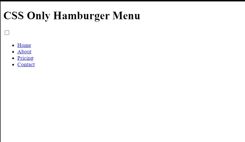
We have added all the necessary elements and links that are required for creating the structure for our hamburger menu.
Output:
CSS: Styling Your Content
Now let’s come to the heart of our project, the styling part. We will add styling to our hamburger menu and make it look more interactive. Before styling, I would suggest you guys try adding styling from your side after going through the project, which will help you build your styling skills.
Body & Background Styling:
Using the universal selector, we will add some of the basic styling to our portfolio webpage.
Using the margin and padding properties, we will set the padding and margin to “zero” from the default browser styling.
Using the body tag selector, we will add a background color to our hamburger menu using the display type “flex,” and using the justify-content property, we will align the content in the center.
*,
*::after,
*::before {
    padding: 0;
    margin: 0;
    box-sizing: border-box;
}


body {
    background-color: antiquewhite;
    display: flex;
    justify-content: center;
    font-family: sans-serif;
}
Styling Container and Elements:
Styling container
Using the class selector method (.container), we will set the position as relative, and using the margin property, we will set the margin as 3rem of our hamburger menu.
Using the height property, we will set the height of the hamburger menu container as 600px, and using the text-align property, we will set the text to the center of the webpage.
.container {
  position: relative;
  margin: 3rem;
  padding: 3rem;
  height: 600px;
  text-align: center;
  border: 3px solid black;
  border-radius: 1em;
  background-color: beige;
}
Styling Elements
Using the parent-child tag selector, we will select the heading of our hamburger menu, and using the margin-bottom property, we will set the margin to 2rem.
Then, using the class selector (.menu-items), we will use a property called text-align to align all the text of the menu items to the center of the container.
Using the border property, we will add a border of 4px solid black to our hamburger menu.
.container h1 {
  margin-bottom: 2rem;
}


.menu-items {
  text-align: center;
  position: absolute;
  padding: 5rem;
  margin-top: -6rem;
  margin-left: -1rem;
  top: 13rem;
  left: 7.5rem;
  list-style: none;
  opacity: 0;
  font-size: 2rem;
  border: 4px solid black;
  background-color: black;
  border-radius: 0.25em;
  transform: translateX(-10%);
  transition: transform 100ms ease-in-out, opacity 200ms;
}
Now we will add the styling to our menu items or list items of the hamburger menu. We will use the color property to set the font color to white, and using the padding property, we will set the padding to 0.5rem.
We will also add a hover property to our menu items, and we will change the font of the menu items when the user hovers over them.
.menu-items li{
  color: white;
  padding: 0.5rem;
}


.menu-items li a{
  color: white;
  text-decoration: none;
}


.menu-items li a:hover{
  color: rgb(174, 174, 174);
}
Check Property and Styling
Using the class selector (.check), we will set the position as absolute, and using the top property, we will add a space of 8rem from the top and 8rem from the left.
Using the width and height properties, we will set the height and width as 3rem.
Using the class selector (.check:hover) property, we will set the cursor as a pointer as the user hovers over the hamburger icon. Now, using the check property, we will toggle between the hamburger menu expand and collapse features.
If the checked property of the hamburger icon is checked, using the translate property, opacity is set to 1, and if the checkbox is already checked, then opacity will be set to zero, and the hamburger will hide.
.check {
  position: absolute;
  top: 8rem;
  left: 8rem;
  height: 3rem;
  width: 3rem;
  opacity: 0;
  z-index: 3;
}


.check:hover {
  cursor: pointer;
}


.check:checked~.menu-items {
  display: block;
  transform: translateX(0%);
  opacity: 1;
}


.ham-menu {
  height: 3rem;
  width: 3rem;
  position: absolute;
  top: 8rem;
  left: 8rem;
  padding: 0.5rem;
  z-index: 2;
  display: flex;
  flex-direction: column;
  justify-content: space-around;
  background-color: black;
  border-radius: 0.25em;
}


.ham-menu .line {
  background-color: white;
  border-radius: 1em;
  width: 2rem;
  height: 0.25rem;
}


.ham-menu .line1 {
  transform-origin: 0% 0%;
  transition: transform 100ms ease-in-out;
}


.ham-menu .line3 {
  transform-origin: 0% 100%;
  transition: transform 100ms ease-in-out;
}


.check:checked~.ham-menu .line1 {
  display: block;
  transform: rotate(45deg);
}


.check:checked~.ham-menu .line2 {
  opacity: 0;
}


.check:checked~.ham-menu .line3 {
  display: block;
  transform: rotate(-45deg);
}
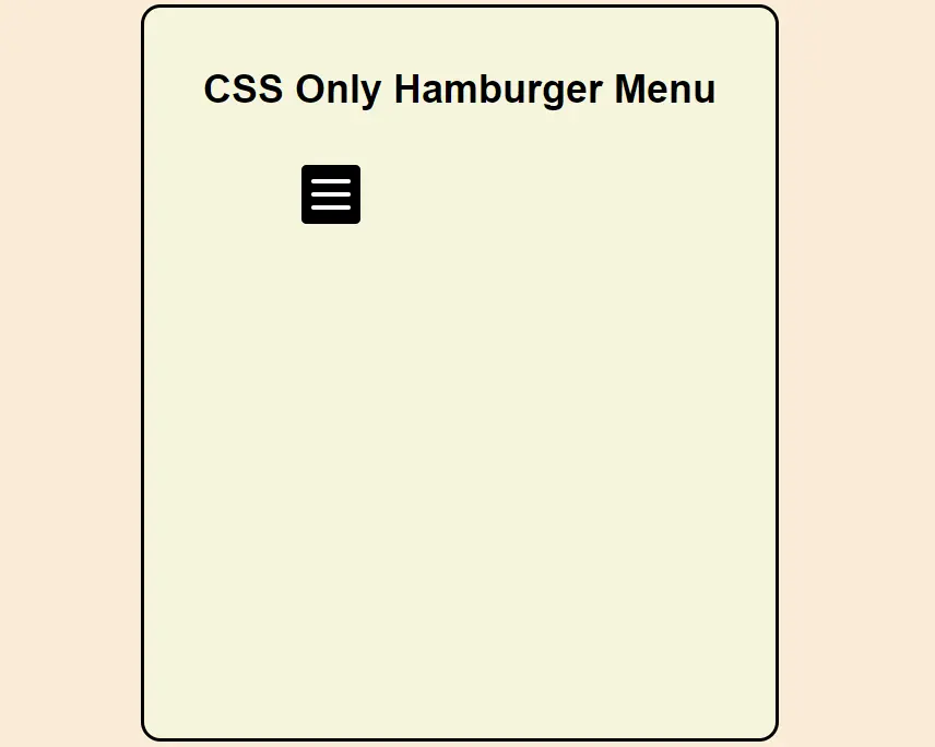
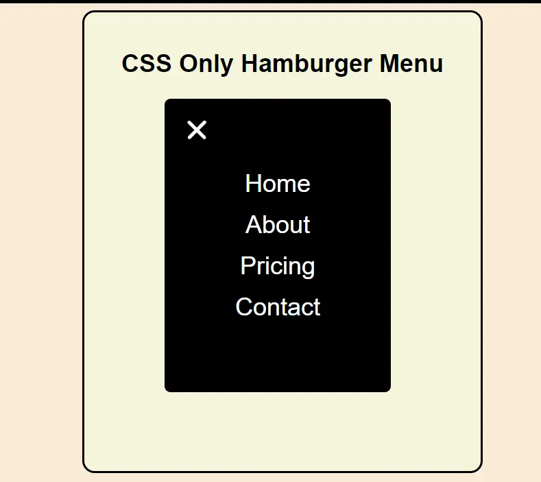
Final Output:
See the Pen Hamburger Menu (CSS Only) by Satvik Popli (@satvikpopli) on CodePen.
Conclusion
I hope you get the idea of the project. We just attempted to make the entire thing more beginner-friendly by breaking it down step by step.
I advise beginners to read and understand this article first and then Try creating a unique and customizable Hamburger Menu With HTML and CSS, we have finished our Hamburger Menu using CSS.
