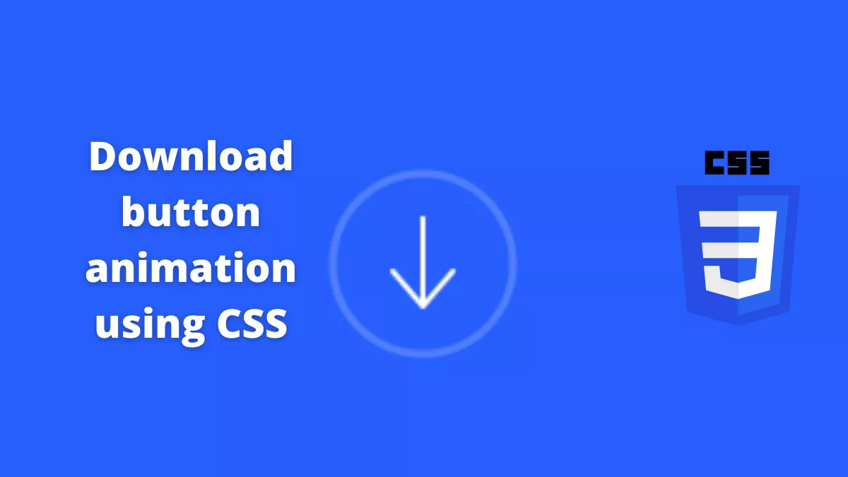
Download progress animation using CSS is an awesome animation for the download button. Animations are a great way to keep engaged users.
Also, Read- 3D Navigation Menu Using CSS
How to create download progress animation using CSS?
Step 1:
First, we will create an HTML file with the below code.
<!DOCTYPE html>
<html lang="en">
  <head>
    <meta charset="UTF-8" />
    <meta http-equiv="X-UA-Compatible" content="IE=edge" />
    <meta name="viewport" content="width=device-width, initial-scale=1.0" />
    <link
      rel="stylesheet"
      href="https://cdn.jsdelivr.net/npm/[email protected]/inter.min.css"
    />
    <link rel="stylesheet" href="style.css" />
    <title>Download Progress animation Using CSS</title>
  </head>
  <body>
    <button class="button">
      <svg class="circle" viewBox="0 0 76 76">
        <circle class="default" cx="38" cy="38" r="36"></circle>
        <circle class="active" cx="38" cy="38" r="36"></circle>
      </svg>
      <div class="icon">
        <svg class="line" viewBox="0 0 4 37">
          <line x1="2" y1="2" x2="2" y2="35"></line>
        </svg>
        <div>
          <svg class="arrow" viewBox="0 0 40 32"></svg>
          <svg class="progress" viewBox="0 0 444 10">
            <path
              d="M2,5 L42,5 C60.0089086,6.33131695 73.3422419,6.99798362 82,7 C87.572404,7.00129781 91.0932494,1.72677301 102,1.99944178 C112.906751,2.27211054 112.000464,7.99986045 122,8 C131.999536,8.00013955 132,2 142,2 C152,2 152,8 162,8 C172,8 172,2 182,2 C192,2 192,8 202,8 C212,8 212,2 222,2 C232,2 232,8 242,8 C252,8 252,2 262,2 C272,2 272,8 282,8 C292,8 292,2 302,2 C312,2 312,8 322,8 C332,8 332,2 342,2 C352,2 351.897852,7.49489262 362,8 C372.102148,8.50510738 378.620177,5.22532154 402,5 L442,5"
            ></path>
          </svg>
        </div>
      </div>
      <span>0%</span>
    </button>

    <script src="https://cdn.jsdelivr.net/npm/[email protected]/dist/gsap.min.js"></script>
    <script src="main.js"></script>
  </body>
</html>
Step 2:
Next, We will create a style.css file and copy the below code
.button {
  --default: rgba(255, 255, 255, 0.2);
  --active: #fff;
  position: relative;
  border: none;
  outline: none;
  background: none;
  padding: 0;
  -webkit-appearance: none;
  -webkit-tap-highlight-color: transparent;
  cursor: pointer;
  transform: scale(var(--s, 1));
  transition: transform 0.2s;
}
.button:active {
  --s: 0.96;
}
.button svg {
  display: block;
  fill: none;
  stroke-width: var(--sw, 3px);
  stroke-linecap: round;
  stroke-linejoin: round;
}
.button .circle {
  width: 76px;
  height: 76px;
  transform: rotate(-90deg);
}
.button .circle circle.default {
  stroke: var(--default);
}
.button .circle circle.active {
  stroke: var(--active);
  stroke-dasharray: 227px;
  stroke-dashoffset: var(--active-offset, 227px);
  transition: stroke-dashoffset var(--all-transition, 4s) ease
    var(--all-delay, 0.8s);
}
.button span {
  display: block;
  position: absolute;
  left: 0;
  right: 0;
  text-align: center;
  bottom: 13px;
  font-weight: 500;
  font-size: 10px;
  color: var(--active);
  opacity: var(--count-opacity, 0);
  transform: translateY(var(--count-y, 4px));
  -webkit-animation: var(--count, none) 0.3s ease forwards
    var(--all-delay, 4.6s);
  animation: var(--count, none) 0.3s ease forwards var(--all-delay, 4.6s);
  transition: opacity 0.2s ease 0.6s, transform 0.3s ease 0.6s;
}
.button .icon {
  --sw: 2px;
  width: 24px;
  height: 40px;
  position: absolute;
  left: 50%;
  top: 50%;
  margin: -20px 0 0 -12px;
}
.button .icon svg.line {
  width: 4px;
  height: 37px;
  stroke: var(--active);
  position: absolute;
  left: 10px;
  top: 0;
  stroke-dasharray: 0 33px var(--line-array, 33px) 66px;
  stroke-dashoffset: var(--line-offset, 33px);
  transform: translateY(var(--line-y, 0));
  opacity: var(--line-opacity, 1);
  transition: stroke-dasharray 0.2s, stroke-dashoffset 0.2s,
    transform 0.32s ease var(--all-delay, 0.25s);
}
.button .icon div {
  width: 40px;
  height: 32px;
  position: absolute;
  overflow: hidden;
  left: 50%;
  bottom: 1px;
  margin-left: -20px;
  transform: translate(var(--icon-x, 0), var(--icon-y, 0));
  transition: transform 0.3s ease var(--all-delay, 4.8s);
  -webkit-animation: var(--overflow, none) 0s linear forwards
    var(--all-delay, 4.8s);
  animation: var(--overflow, none) 0s linear forwards var(--all-delay, 4.8s);
}
.button .icon div:before,
.button .icon div:after {
  content: "";
  position: absolute;
  z-index: 1;
  height: 2px;
  left: var(--l, 0);
  top: 15px;
  width: var(--w, 16px);
  background: var(--active);
  border-radius: 1px;
  transform-origin: var(--tx, 15px) 1px;
  transform: rotate(var(--before-rotate, 0deg));
  opacity: var(--tick-opacity, 0);
  transition: transform 0.4s ease var(--all-delay, 4.8s),
    opacity 0s linear var(--all-delay, 4.8s);
}
.button .icon div:after {
  --l: 14px;
  --w: 26px;
  --tx: 1px;
  transform: rotate(var(--after-rotate, 0deg));
}
.button .icon div svg {
  stroke: var(--active);
}
.button .icon div svg.arrow {
  width: 40px;
  height: 32px;
  opacity: var(--arrow-opacity, 1);
  transition: opacity 0s linear var(--all-delay, 1s);
}
.button .icon div svg.progress {
  width: 444px;
  height: 10px;
  position: absolute;
  left: 0;
  top: 11px;
  transform: translateX(var(--progress-x, 0));
  opacity: var(--progress-opacity, 0);
  transition: transform var(--all-transition, 4.4s) ease var(--all-delay, 0.4s),
    opacity 0s linear var(--all-delay, 1s);
  -webkit-animation: var(--hide, none) 0s linear forwards var(--all-delay, 4.8s);
  animation: var(--hide, none) 0s linear forwards var(--all-delay, 4.8s);
}
.button.loading:not(.reset) {
  --line-y: -36px;
  --line-array: 0;
  --line-offset: 15px;
  --active-offset: 0;
  --arrow-opacity: 0;
  --progress-opacity: 1;
  --progress-x: -400px;
  --tick-opacity: 1;
  --before-rotate: 47deg;
  --after-rotate: -46deg;
  --hide: hide;
  --overflow: overflow;
  --icon-x: 2px;
  --icon-y: 7px;
  --count-opacity: 1;
  --count-y: 0;
  --count: count;
}
.button.reset {
  --all-delay: 0s;
  --all-transition: 0.3s;
}

@-webkit-keyframes hide {
  to {
    opacity: 0;
  }
}

@keyframes hide {
  to {
    opacity: 0;
  }
}
@-webkit-keyframes count {
  to {
    transform: translateY(4px);
    opacity: 0;
  }
}
@keyframes count {
  to {
    transform: translateY(4px);
    opacity: 0;
  }
}
@-webkit-keyframes overflow {
  to {
    overflow: visible;
  }
}
@keyframes overflow {
  to {
    overflow: visible;
  }
}
html {
  box-sizing: border-box;
  -webkit-font-smoothing: antialiased;
}

* {
  box-sizing: inherit;
}
*:before,
*:after {
  box-sizing: inherit;
}

body {
  min-height: 100vh;
  font-family: "Inter", "Inter UI", Arial;
  display: flex;
  justify-content: center;
  align-items: center;
  background: #275efe;
  font-family: "Roboto", Arial, sans-serif;
}
body .dribbble {
  position: fixed;
  display: block;
  right: 20px;
  bottom: 20px;
}
body .dribbble img {
  display: block;
  width: 76px;
}
body .twitter {
  position: fixed;
  display: block;
  right: 112px;
  bottom: 14px;
}
body .twitter svg {
  width: 24px;
  height: 24px;
  fill: white;
}
Step 3:
Now, we will create a main.js file and use the below Javascript code
const $ = (s, o = document) => o.querySelector(s);
const $$ = (s, o = document) => o.querySelectorAll(s);

$$(".button").forEach((button) => {
  let count = {
      number: 0,
    },
    icon = $(".icon", button),
    iconDiv = $(".icon > div", button),
    arrow = $(".icon .arrow", button),
    countElem = $("span", button),
    svgPath = new Proxy(
      {
        y: null,
        s: null,
        f: null,
        l: null,
      },
      {
        set(target, key, value) {
          target[key] = value;
          if (
            target.y !== null &&
            target.s != null &&
            target.f != null &&
            target.l != null
          ) {
            arrow.innerHTML = getPath(
              target.y,
              target.f,
              target.l,
              target.s,
              null
            );
          }
          return true;
        },
        get(target, key) {
          return target[key];
        },
      }
    );

  svgPath.y = 30;
  svgPath.s = 0;
  svgPath.f = 8;
  svgPath.l = 32;

  button.addEventListener("click", (e) => {
    if (!button.classList.contains("loading")) {
      if (!button.classList.contains("animation")) {
        button.classList.add("loading", "animation");

        gsap.to(svgPath, {
          f: 2,
          l: 38,
          duration: 0.3,
          delay: 0.15,
        });

        gsap.to(svgPath, {
          s: 0.2,
          y: 16,
          duration: 0.8,
          delay: 0.15,
          ease: Elastic.easeOut.config(1, 0.4),
        });

        gsap.to(count, {
          number: "100",
          duration: 3.8,
          delay: 0.8,
          onUpdate() {
            countElem.innerHTML = Math.round(count.number) + "%";
          },
        });

        setTimeout(() => {
          iconDiv.style.setProperty("overflow", "visible");
          setTimeout(() => {
            button.classList.remove("animation");
          }, 600);
        }, 4820);
      }
    } else {
      if (!button.classList.contains("animation")) {
        button.classList.add("reset");

        gsap.to(svgPath, {
          f: 8,
          l: 32,
          duration: 0.4,
        });

        gsap.to(svgPath, {
          s: 0,
          y: 30,
          duration: 0.4,
        });

        setTimeout(() => {
          button.classList.remove("loading", "reset");
          iconDiv.removeAttribute("style");
        }, 400);
      }
    }
    e.preventDefault();
  });
});

function getPoint(point, i, a, smoothing) {
  let cp = (current, previous, next, reverse) => {
      let p = previous || current,
        n = next || current,
        o = {
          length: Math.sqrt(
            Math.pow(n[0] - p[0], 2) + Math.pow(n[1] - p[1], 2)
          ),
          angle: Math.atan2(n[1] - p[1], n[0] - p[0]),
        },
        angle = o.angle + (reverse ? Math.PI : 0),
        length = o.length * smoothing;
      return [
        current[0] + Math.cos(angle) * length,
        current[1] + Math.sin(angle) * length,
      ];
    },
    cps = cp(a[i - 1], a[i - 2], point, false),
    cpe = cp(point, a[i - 1], a[i + 1], true);
  return `C ${cps[0]},${cps[1]} ${cpe[0]},${cpe[1]} ${point[0]},${point[1]}`;
}

function getPath(update, first, last, smoothing, pointsNew) {
  let points = pointsNew
      ? pointsNew
      : [
          [first, 16],
          [20, update],
          [last, 16],
        ],
    d = points.reduce(
      (acc, point, i, a) =>
        i === 0
          ? `M ${point[0]},${point[1]}`
          : `${acc} ${getPoint(point, i, a, smoothing)}`,
      ""
    );
  return `<path d="${d}" />`;
}
The source code is available on Github.
If you like this post then please share and comment
