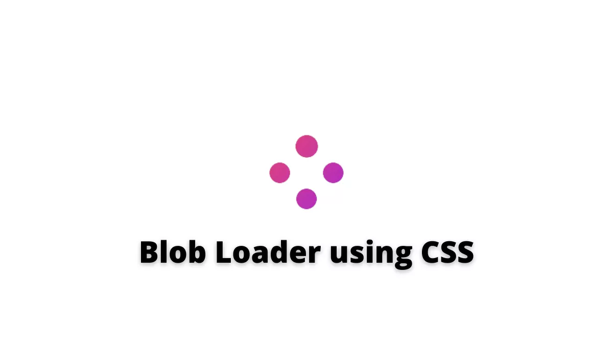
Blob loader using CSS can be helpful to show the loading of something in the webpage. It is a very unique and cool loader. This loader is created by Temani Afif on Codepen.
Also, Read – 3D Red Switch
How to create a Blob loader using CSS?
We can create this loader with the below steps
Step 1: HTML
First, we will start by creating an index.html file and then copy the below code.
<!DOCTYPE html>
<html lang="en">
  <head>
    <meta charset="UTF-8" />
    <meta http-equiv="X-UA-Compatible" content="IE=edge" />
    <meta name="viewport" content="width=device-width, initial-scale=1.0" />
    <link rel="stylesheet" href="style.css" />
    <title>Blob Loader using CSS</title>
  </head>
  <body>
    <div class="loader"></div>
  </body>
</html>
Step 2: CSS
Now, create the style.css file and write the below code to it
.loader {
  width: 200px; /* control the size */
  aspect-ratio: 1;
  display: grid;
  background: linear-gradient(135deg, #fe5251, #911cf1);
  clip-path: inset(10%);
}
.loader:before {
  content: "";
  padding: 10%;
  --_g: no-repeat content-box radial-gradient(50% 50%, #000 95%, #0000);
  background: var(--_g), var(--_g), var(--_g), var(--_g), #fff;
  background-size: 20% 20%;
  filter: blur(5px) contrast(20);
  mix-blend-mode: lighten;
  animation: l 3s infinite, s 3s infinite;
}
@keyframes l {
  0%,
  100% {
    background-position: top, right, bottom, left;
  }
  20% {
    background-position: center, right, bottom, left;
  }
  40% {
    background-position: center, center, bottom, left;
  }
  60% {
    background-position: center, center, center, left;
  }
  80% {
    background-position: center, center, center, center;
  }
}
@keyframes s {
  0%,
  25%,
  90% {
    background-size: 20% 20%;
  }
  40%,
  45% {
    background-size: 30% 30%, 20% 20%, 20% 20%, 20% 20%;
  }
  60%,
  65% {
    background-size: 40% 40%, 20% 20%, 20% 20%, 20% 20%;
  }
  80% {
    background-size: 50% 50%, 20% 20%, 20% 20%, 20% 20%;
  }
}

body {
  margin: 0;
  height: 100vh;
  display: grid;
  place-content: center;
}
Boom! You have it.
The source code is available on Codepen.
If you find this post helpful then please share it with your friends.

