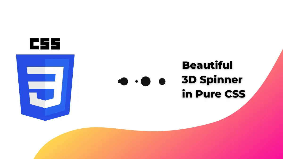
Today we will create a 3D spinner in CSS. You can use it as a loading animation on your website or make it a decorative element.
Also Read- Beautiful Mouse Art in CSS.
Step 1:
First, we will create our HTML file and write the below code to it.
<!DOCTYPE html>
<html lang="en">
  <head>
    <meta charset="UTF-8" />
    <meta http-equiv="X-UA-Compatible" content="IE=edge" />
    <meta name="viewport" content="width=device-width, initial-scale=1.0" />
    <link rel="stylesheet" href="style.css" />
    <title>3D Spinner in CSS</title>
  </head>
  <body>
    <div class="loader-3d"></div>
  </body>
</html>
Step 2:
Now, we will create a styole.css file write the below code
* {
  margin: 0;
  padding: 0;
}
body {
  background: #fff;
}
.loader-3d {
  top: calc(50% - 12.5px);
  left: calc(50% - 100px);
  position: absolute !important;
}
/* Demo specific styles end */

.loader-3d,
.loader-3d:before,
.loader-3d:after {
  width: 200px;
  height: 40px;
  background: no-repeat;
  background-image: radial-gradient(closest-side, #111 100%, transparent),
    radial-gradient(closest-side, #111 100%, transparent);
  background-size: 20px 20px, 20px 20px;
  background-position: 0% center, 100% center;
  position: absolute;
  transform: translateZ(0);
  animation: slide 1.5s cubic-bezier(0.5, 0, 0.5, 1) infinite,
    zoom ease-out 0.75s infinite alternate;
  content: "";
}
.loader-3d {
  animation-delay: 0.5s;
}
.loader-3d:after {
  animation-delay: 1s;
}

@keyframes slide {
  to {
    background-position: 100%, 0;
  }
}

@keyframes zoom {
  to {
    background-size: 40px 40px, 10px 10px;
  }
}
And you have it.
The source code is available at Github. Click here for the source code.
If you find this post helpful then please share and comment.
