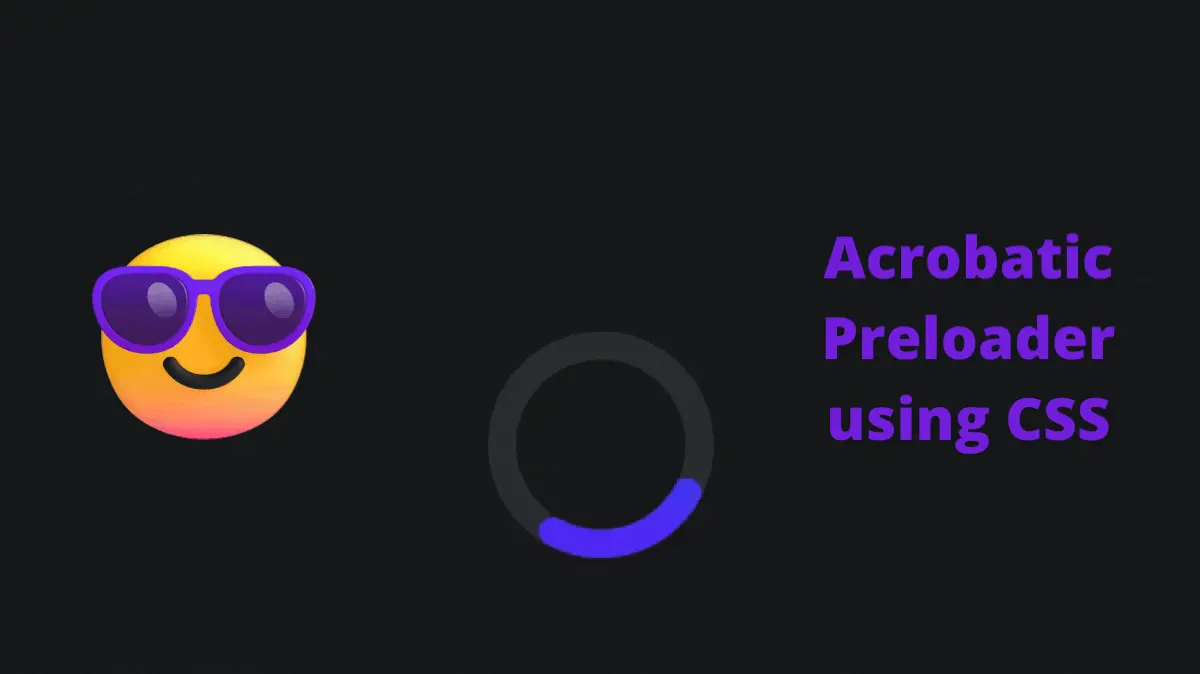
Acrobatic Preloader using CSS is a cool project. We can use this kind of preloader to entertain users while we load the webpage. Sometimes webpages take a long time to load, While the page is loading users see a blank white screen. Instead, we can show them a preloader to indicate the page is loading.
Also, Read- Expanding Flex Cards
How to create an Acrobatic Preloader using CSS?
To create this kind of preloader we can use SVG and CSS.
Step 1: HTML
First, We will create an HTML file with the below code.
<!DOCTYPE html>
<html lang="en">
  <head>
    <meta charset="UTF-8" />
    <meta http-equiv="X-UA-Compatible" content="IE=edge" />
    <meta name="viewport" content="width=device-width, initial-scale=1.0" />
    <link rel="stylesheet" href="style.css" />
    <title>Acrobatic Preloader using CSS</title>
  </head>
  <body>
    <main>
      <svg
        class="ap"
        viewBox="0 0 128 256"
        width="128px"
        height="256px"
        xmlns="http://www.w3.org/2000/svg"
      >
        <defs>
          <linearGradient id="ap-grad1" x1="0" y1="0" x2="0" y2="1">
            <stop offset="0%" stop-color="hsl(223,90%,55%)" />
            <stop offset="100%" stop-color="hsl(253,90%,55%)" />
          </linearGradient>
          <linearGradient id="ap-grad2" x1="0" y1="0" x2="0" y2="1">
            <stop offset="0%" stop-color="hsl(193,90%,55%)" />
            <stop offset="50%" stop-color="hsl(223,90%,55%)" />
            <stop offset="100%" stop-color="hsl(253,90%,55%)" />
          </linearGradient>
        </defs>
        <circle
          class="ap__ring"
          r="56"
          cx="64"
          cy="192"
          fill="none"
          stroke="#ddd"
          stroke-width="16"
          stroke-linecap="round"
        />
        <circle
          class="ap__worm1"
          r="56"
          cx="64"
          cy="192"
          fill="none"
          stroke="url(#ap-grad1)"
          stroke-width="16"
          stroke-linecap="round"
          stroke-dasharray="87.96 263.89"
        />
        <path
          class="ap__worm2"
          d="M120,192A56,56,0,0,1,8,192C8,161.07,16,8,64,8S120,161.07,120,192Z"
          fill="none"
          stroke="url(#ap-grad2)"
          stroke-width="16"
          stroke-linecap="round"
          stroke-dasharray="87.96 494"
        />
      </svg>
    </main>
  </body>
</html>
Step 2: CSS
Last, We will create a style.css and add the below code to it.
* {
  border: 0;
  box-sizing: border-box;
  margin: 0;
  padding: 0;
}
:root {
  --hue: 223;
  --bg: hsl(var(--hue), 10%, 90%);
  --fg: hsl(var(--hue), 10%, 10%);
  font-size: calc(16px + (24 - 16) * (100vw - 320px) / (1280 - 320));
}
body {
  background-color: var(--bg);
  color: var(--fg);
  font: 1em/1.5 sans-serif;
  height: 100vh;
  display: grid;
  place-items: center;
  transition: background-color 0.3s;
}
main {
  padding: 1.5em 0;
}

.ap {
  width: 8em;
  height: 16em;
}
.ap__ring {
  stroke: hsla(var(--hue), 10%, 10%, 0.15);
  transition: stroke 0.3s;
}
.ap__worm1,
.ap__worm2 {
  animation-duration: 3s;
  animation-iteration-count: infinite;
}
.ap__worm1 {
  animation-name: worm1;
}
.ap__worm2 {
  animation-name: worm2;
  visibility: hidden;
}

/* Dark theme */
@media (prefers-color-scheme: dark) {
  :root {
    --bg: hsl(var(--hue), 10%, 10%);
    --fg: hsl(var(--hue), 10%, 90%);
  }
  .ap__ring {
    stroke: hsla(var(--hue), 10%, 90%, 0.1);
  }
}

/* Animtions */
@keyframes worm1 {
  from {
    animation-timing-function: ease-in-out;
    stroke-dashoffset: -87.96;
  }
  20% {
    animation-timing-function: ease-in;
    stroke-dashoffset: 0;
  }
  60% {
    stroke-dashoffset: -791.68;
    visibility: visible;
  }
  60.1%,
  to {
    stroke-dashoffset: -791.68;
    visibility: hidden;
  }
}
@keyframes worm2 {
  from,
  60% {
    stroke-dashoffset: -87.96;
    visibility: hidden;
  }
  60.1% {
    animation-timing-function: cubic-bezier(0, 0, 0.5, 0.75);
    stroke-dashoffset: -87.96;
    visibility: visible;
  }
  77% {
    animation-timing-function: cubic-bezier(0.5, 0.25, 0.5, 0.88);
    stroke-dashoffset: -340;
    visibility: visible;
  }
  to {
    stroke-dashoffset: -669.92;
    visibility: visible;
  }
}
Boom! You have created a preloader.
The source code is available on Github.
If you find this project useful then please share it with your friends and don’t forget to comment.

